


.svg)


.svg)
.svg)


Imagine trying to navigate a new city without a map. Overwhelming right? One wrong turn and you’re reaching your destination 30 minutes late. That’s what it’s like to manage your business’s website without an intuitive and functional dashboard. A website dashboard gives you a clean and organised view of your business. To make the most of your dashboard, you need a simple, decluttered, and communicative dashboard that helps you understand data.
In 2024, the focus is on creating dashboards that are not just functional but also intuitive, clean, and goal-oriented. At Mellow Designs, we’ve been tracking the evolving trends in digital product design. Here are some of the best practices for designing effective website dashboards.
Decoding the digital nerve centre
Before we get to the best practices of designing a website dashboard, let’s first unwrap its meaning and functions. At its core, a website dashboard is a user interface that displays key information in an organised and visual manner. It should allow users to monitor, track, and manage various tasks or data points.
Think of your dashboard as the cockpit of an aeroplane. All the essential controls and data are visible at a glance, enabling the pilot (or user) to make informed decisions quickly.
Whether it's an admin panel for a web app or an analytics dashboard for tracking sales, a website dashboard can be a powerful tool for simplifying complex data.
No mess, less stress—the power of intuitive dashboards
A well-designed web app dashboard plays an important role in digital product design. It empowers users with insights, enabling them to make data-driven decisions. Users can get access to vital information with ease. A cluttered, complex dashboard can slow down user efficiency, much like how a messy desk can hinder productivity. On the other hand, an intuitive dashboard is like an organised work desk—efficient, familiar, and easy to use.
In 2024, with users demanding faster access to insights, businesses need dashboards that balance design with functionality. Users should spend less time searching for data and more time acting on it. That’s why we at Mellow Designs are committed to helping you achieve just that.
Unlocking Intuition: Best Practices for Effortless Dashboard Design
1. Design for simplicity and clarity to avoid confusion
Imagine walking into a room filled with noise—it’s difficult to focus, right? A cluttered dashboard feels exactly the same. The key to an intuitive UI design lies in clarity and simplicity.
Start by organising information hierarchically. This ensures that the most important data stands out. When users open the dashboard, they should immediately understand what’s happening without needing to dig for insights.
For example, a project management dashboard can prioritise key metrics like the number of completed tasks or upcoming deadlines at the top. Secondary information like team member availability can be tucked into a less prominent area.
2. Data visualisations, decluttering, and white space
Data is crucial, but presenting it effectively is even more important. In 2024, decluttered, minimalistic design with data visualisations will continue to be the trend.
Charts, infographics, and graphs make complex data easier to understand. The user just has to glance at the dashboard, and they’ll understand the information presented to them. This is why we compare designing a minimal dashboard to serving a gourmet meal—presentation matters.
Minimal dashboards with decluttered design don’t just have well-thought-out data visualisations. They also effectively make use of space.
White space (or negative space) is empty space on the dashboard that gives the design visual breathing space. By balancing white space with content, the dashboard feels less overwhelming and more engaging.
For example, a sales performance dashboard could use a combination of bar graphs for daily sales trends, pie charts for market segment breakdowns, and line charts for revenue growth—all strategically placed with ample white space.
3. Responsive design is a no-brainer
In 2024, most people consume information on their mobile first and other devices later. Therefore, it’s a necessity that we design dashboards that are responsive and readable on both mobile and desktop devices. A well-designed web app dashboard should adjust seamlessly to different screen sizes without losing functionality or clarity.
Whether you open the dashboard on your mobile phone, iPad, or computer screen, it should provide the same essential information without losing its structure. This is especially critical for businesses that rely on data-driven decision-making on the go.
4. Diverse users have varying needs
Whether it’s different categories of business or roles at a company, no two users are the same. Therefore, their dashboard UI shouldn’t be either. Flexibility and personalisation options are game-changers in UI design.
Users should have the ability to customise their dashboard layout, choose which metrics to display, and adjust the data visualisations based on their preferences.
For example, in an employee management dashboard, an HR manager may prioritise seeing attendance trends, while a team lead might prefer viewing project completion stats. By allowing personalisation, both users can have a dashboard tailored to their needs without unnecessary clutter.
5. Design for user needs
Designing a website dashboard without clear goals is like setting out on a road trip without a destination. Each element on the dashboard should serve a purpose, guiding users toward their objectives. Whether it’s increasing sales, monitoring website traffic, or managing customer feedback, the UI should focus on helping users achieve their goals efficiently.
To create a goal-oriented design, you need to have great clarity on the user’s core objectives. Once you have a defined goal, it’s easier to meet user needs with intuitive design. These goals can be monitoring e-commerce sales, prioritising sales funnels, product performance, or customer engagement metrics. By focussing on user goals, the dashboard becomes more intuitive and valuable.
Designing an intuitive website dashboard in 2024 requires a thoughtful blend of clarity, simplicity, responsiveness, and personalization. At Mellow Designs, we believe that a great UI design doesn’t just look good—it works seamlessly. By following the best practices of designing website dashboards, designers can create dashboards that truly empower users.
To build an intuitive web app dashboard that drives results, get in touch with Mellow Designs. Let's partner to transform boring website dashboards into intuitive and functional ones.
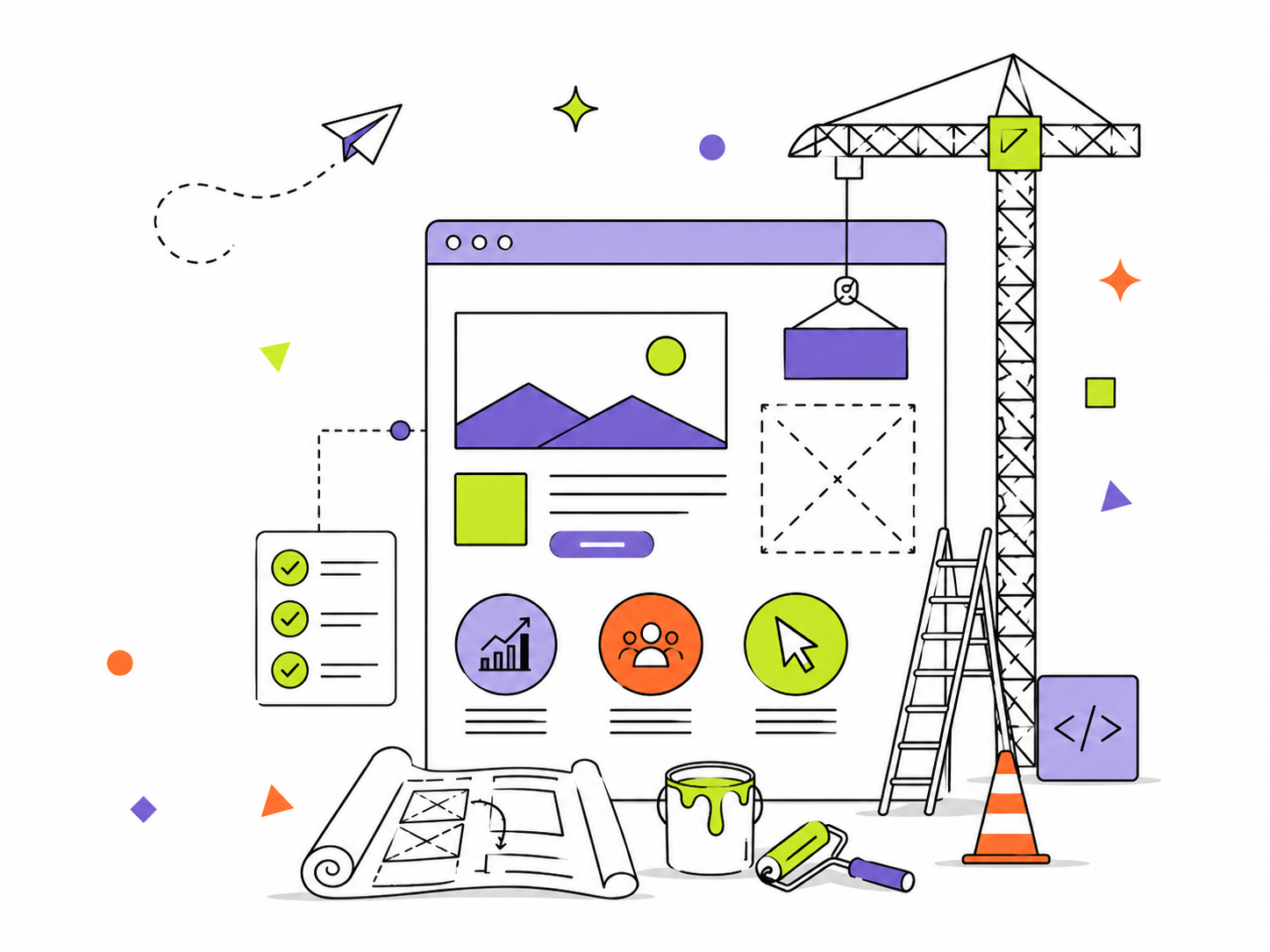


.svg)


