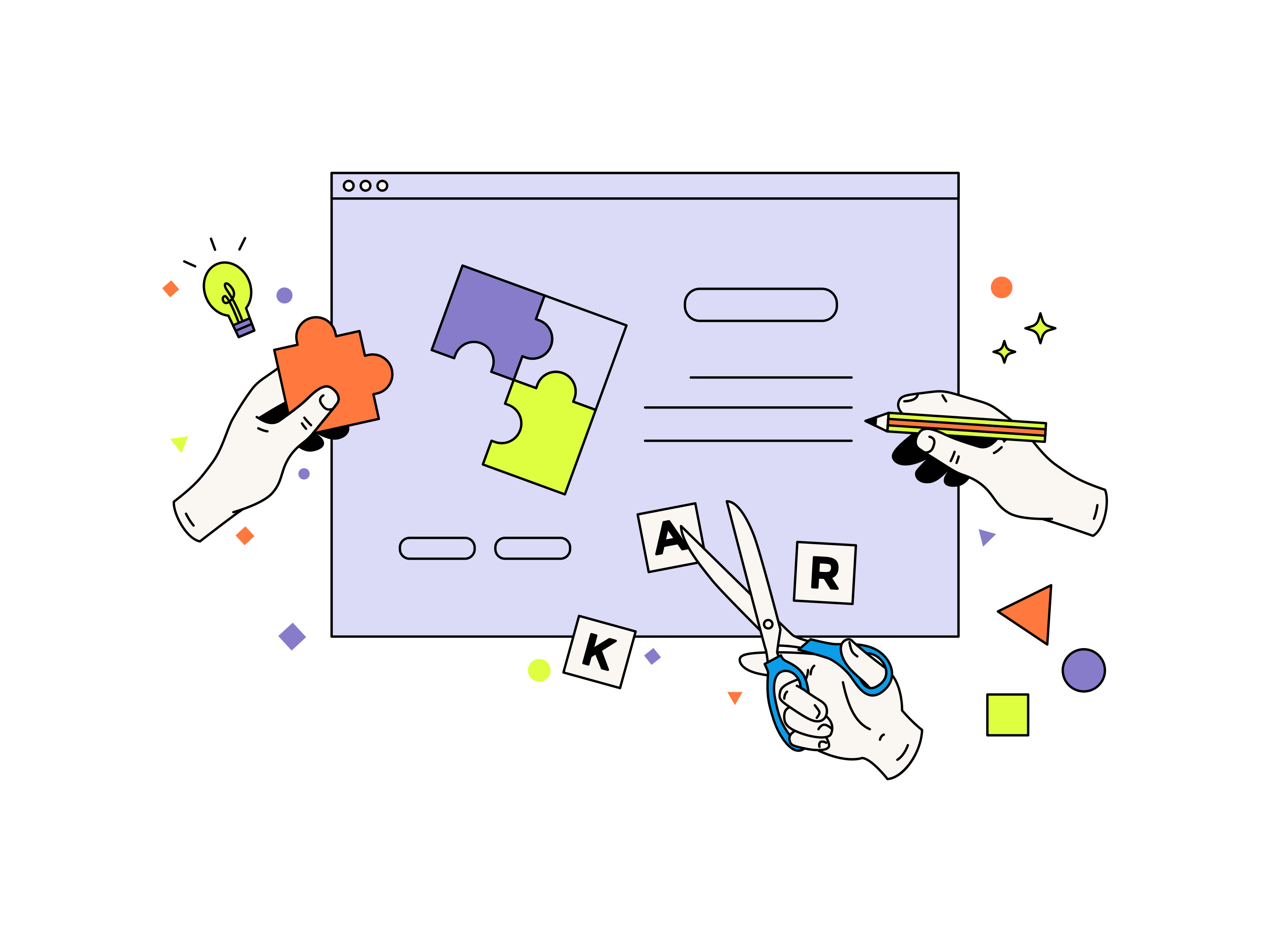
As we know, every mistake is a learning experience. This Wednesday, we at Mellow help you navigate and avoid common mistakes most designers make. With these tips, you can free your creative energy in the best way possible! Save this blog post for the next time you're designing anything, right from a website to a logo. Our tips are versatile.
Let's start with the basics; try not to look at the creative journey as a daunting path. Everybody has a different style and form of expression, so pick what you're comfortable with and develop that niche.
1. Avoid stock images as much as possible
We know what you're thinking! Using stock images is the only way out of plagiarism, and that's very important in the creative community. However, if you choose to use stock images recycled repeatedly by designers, your work can come off as unprofessional. We'd suggest taking fresh photos as much as possible to use in projects. You can make it unique and authentic to your brand specifically.

But we do understand that it's not always possible to escape stock images. If it's a basic sample project, explore websites like Unsplash, Freepik, and Envato for your image needs.
2. The right colour palette is important
Have you studied the theory of colours and their effects on the brain? Well, if you haven't, now is an excellent time to dive right in. Every prominent brand you can think of has its colour palette locked down for its logo or website. Each colour has a different psychological effect, and you need to know it before selecting the color scheme for your next project.

It's fascinating too! Let's get you started with the colours red and yellow. Does that bring to mind the McDonald's logo? That's because red and yellow make you feel hungry.
3. Don't use too many fonts
Playing with fonts is always fun; we're sure you won't disagree. However, if there are too many fonts in your work, it could be pretty distracting and unpleasant to the eye. How can you solve it? It's elementary. Stick to about two to three fonts for a project that works cohesively together. A great way to find which fonts work together is to search on Google fonts. Another excellent site for fonts is DaFonts. They provide pairing options that are easy to navigate.

Keep in mind that the spacing between the letters of the fonts, a process known as kerning, will make a massive difference in your outcome.
4. Always create a versatile design
If you're designing a logo, think of all the many places you can use it. A napkin, a visiting card, a menu? Cover all your bases and ensure that your design can seamlessly fit into all aspects of the brand. The shape, the design, the colour, all of this is important to keep in mind. You can prevent the need to constantly create new designs each time you have to place your brand in a different setting.

5. Hierarchy makes all the difference
Spacing and hierarchy of design is probably the most crucial part to have nailed down as a fellow creative. When you're skimming through a flyer, you want the essential bits of information to pop up at you immediately. After all, most people have an attention span of about 10 seconds, if not less. When you're creating anything, remember to communicate the main idea and then the supporting narrative.

You can choose to highlight your information in various ways, with different colours, font weightage, separate columns; the options are endless. Just make sure it's not a jumble of information that's hard to take in at first glance.
6. Proofread, proofread, proofread!
We said it three times because it's necessary. A spelling mistake here and a grammatical error there will leave your brand looking unprofessional even if these mistakes seem irrelevant to you. Some don't take it lightly as a customer, and it's always easier to focus on the wrong than the right. You suffer because the attention is taken away from the fantastic design to a simple trivial error in the process. Always proofread your work. A subscription to a website like Grammarly can make this process very easy.

Six common mistakes seem almost too simple but make a difference in separating professional and amateur work. Please don't wait to make a mistake to learn because we have it all right here for you. Let us know if you've made any other mistakes you've learned from in the comments below. Please share this with your creative community, so they know what not to do next time!
.jpg)