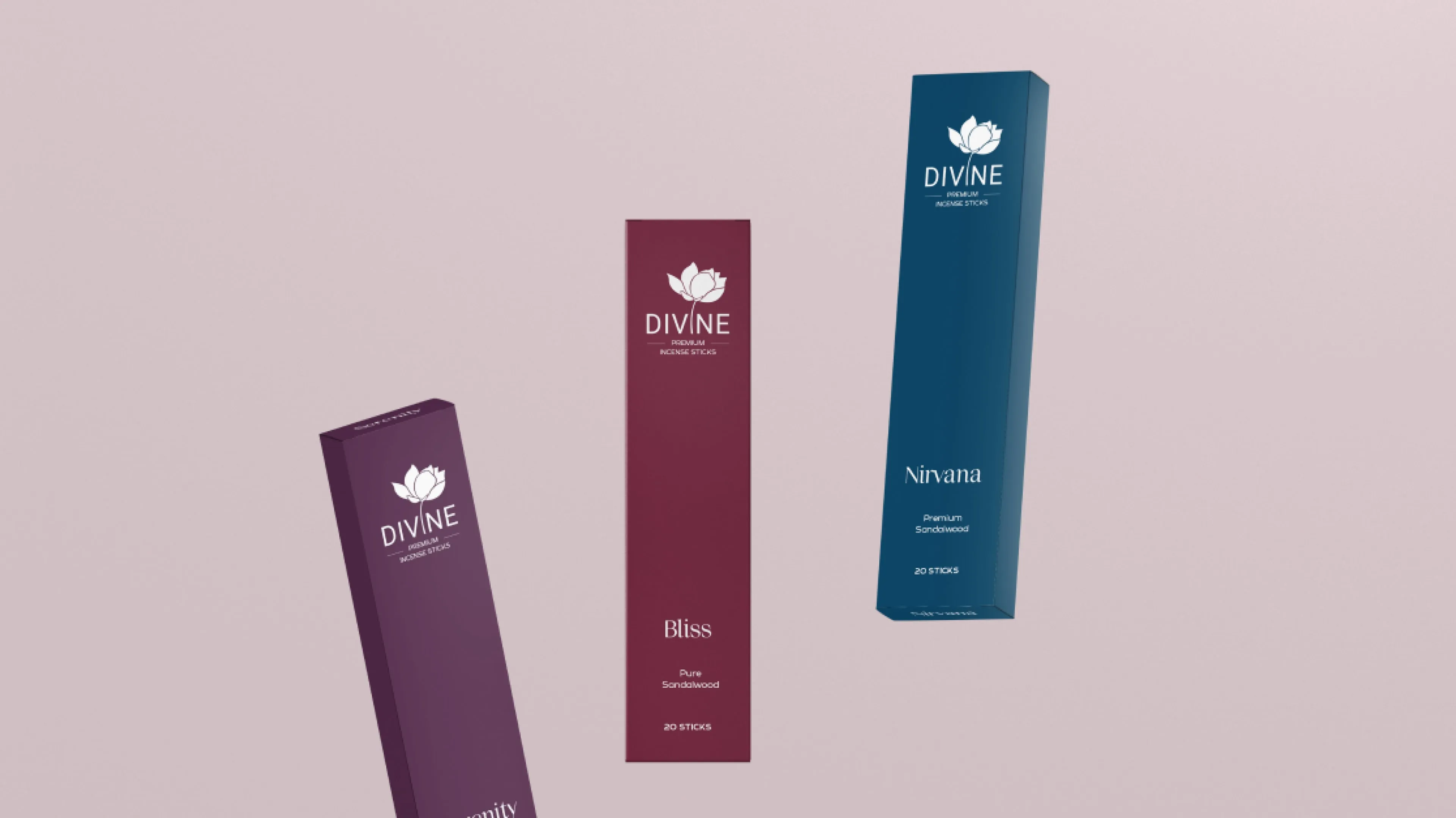
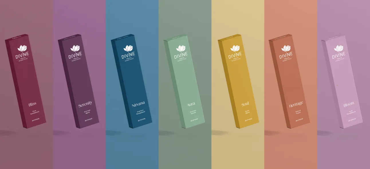
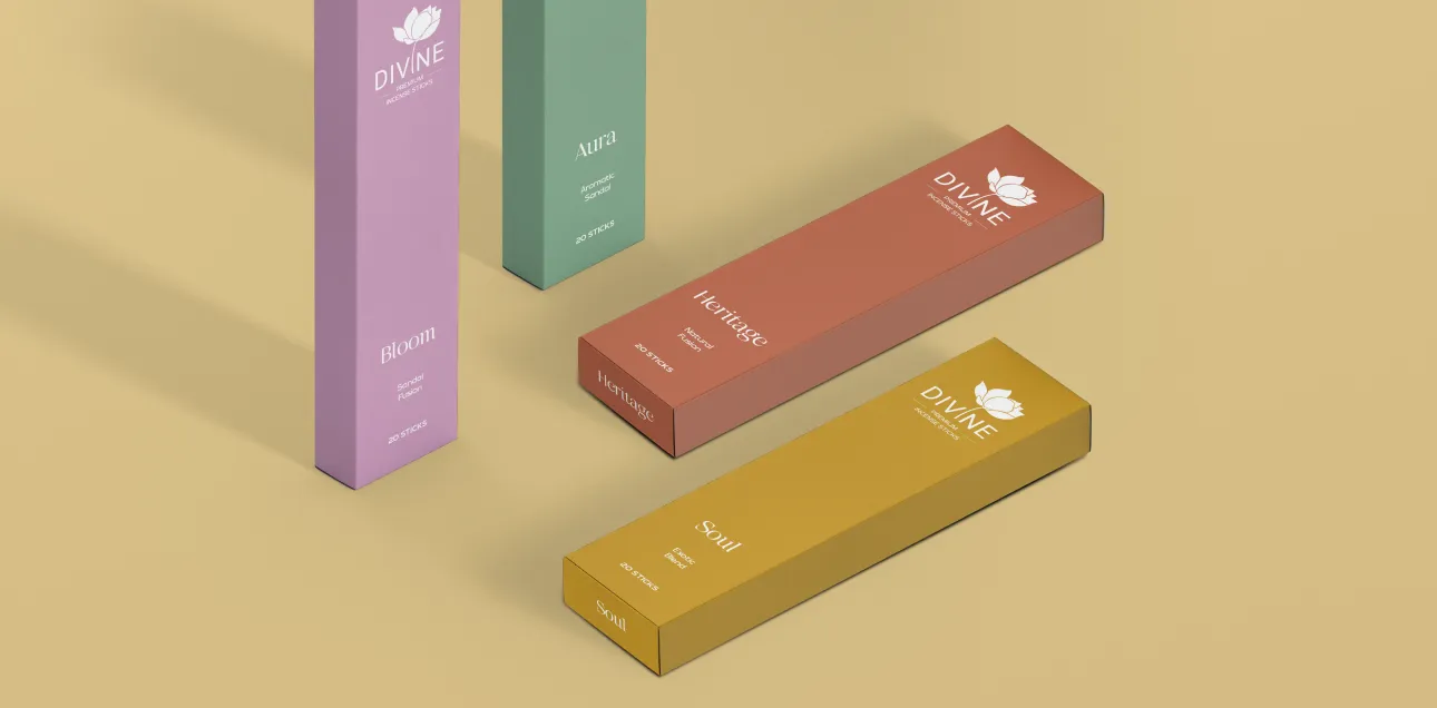
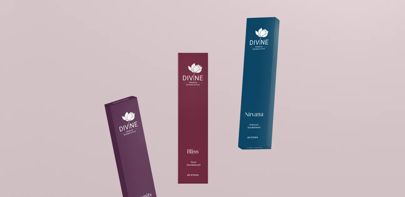
Divine wanted to reintroduce its classic sandalwood incense to a contemporary audience while retaining its heritage and elegance.
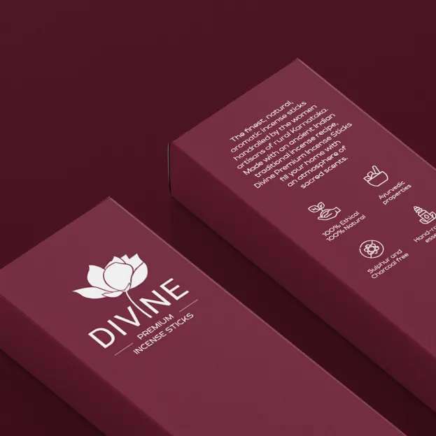
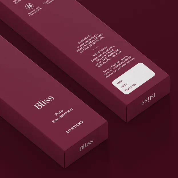
Mellow Designs blended tradition with modernity by incorporating ornamental details across the packaging. The typography and iconography reflected Divine’s essence while staying aligned with modern design trends.
The focus was on creating a classy, timeless aesthetic that resonated with both heritage and modern-day sensibilities, ensuring Divine’s relevance in new, unexplored spaces.
The rebranding allowed Divine to re-enter households with a refreshed appeal, seamlessly fitting into modern lifestyles.


Keep the ornament, update the execution. We blended tradition with modernity in Divine's packaging by carrying ornamental detail through the design, while aligning the typography and iconography with contemporary trends.
Reframe it as a lifestyle object. We aimed Divine's redesign at a classy, timeless aesthetic that reads as current to modern sensibilities while still reflecting the brand's essence as a classic sandalwood product.
That was the intent. We built Divine's rebrand to give the product relevance in new, previously unexplored spaces, letting a traditional incense brand re-enter households with refreshed appeal.
Not if the essence is preserved. We designed Divine's typography and iconography to reflect the brand's existing character, so the update reads as a refresh rather than a replacement.
Divine's rebrand allowed the classic sandalwood range to re-enter households with refreshed appeal, fitting into modern lifestyles rather than remaining a legacy purchase.