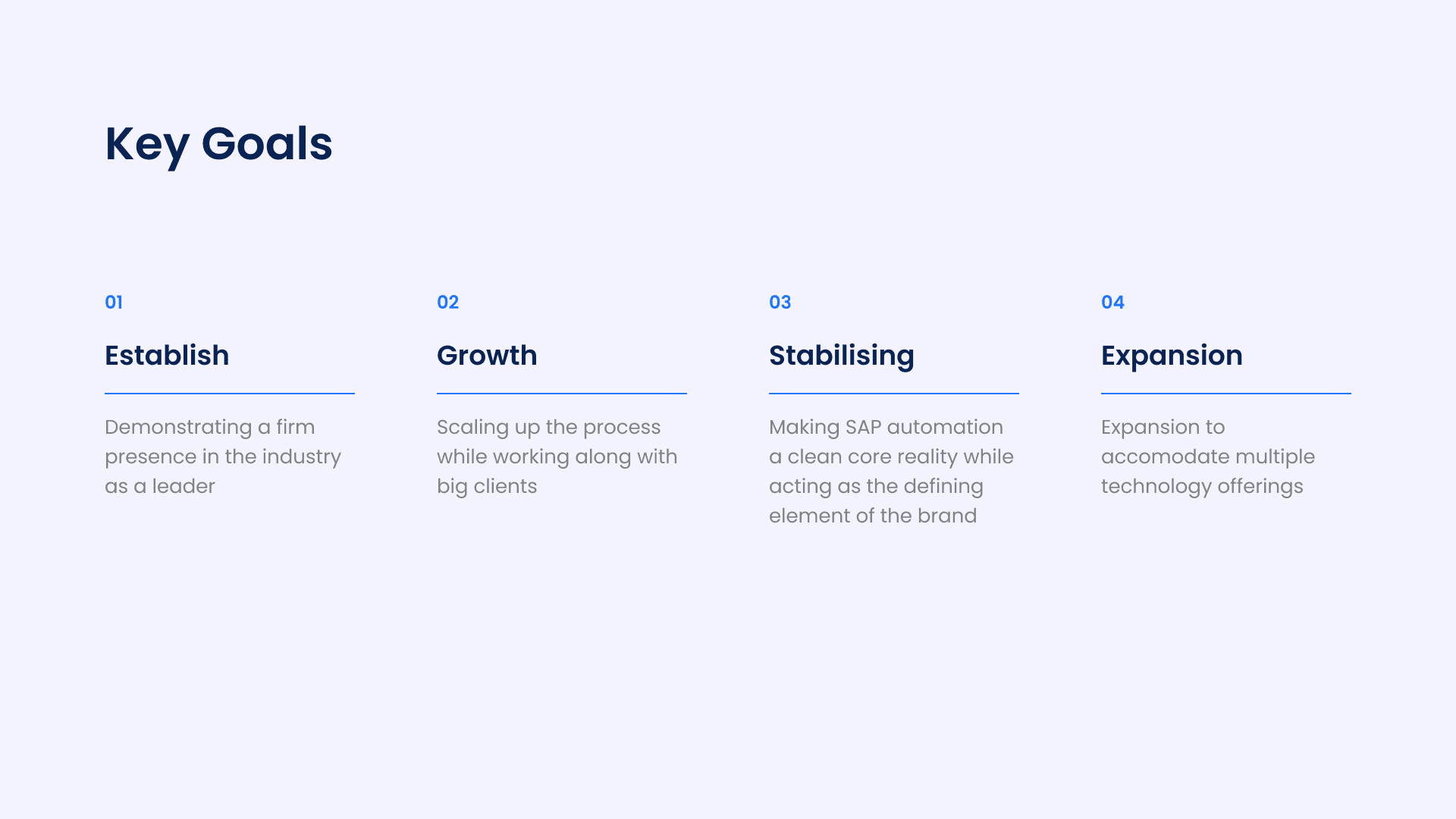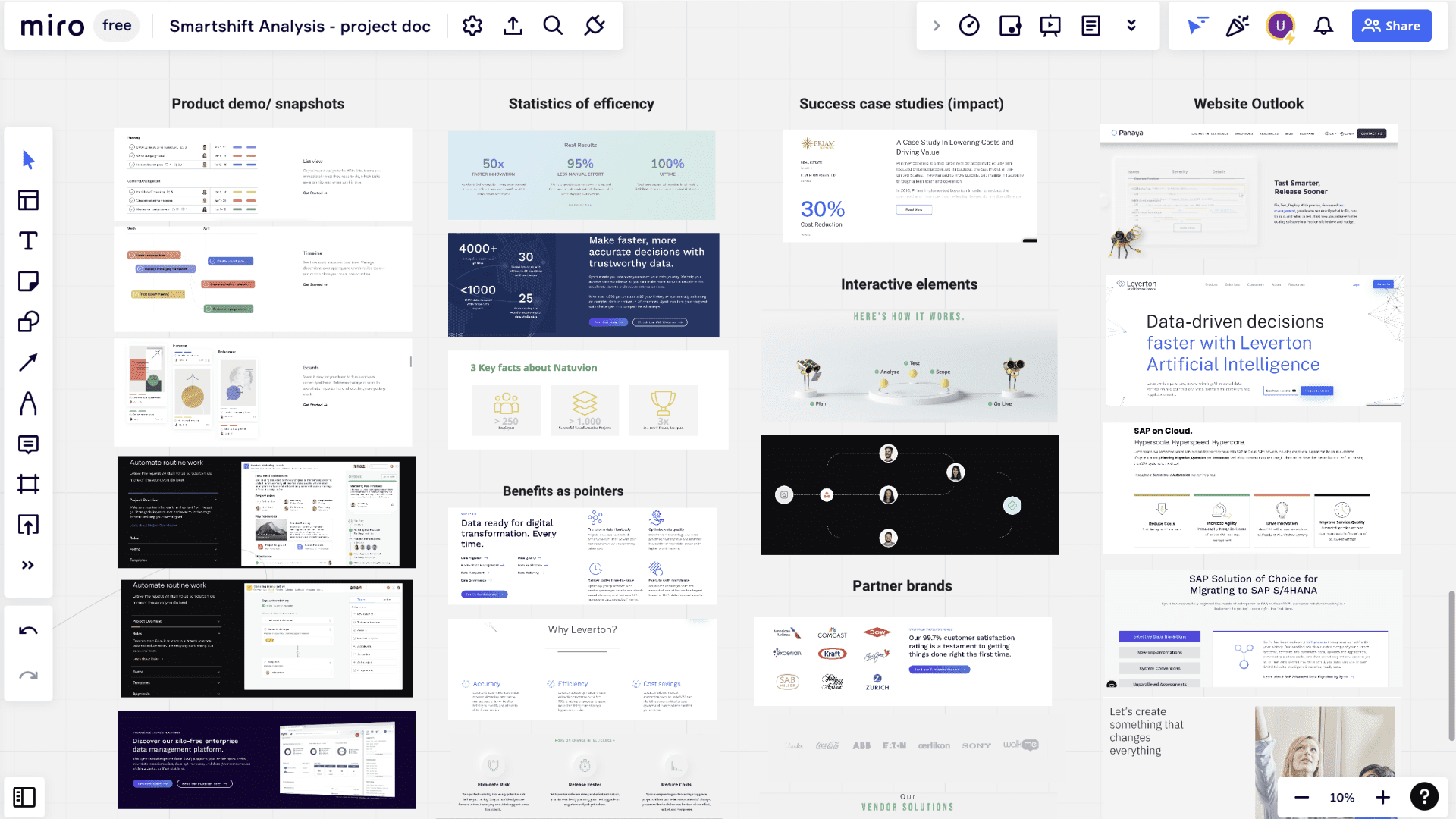
smartShift wanted to reposition itself as an emerging technology partner while retaining its existing brand guidelines. The challenge was to modernise the design while maintaining brand consistency.
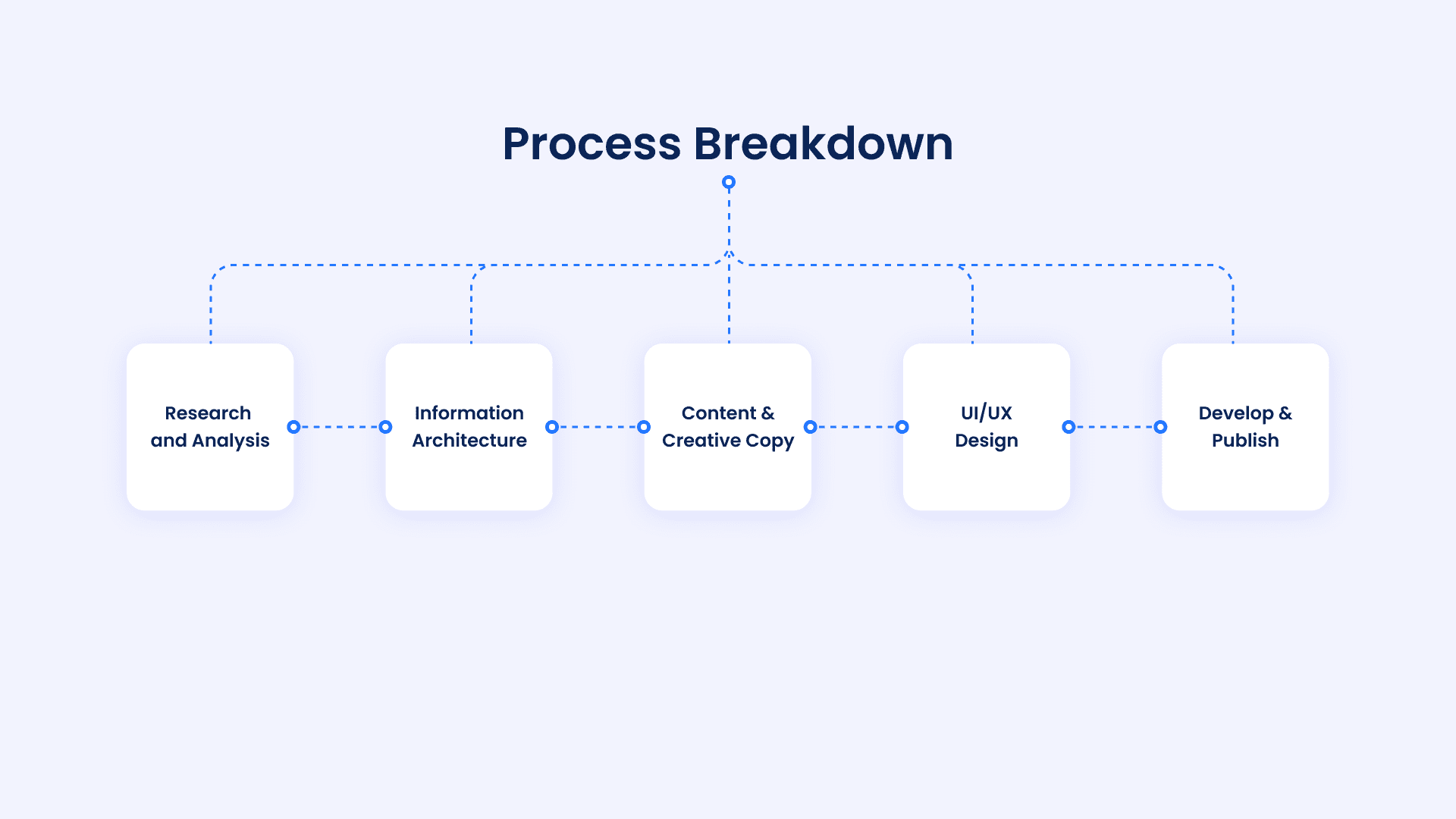
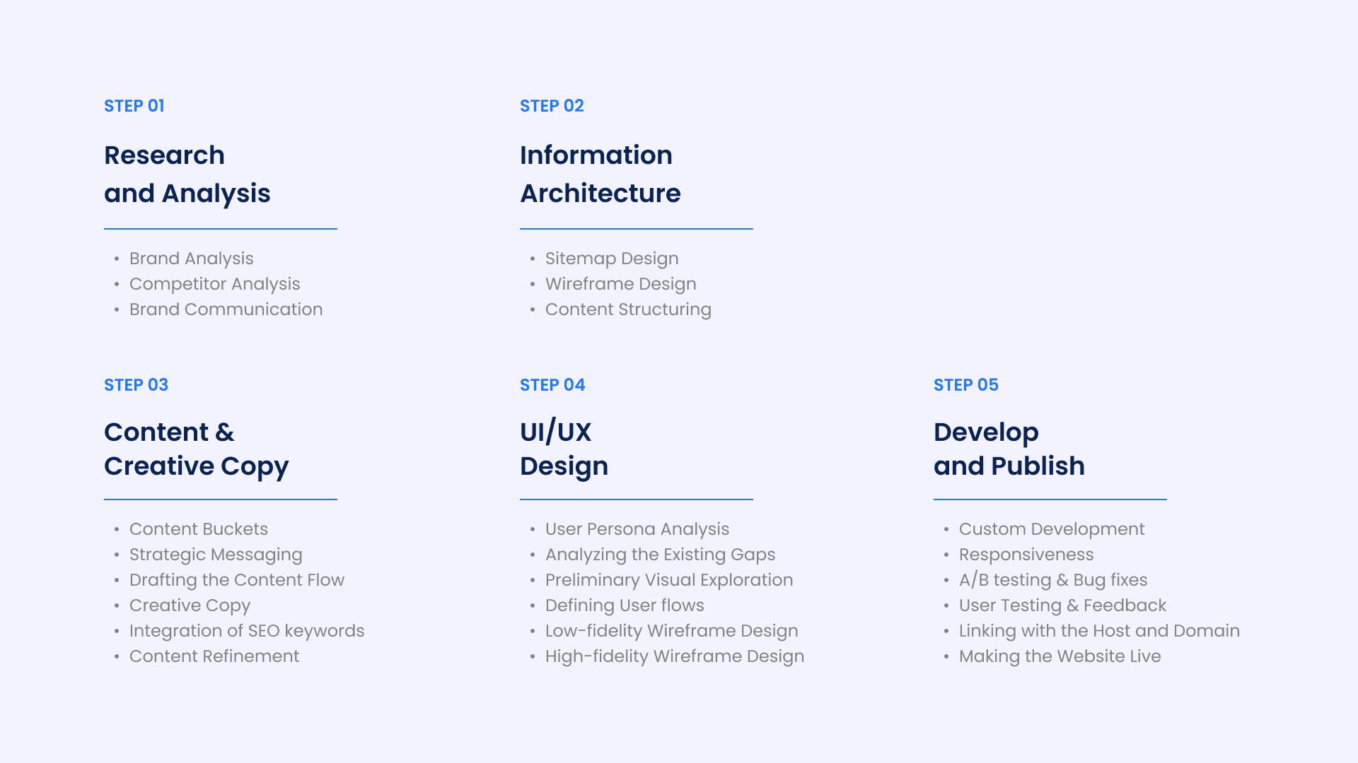
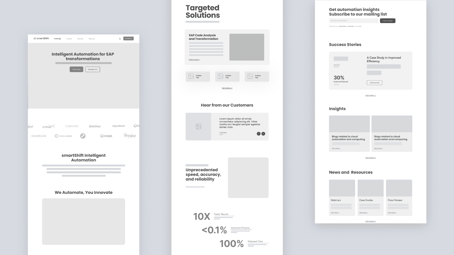
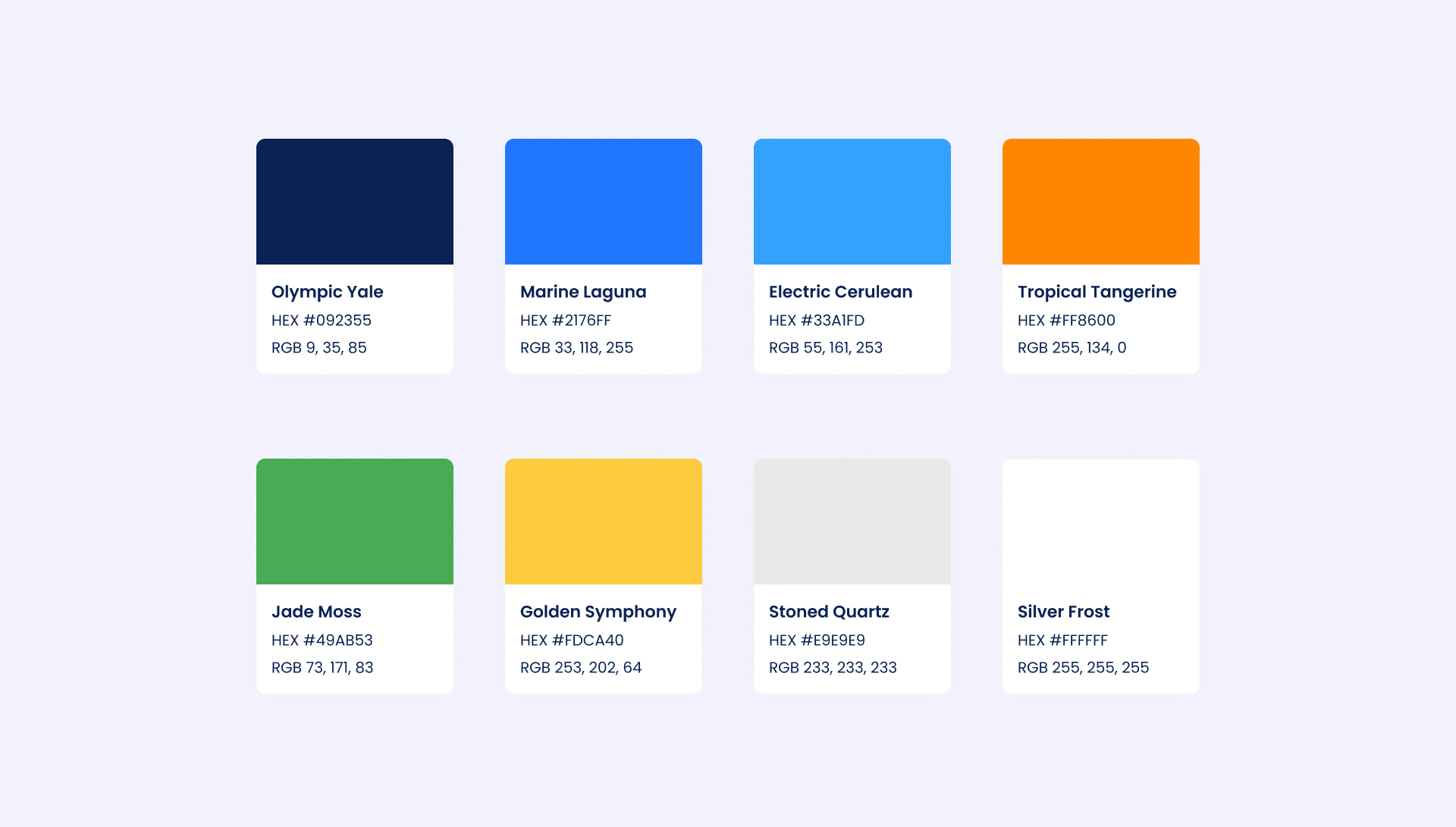
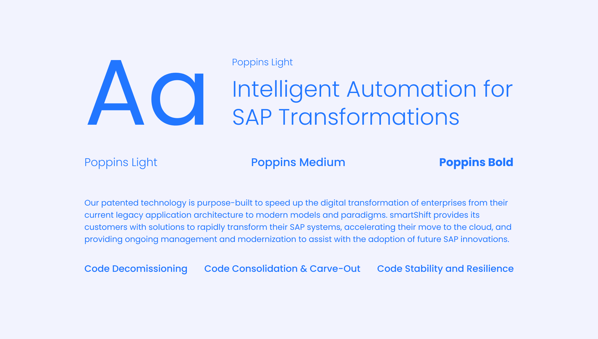
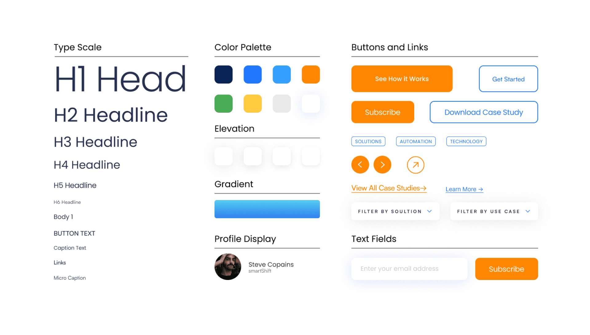
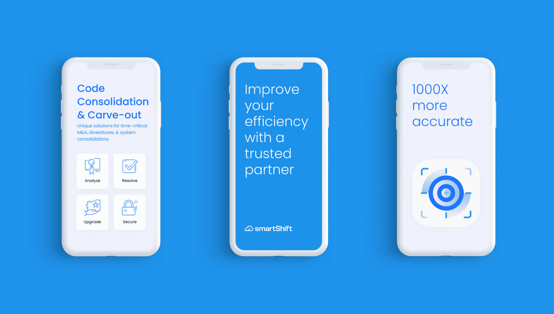
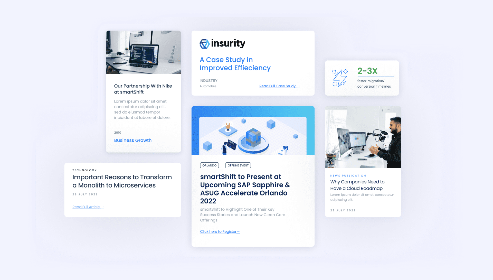
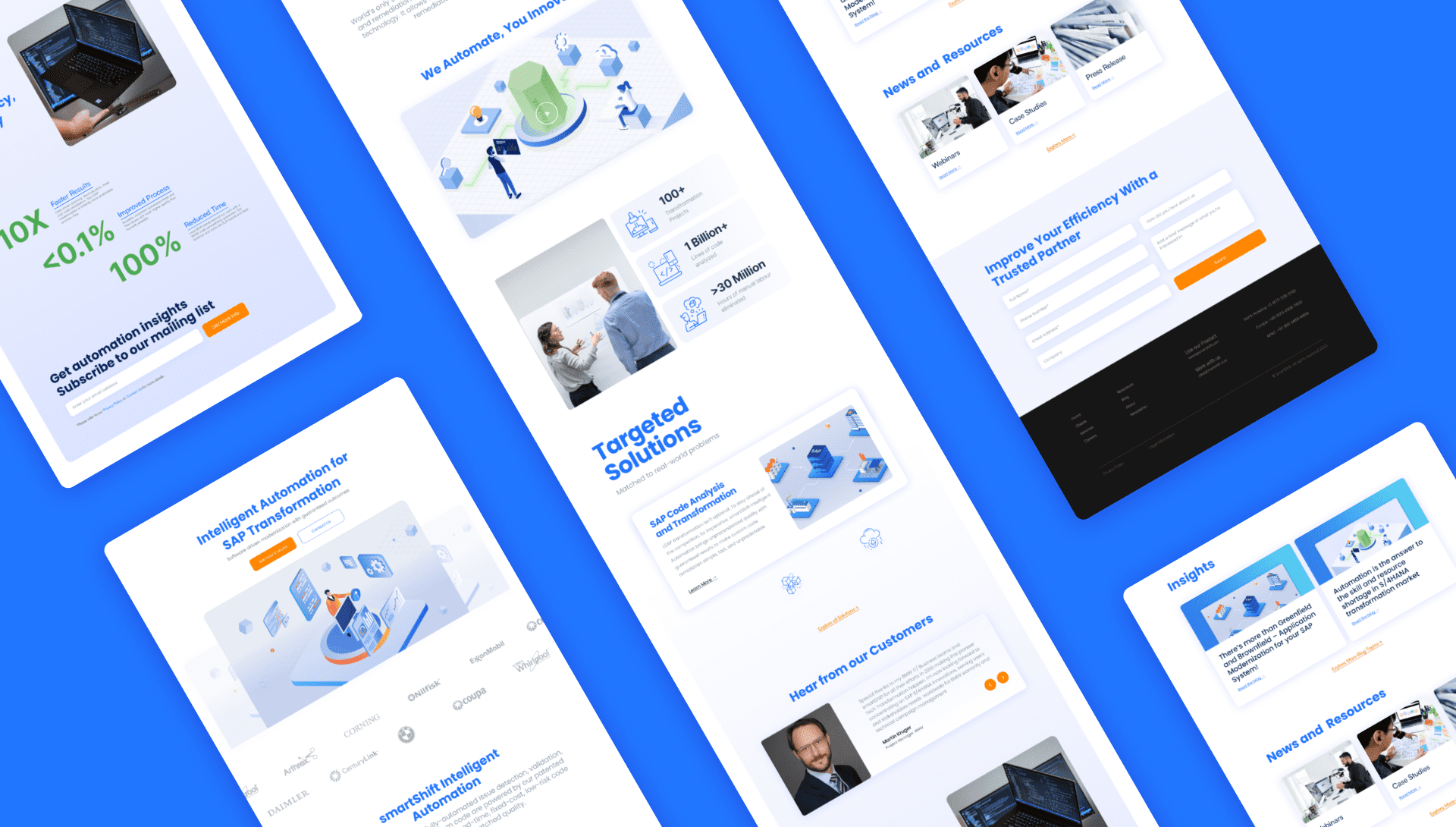
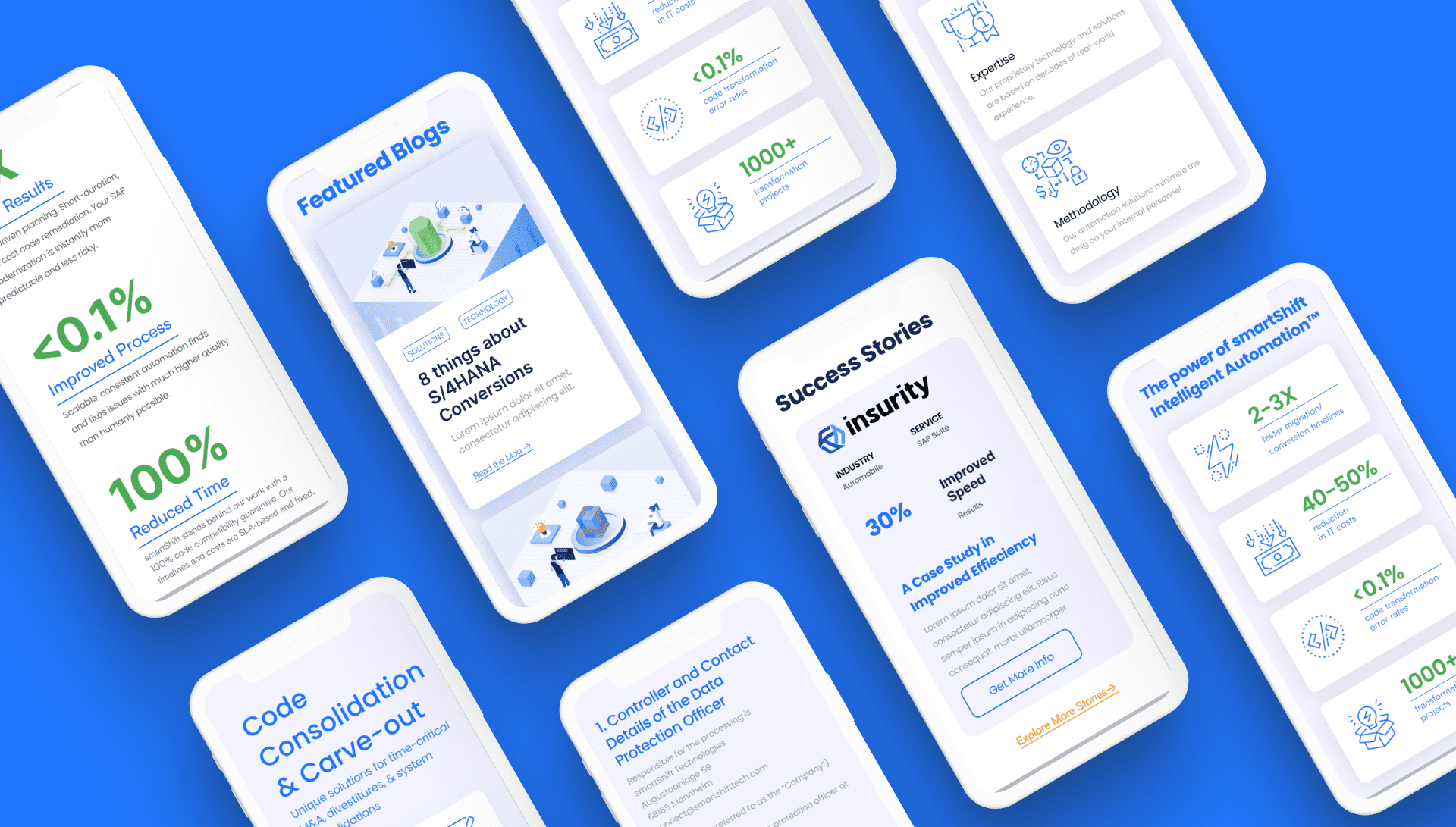
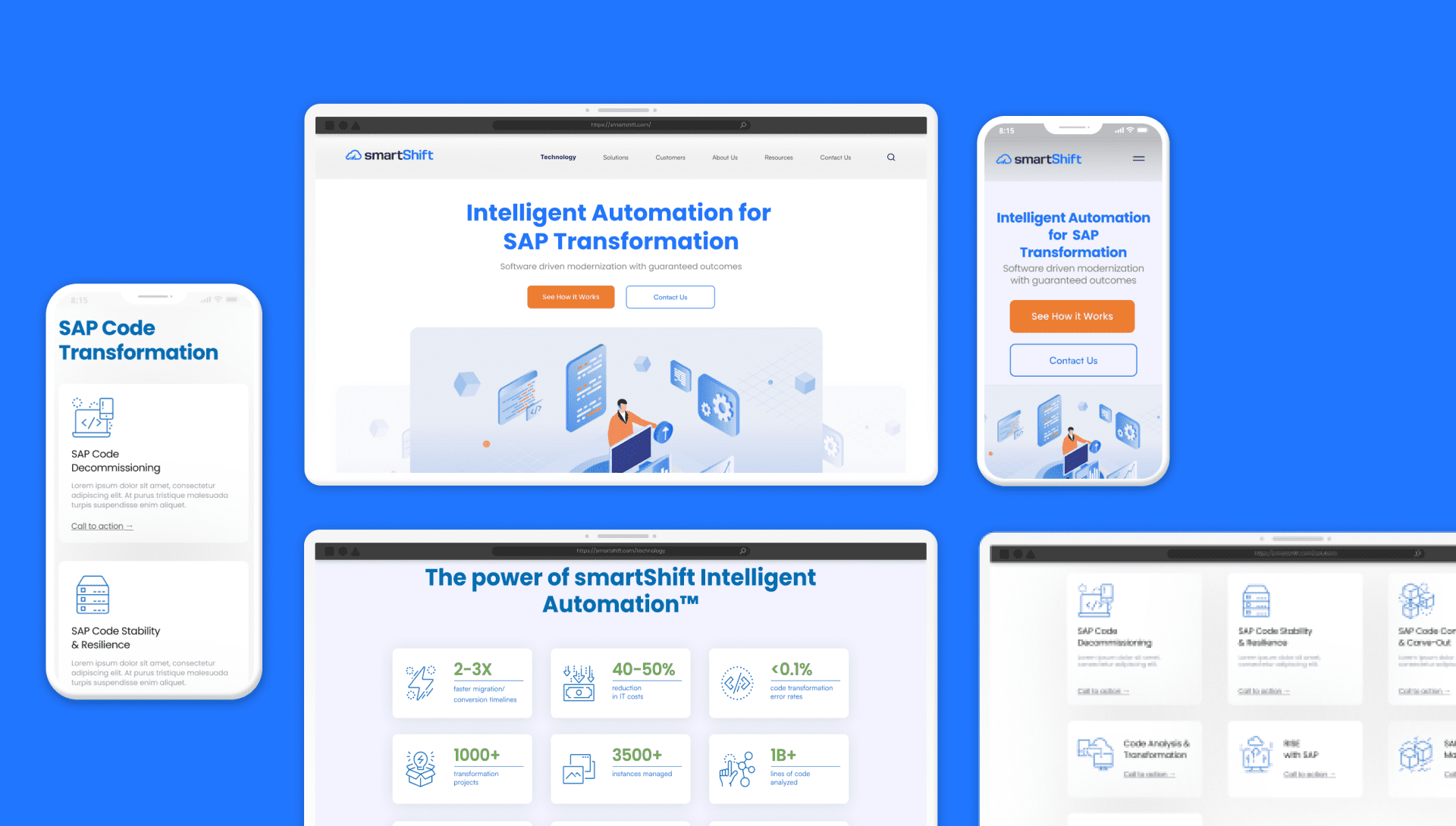
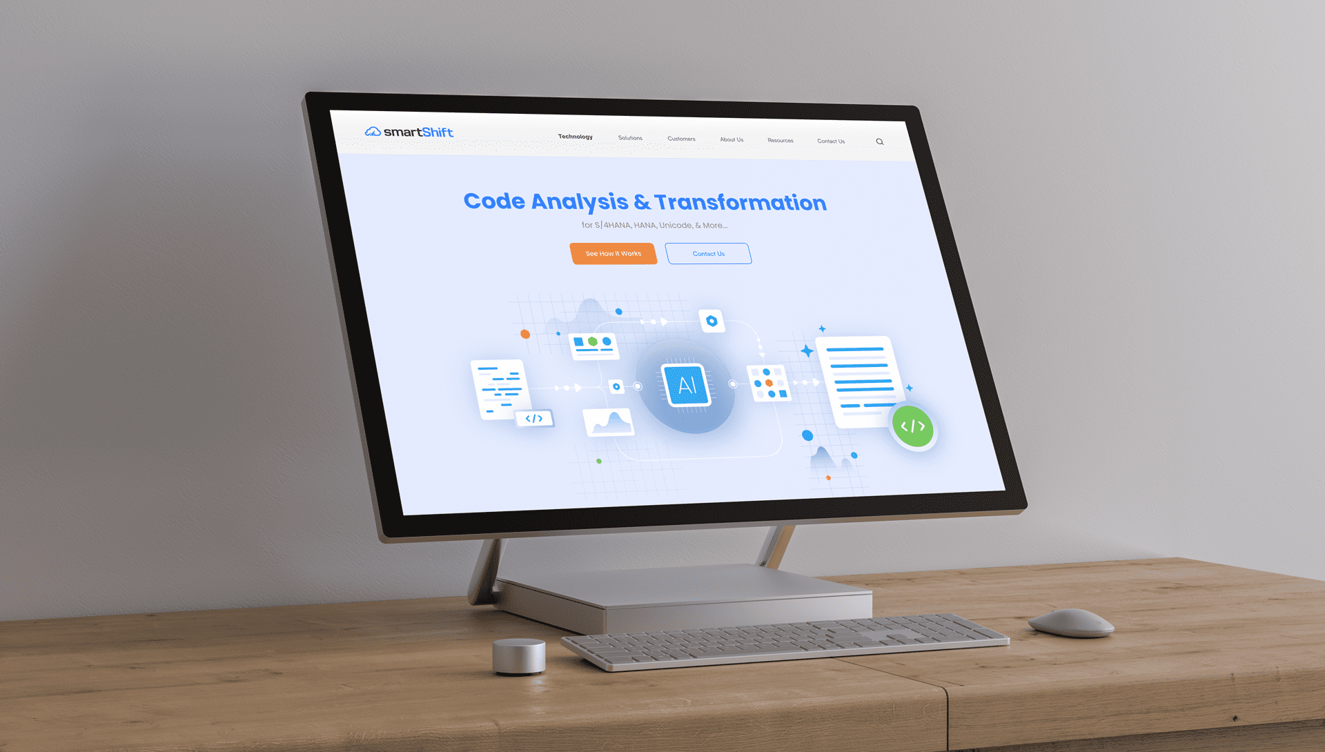
We introduced a fresh visual language with a contemporary colour palette and geometric sans-serif typeface. A minimalistic approach with ample white space kept the design clean, while micro-animations and a card layout enhanced user interaction and ensured consistency across devices.
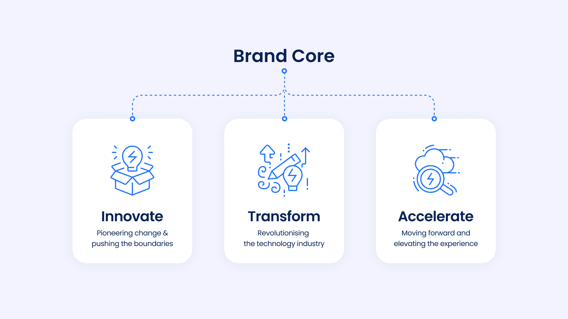
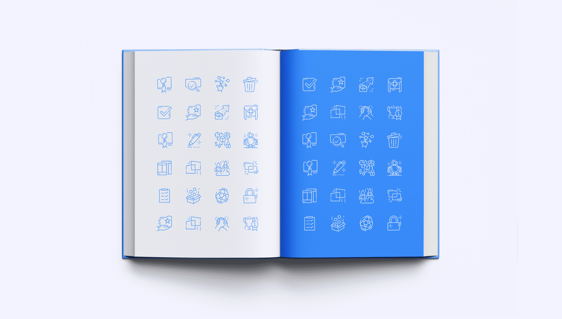
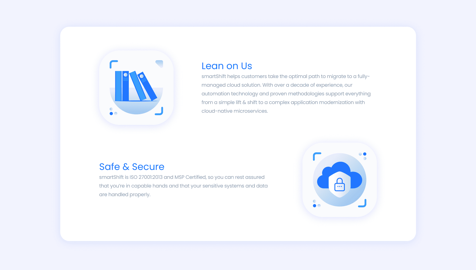
We balanced sophistication with simplicity by introducing a consistent illustration style and versatile icon library, making the communication visually engaging and adaptable.
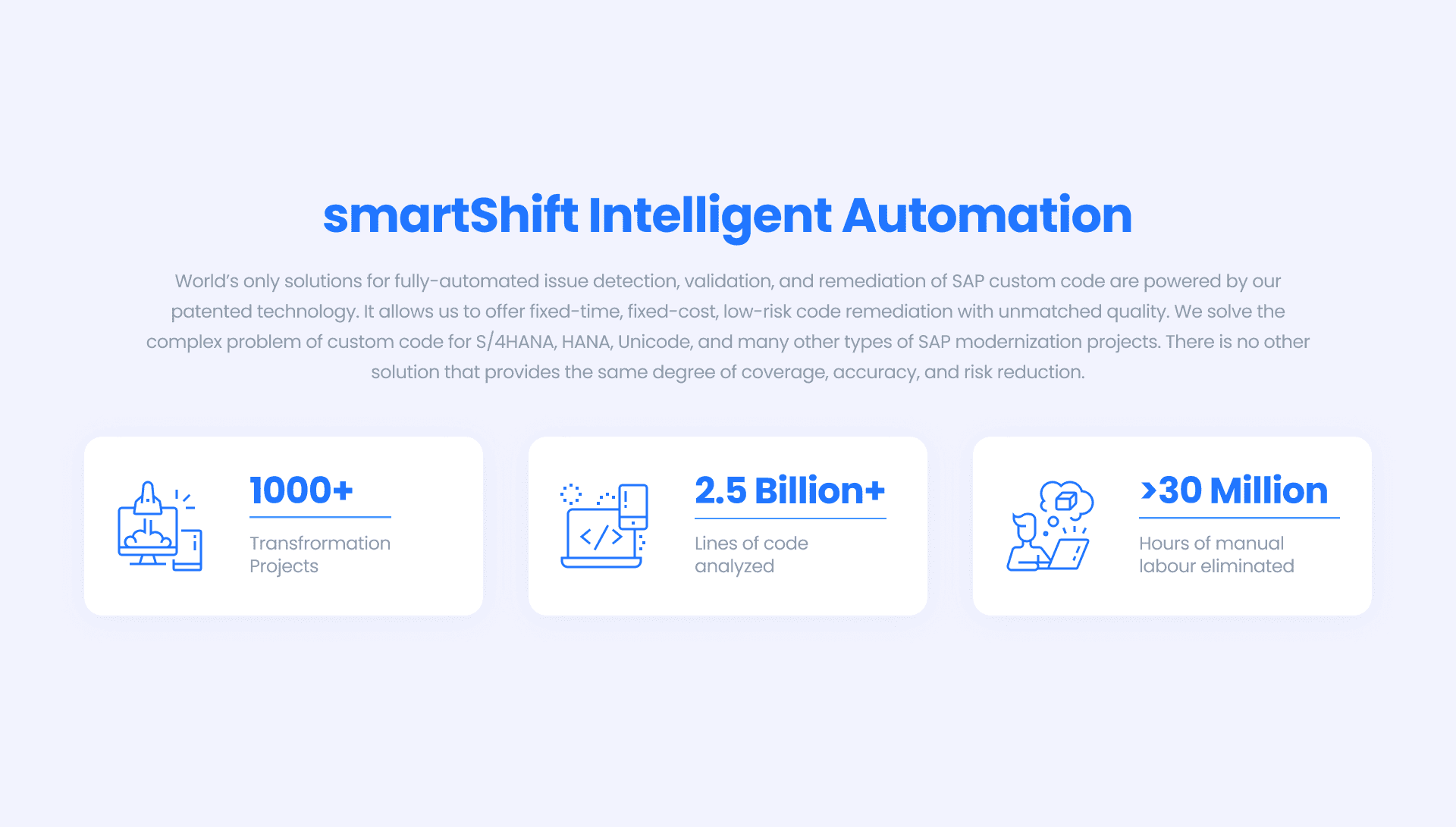
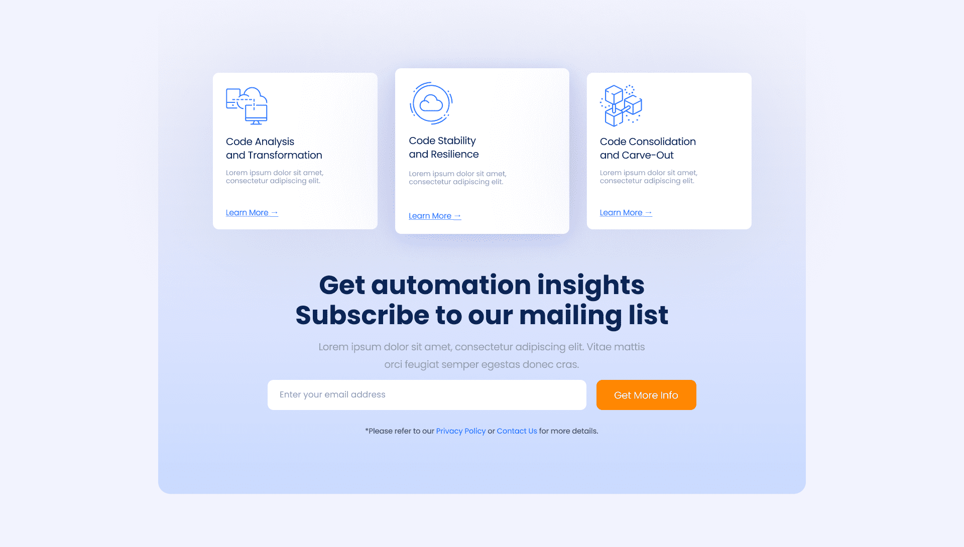
The final website was modern, responsive, and positioned smartShift as a forward-thinking technology partner.