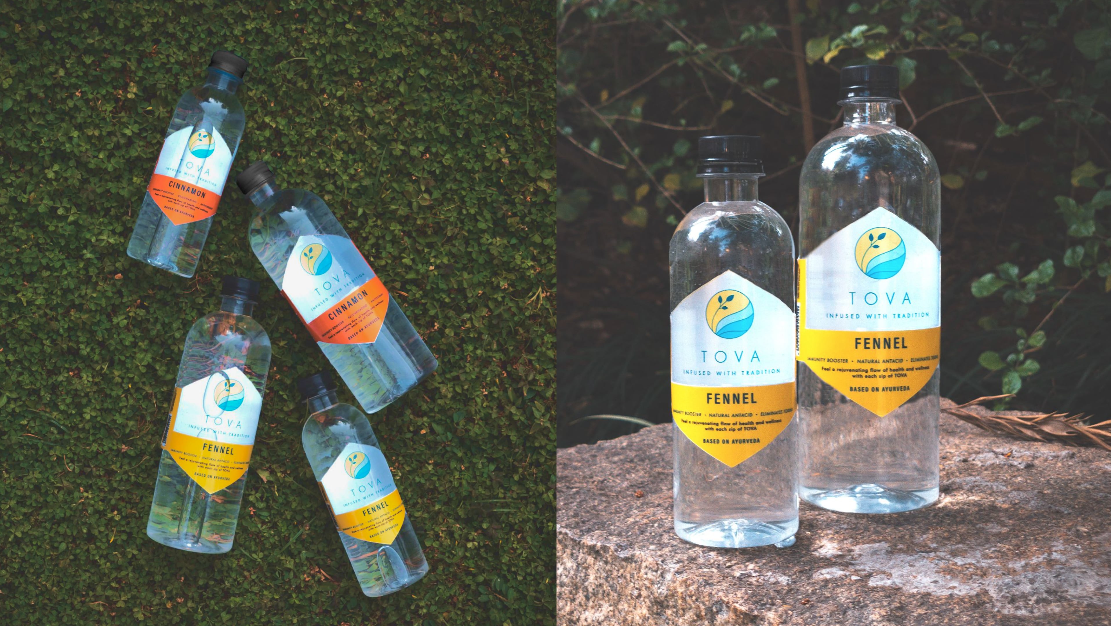
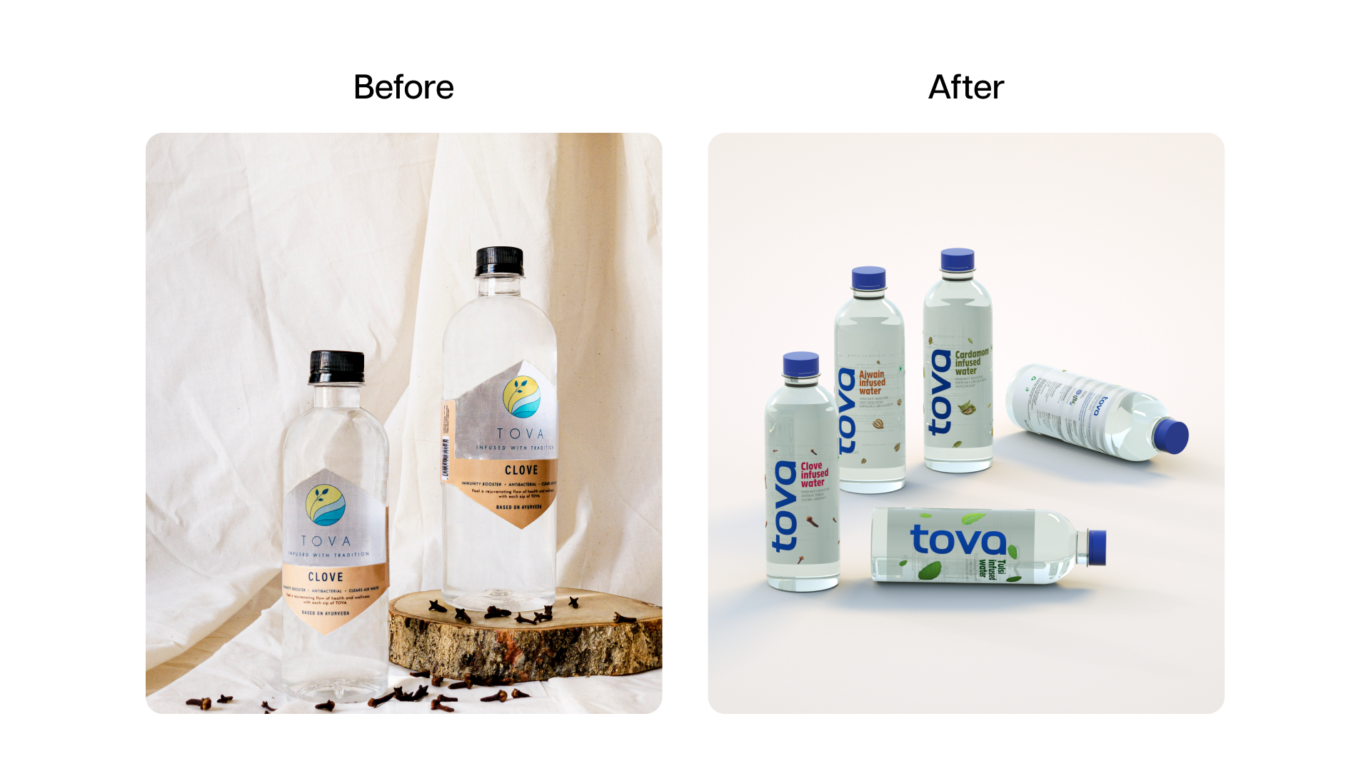
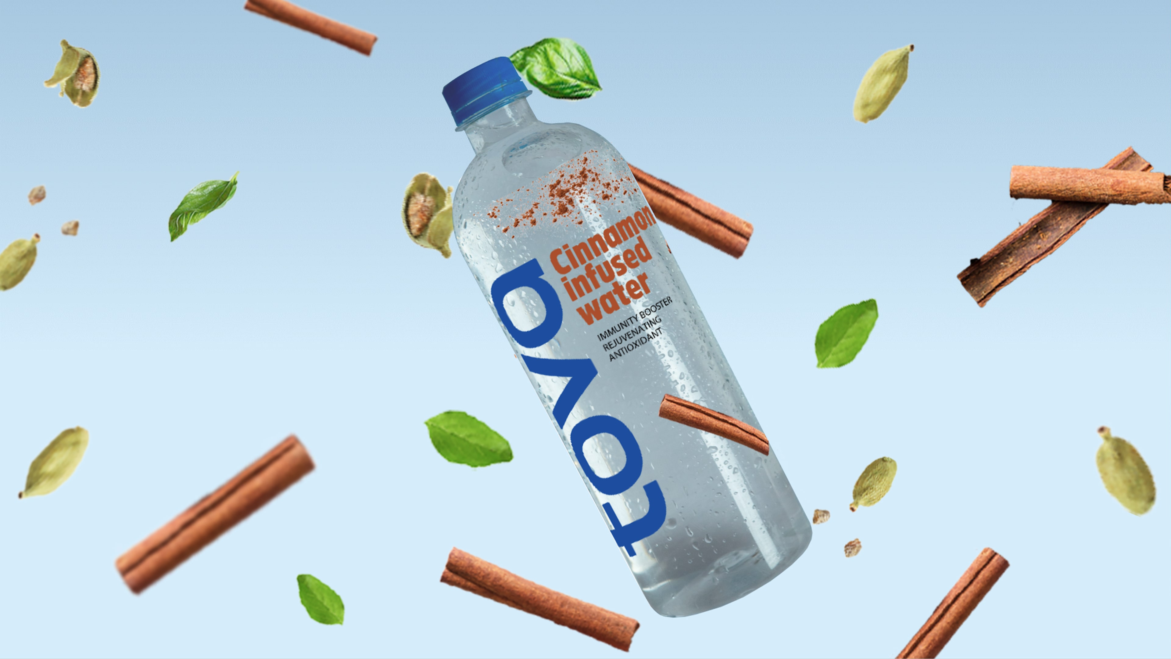
Tova had an excellent recipe for infused waters but struggled with outdated communication and design, limiting its appeal to younger consumers.
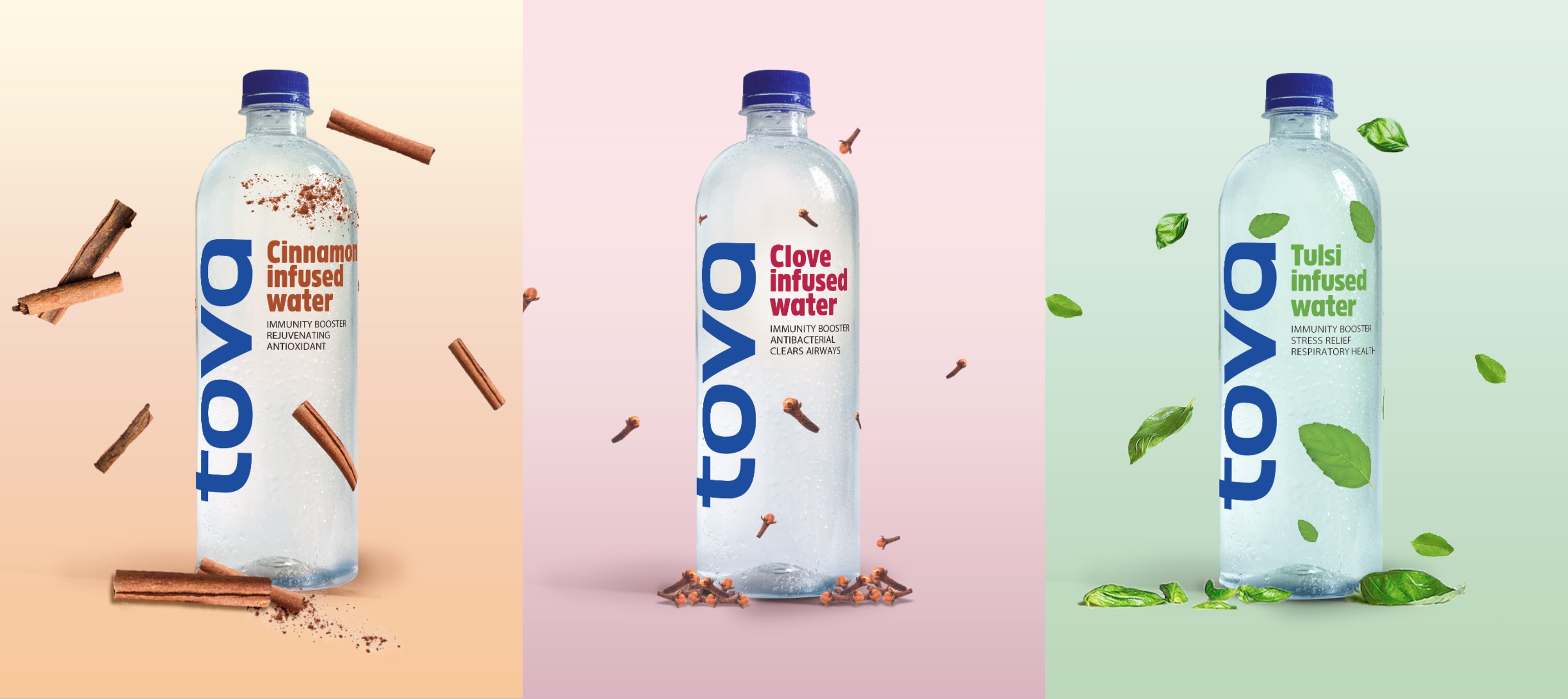
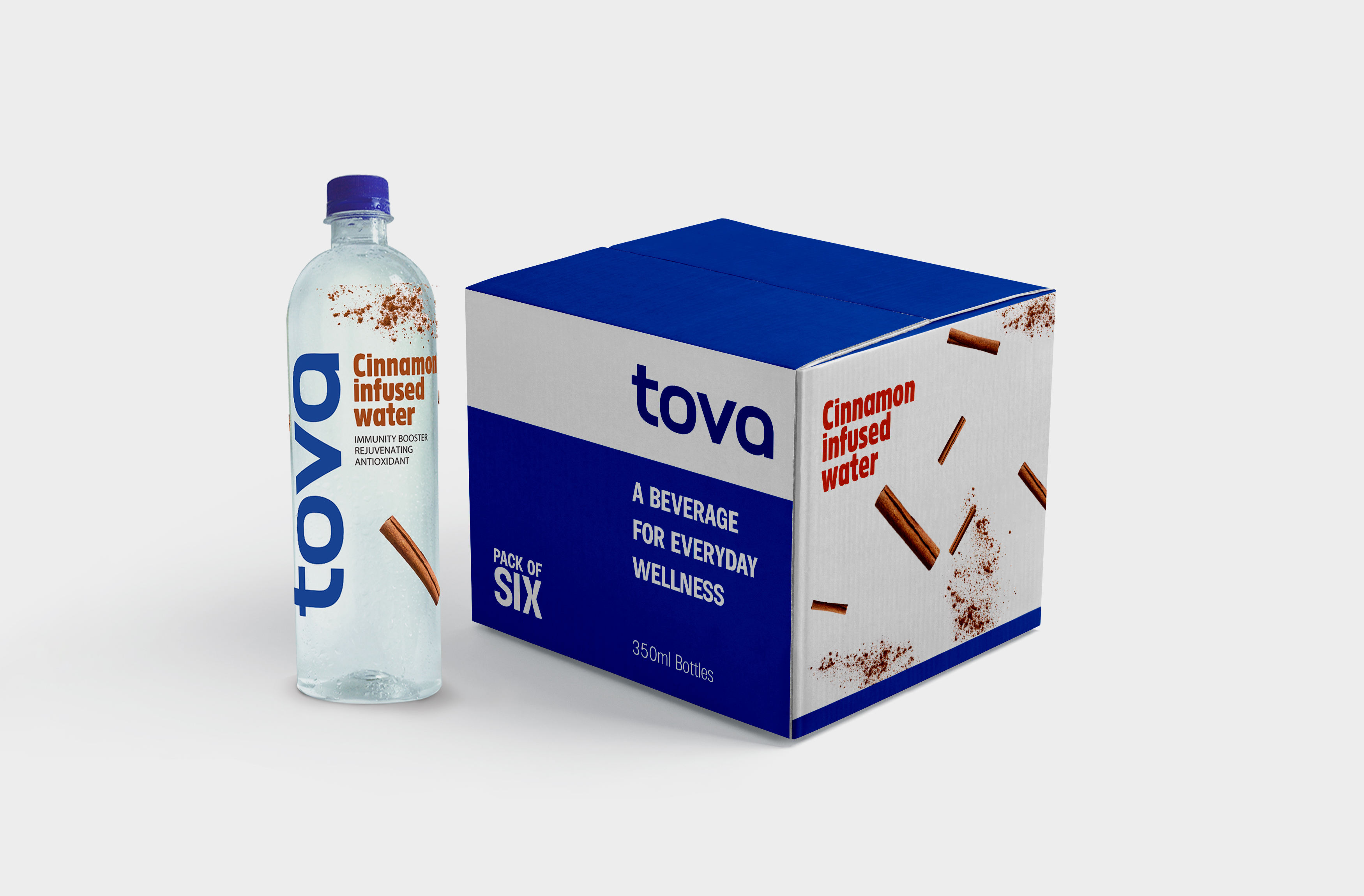
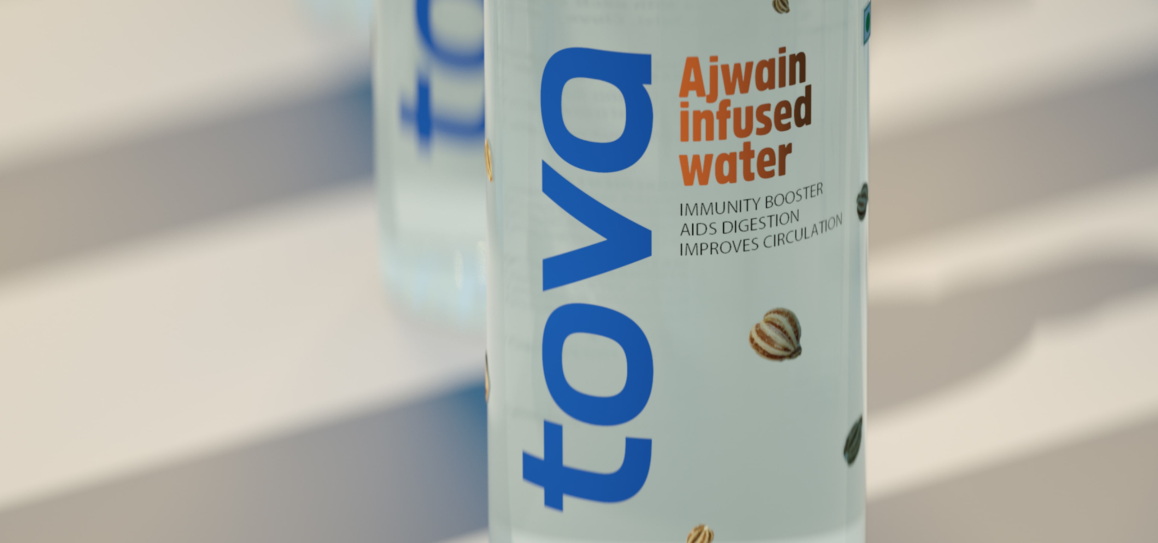
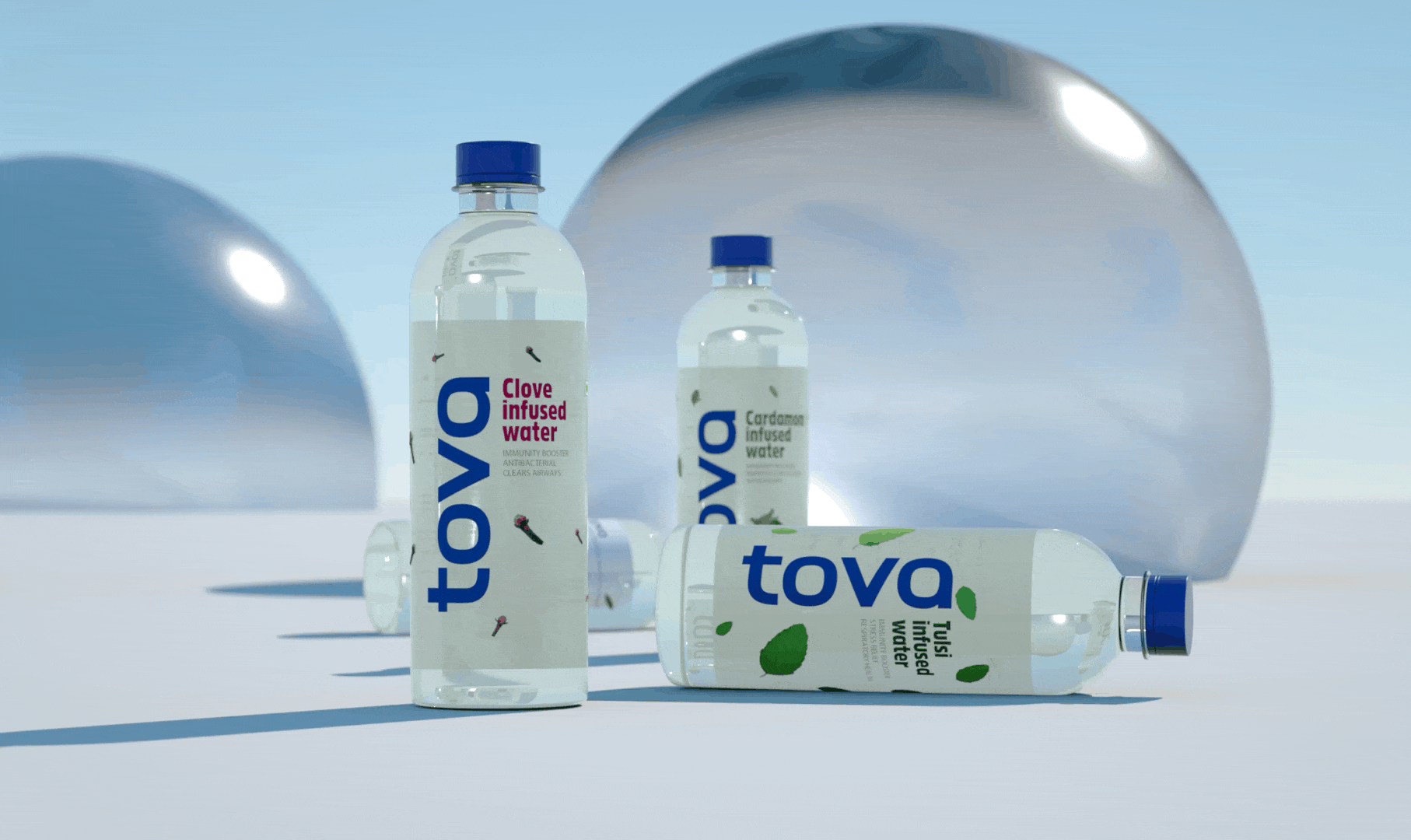
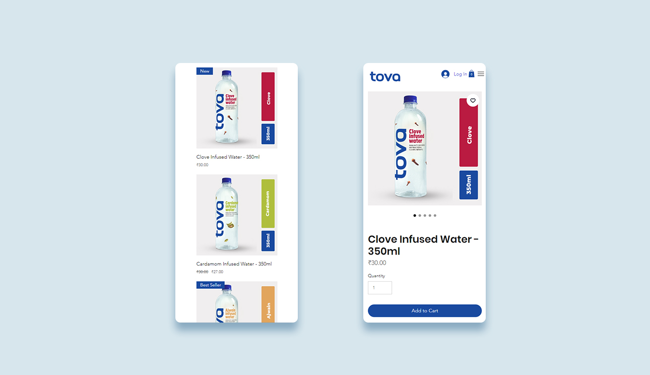
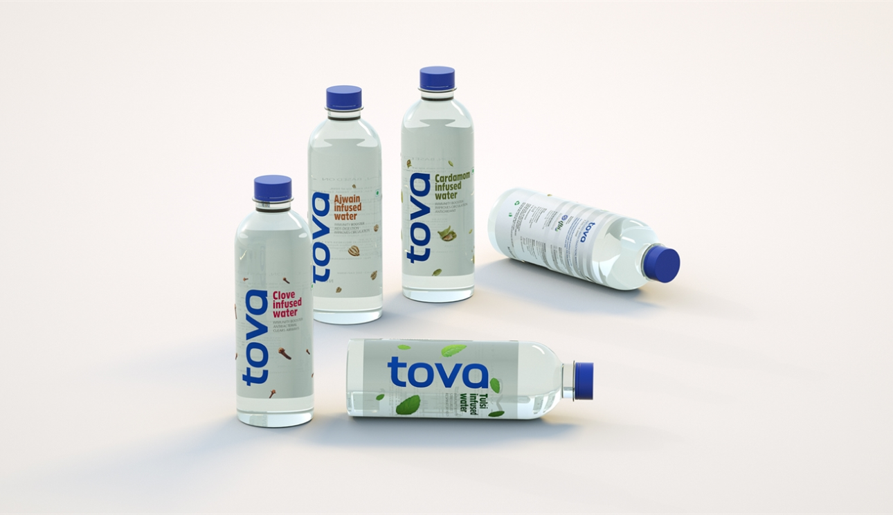
We adopted a minimalistic approach, focusing on typography and the infused ingredients as the brand’s USPs. We designed transparent packaging that showcased the ingredients while using a blocked label at the back to prevent reflections. Bright colours and organic flavour notes maintained Tova’s essence, while a vertically placed logo and larger font enhanced visibility on crowded shelves.
We analysed competitor packaging to identify design gaps and realised that highlighting the ingredients and flavour notes would create an immediate connection with health-conscious consumers. Our aim was to create a design that felt fresh and organic while standing out on a shelf of similar products.
The refreshed branding, including an interactive website design that highlights flavour notes dynamically, positioned Tova as a modern and attractive choice for consumers.
.jpeg)