.webp)
Havikar is a quiet sanctuary of health, a small, thoughtful range of Ayurvedic wellness mixes born from the soul of Karnataka. In Kannada, the name carries a beautiful, gentle promise to offer good things with pure intent. Made from family recipes kept close for generations, slow-crafted Havikar is meant to bring balance to the fast-paced lives we live today.
While the ancestral recipes were pure, the brand’s true beauty was buried beneath the rigid weight of a textbook layout. At Mellow, we saw our role not as rewriting their history, but as bringing it to light. We set out to re-architect Havikar’s physical presence from the ground up, weaving the packaging into a gentle ritual that opens like a cherished story.
For generations, Ayurveda as a category has been trapped inside cluttered, textbook layouts that read like strict medical prescriptions. This heavy presentation made it hard for Indian heritage to find its place in the premium segment, failing to connect with a contemporary aesthetic or fit into a curated lifestyle.
Havikar was caught in this exact compromise. The profound wealth of the brand remained hidden away in a cupboard, simply because the packaging couldn't command a proud place in the open spaces of a modern home.

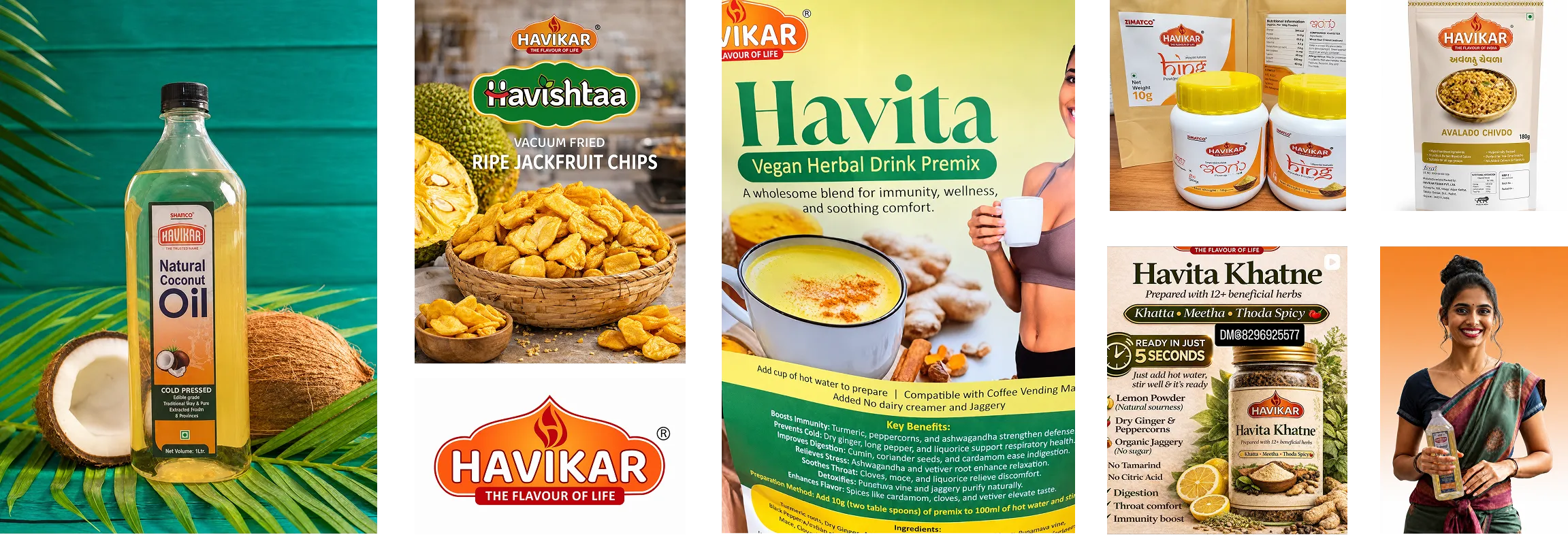
Looking closely at Havikar’s original packaging, the breakdown came down to a complete lack of shelf confidence. The logo was drawn thin, and the core benefits were flattened into a single, unreadable block of text. There was no visual anchor to the product, making it completely unnoticeable to a passing consumer.

The true gap in the market lay in lifestyle alignment. Since the Ayurvedic category had lagged behind the cultural shift of wellness being a form of personal pride, the opportunity was wide open. Introducing a modern design sensibility became our greatest lever to transform Havikar from a functional formulation into a premium extension of modern wellness.

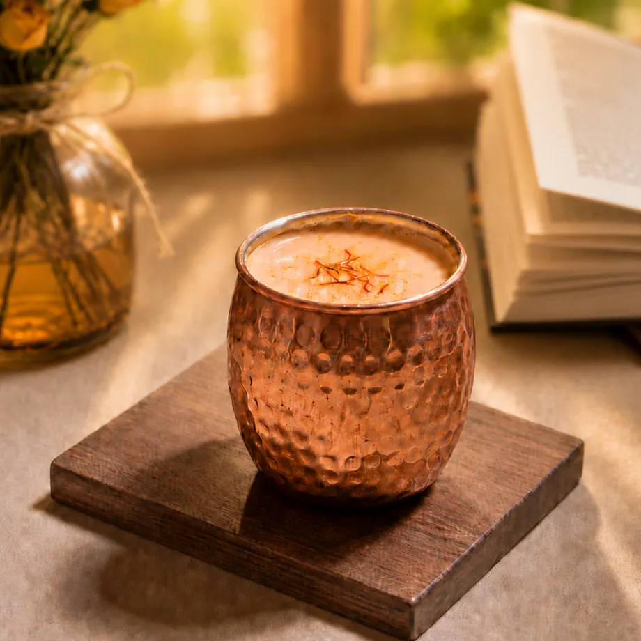
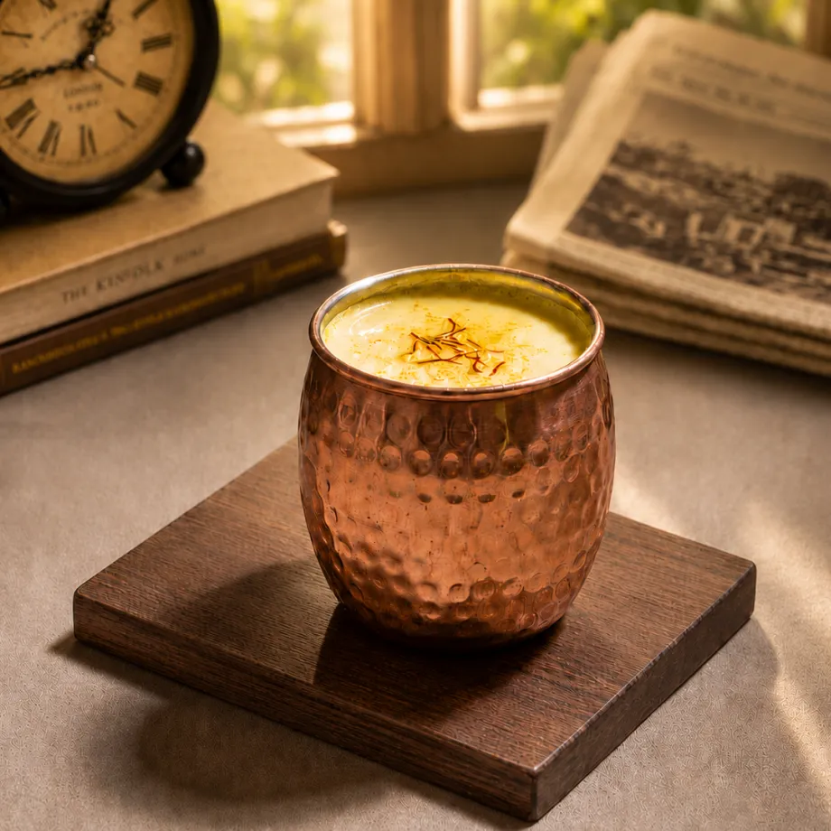
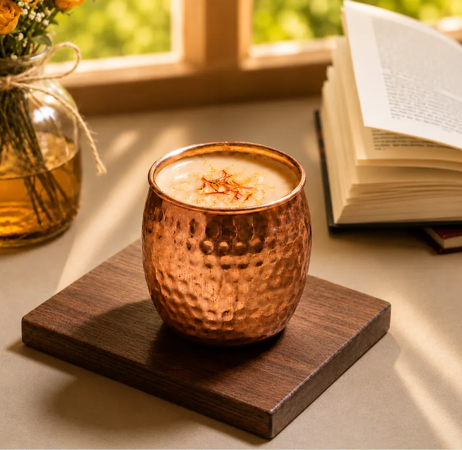
To make Havikar relatable to a fast-moving world, we shifted the conversation from clinical correction to daily nourishment. We positioned the brand as an intentional pause in a chaotic day, treating the identity like a modern chapter of an ancestral book of wisdom. This allowed the heritage to feel accessible, light, and deeply restorative, changing the consumer's experience from taking medicine to participating in a beautiful ritual.

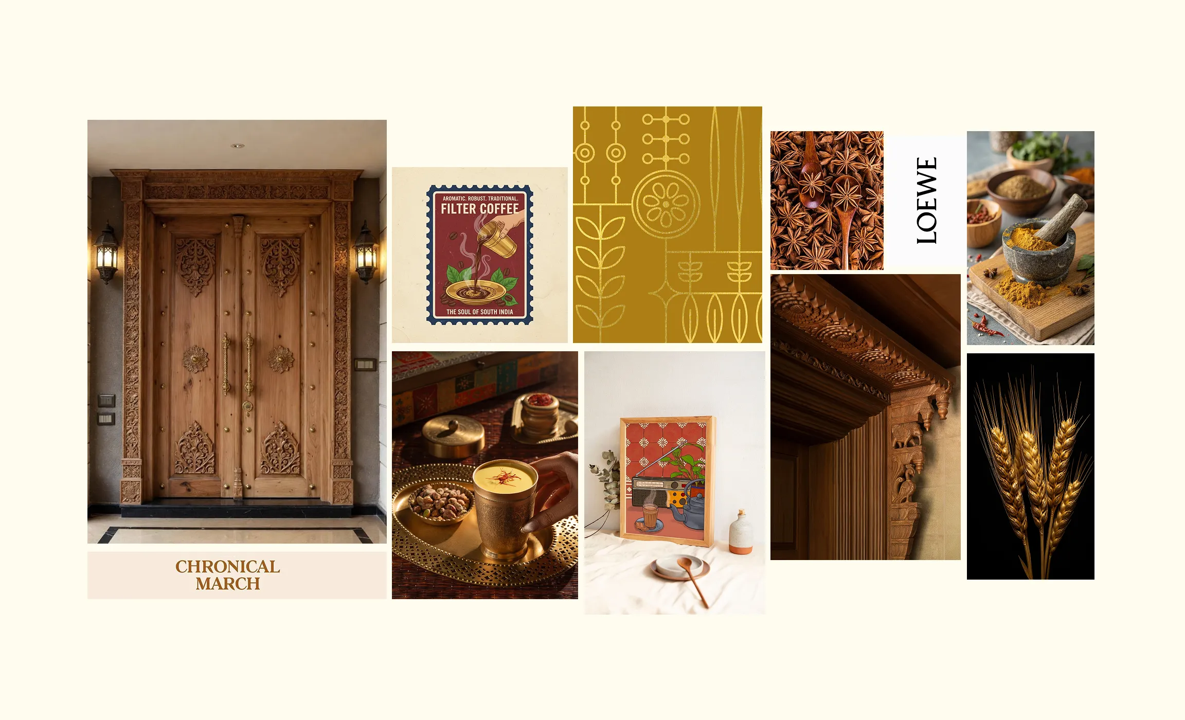
The transformation was achieved through a deliberate balance between contemporary luxury and deep traditional care. The identity was rebuilt to bring the profound wellness within directly to the exterior. By pairing modern design with rich cultural roots, Havikar shifts from a clinical product into a visual statement that no longer blends into the category.
.webp)
.webp)
.webp)
.webp)
.webp)
.webp)
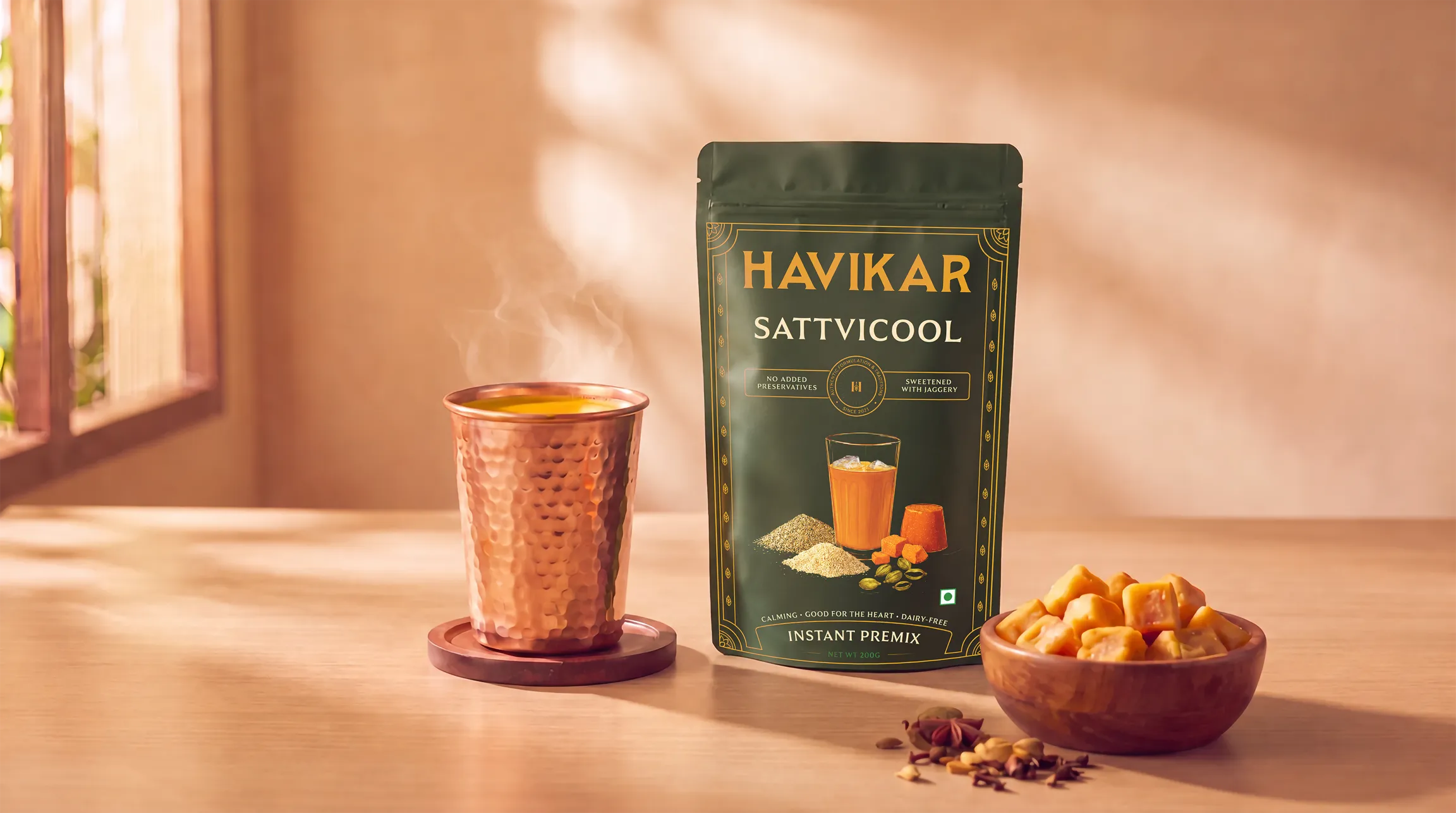
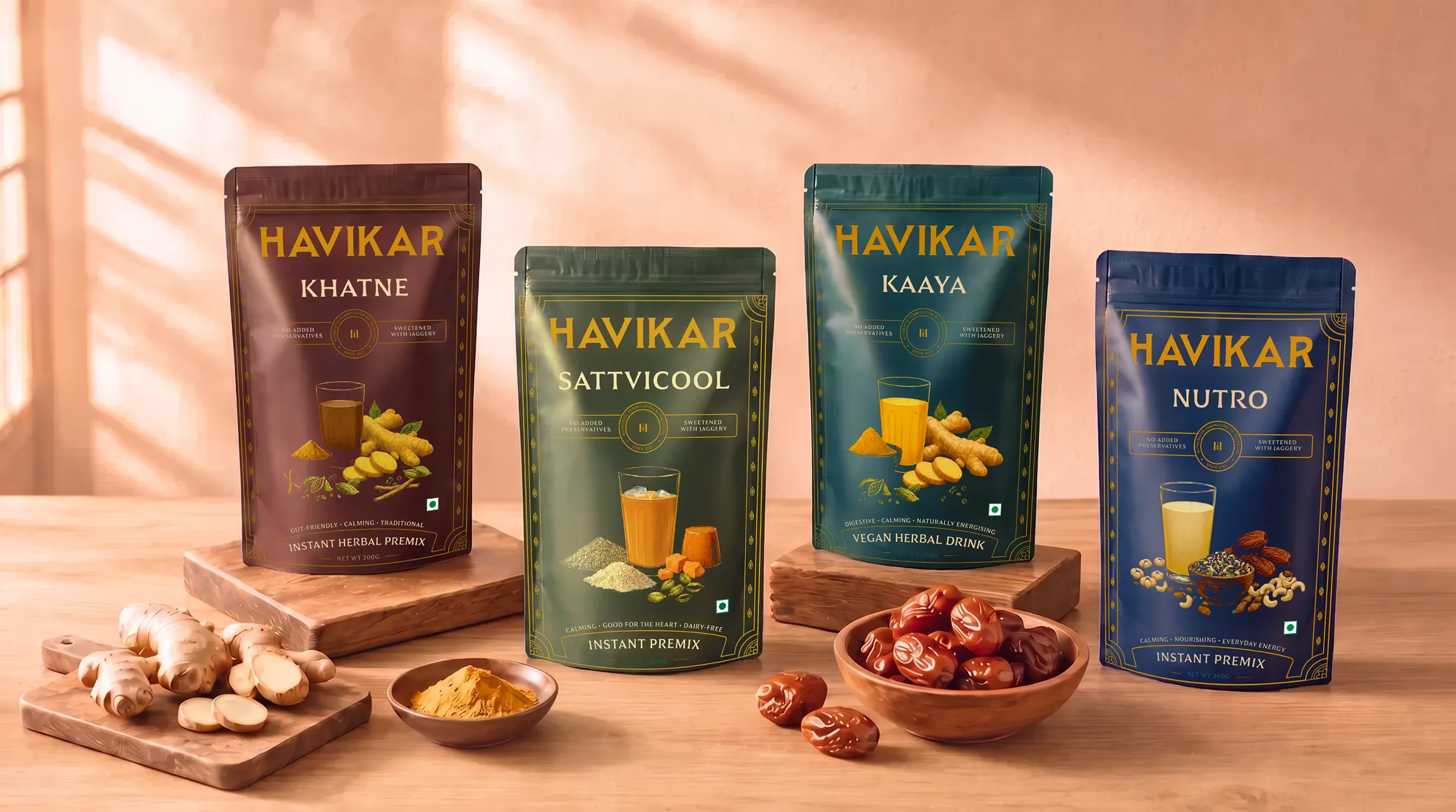
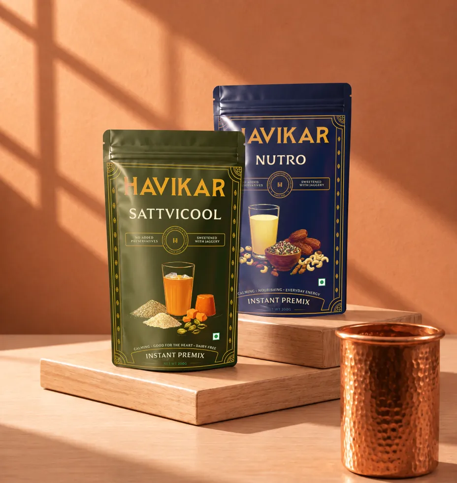
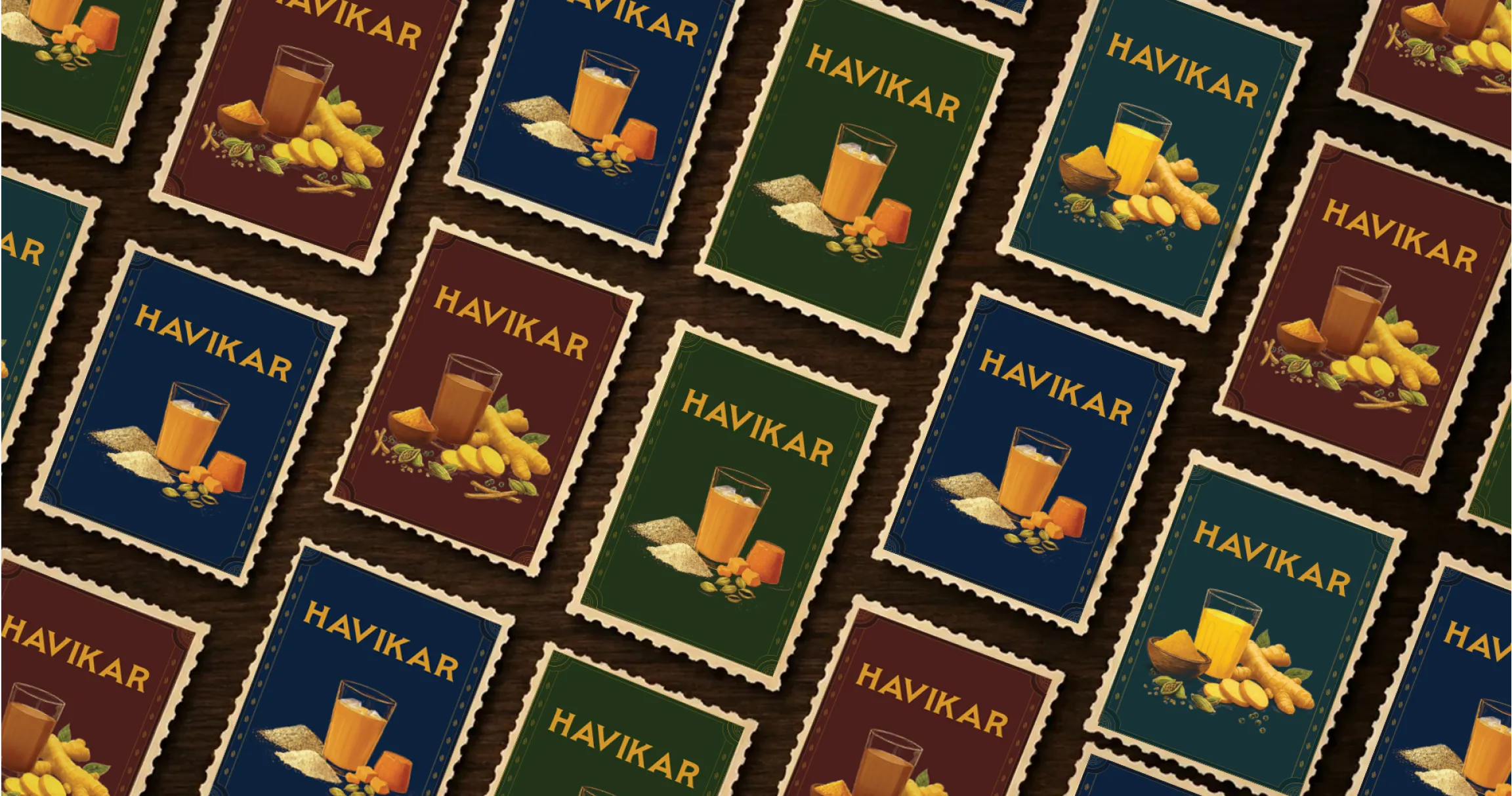
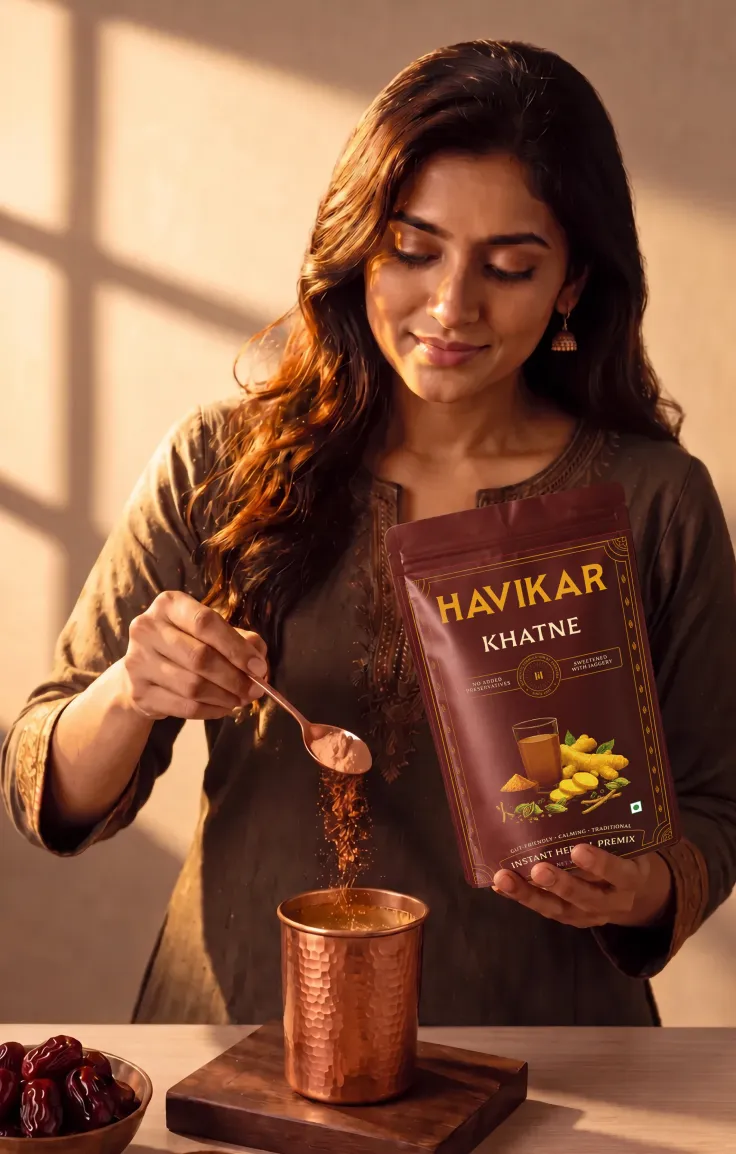
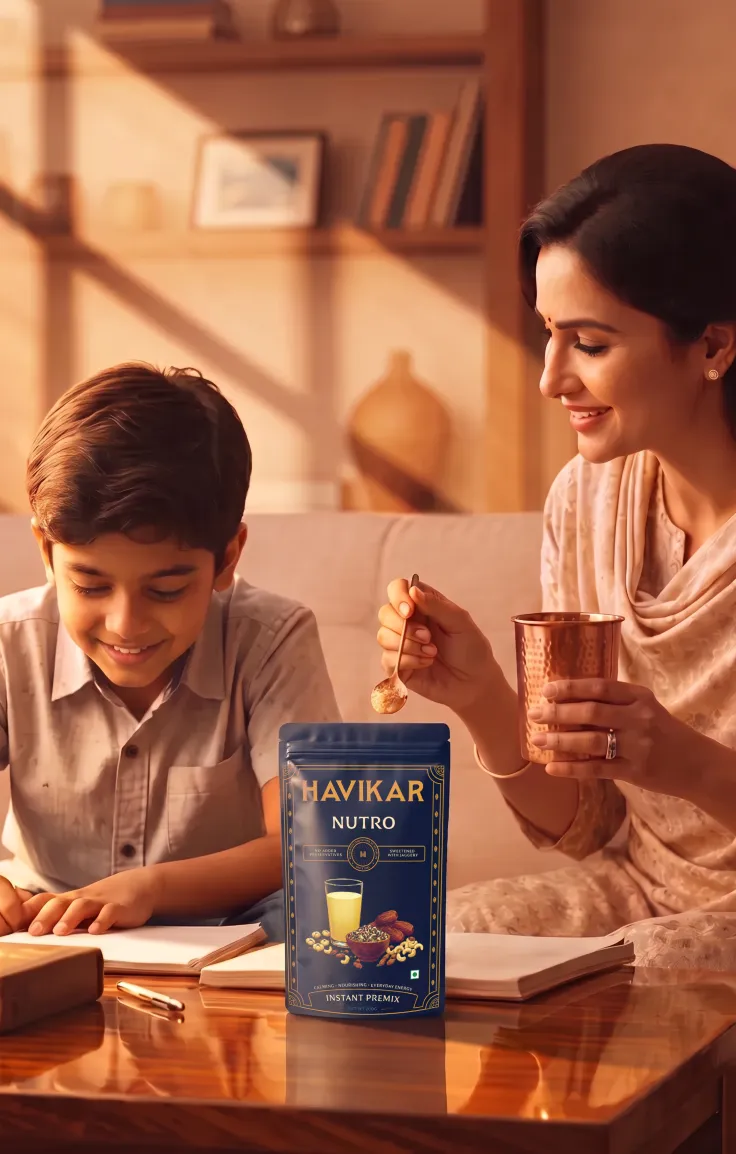
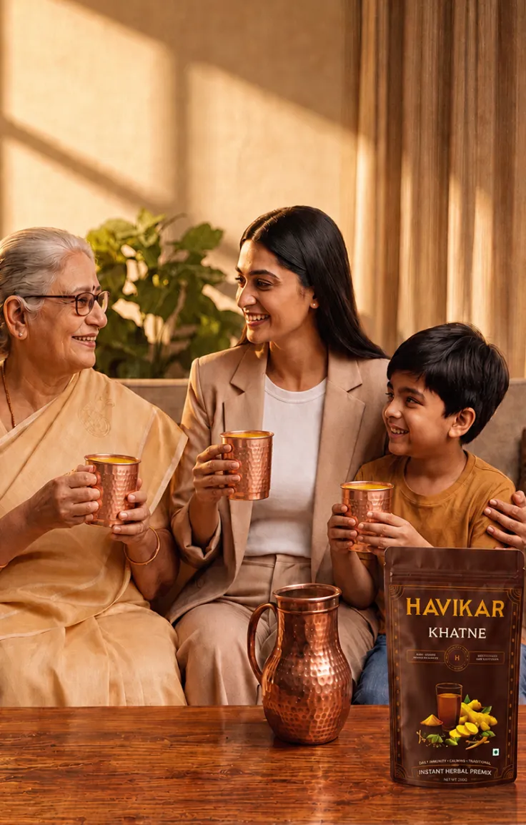
A serene visual clarity now shapes each pouch. A more nuanced colour palette holds the entire range together while letting each mix keep its own distinct character, and the custom stamp illustrations earn the trust. Brought together, the packaging stopped slipping past people and began holding their attention with a quiet, magnetic presence.


.webp)
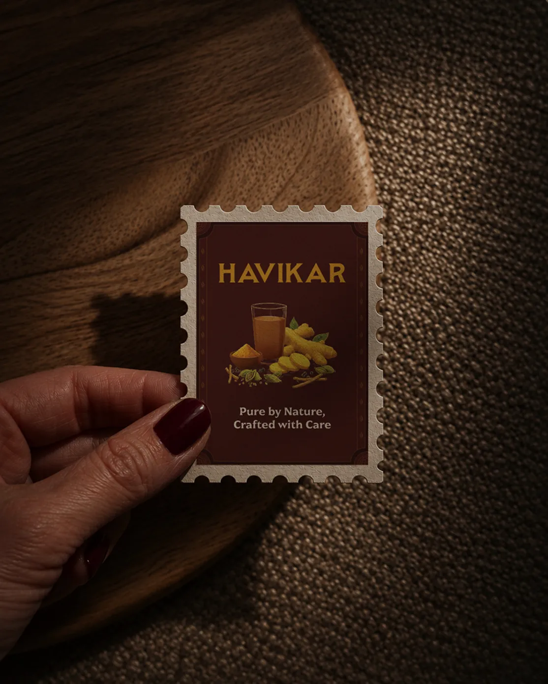
The heart of Havikar belongs to its ingredients, so we let them carry the narrative completely. To honour them, we looked to how Karnataka has historically preserved its sacred treasures, in vivid murals, in paint and on weathered temple walls. We gave every key ingredient an oil study of its own, painting them with the same timeless reverence Karnataka has always shown the things it loves.


A fast life leaves little room for looking after yourself, which means a wellness habit must feel effortless to keep up. Havikar is for people who've decided that's worth doing on purpose. They don't want more products, just fewer, better ones, the kind that earn a place in a daily ritual. We designed for that hand and that habit, for the quiet pleasure of reaching for the same good thing each day.


.webp)