Our Business Verticals

Business Design

Business problems, analysed strategically and solved through brand solutions built to scale.

You are here

Mellow Films

AI films and photography built to scale D2C brands without scaling the cost.

Explore
Explore

Mellow X

UI/UX and websites designed for how brands work in the AI era

Explore
Explore

Mellow Staffing

Creative talent tested on real-world briefs and matched to the teams that need them.

Explore
Explore

Moneymatters

Strategic UX Consultation for India’s Go-To Financial Media Ecosystem

Services

Business Design Consultation
Website & design consultation
UI/UX Design

Year

2026

Duration

2 Months
Visit Website
Visit Website

The Brief

Overview

Moneymatters stands as India’s definitive financial media ecosystem, providing millions of professionals with real-time market insights, news, and deep data analysis.

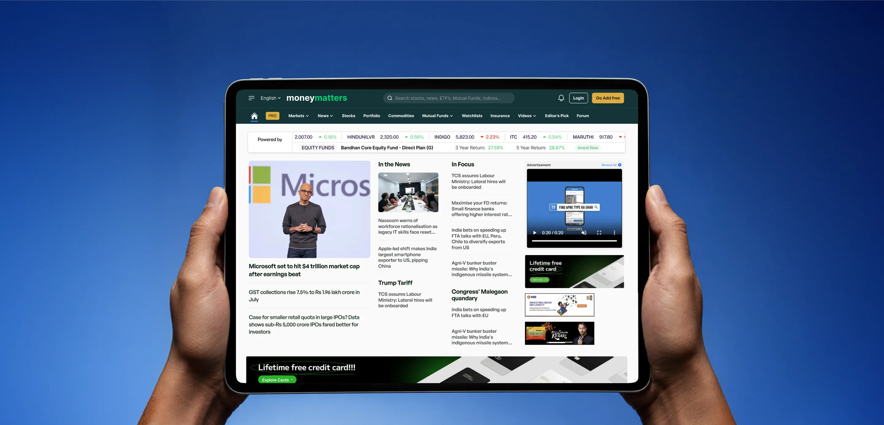
As a high-traffic digital destination, the platform leverages a robust programmatic advertising model to power its revenue engine. Navigating a massive volume of daily content alongside dense advertising placements naturally created a highly saturated digital layout.

Moneymatters engaged with Mellow as their strategic business design partner to conceptualize a comprehensive UX overhaul.

Lost Navigation

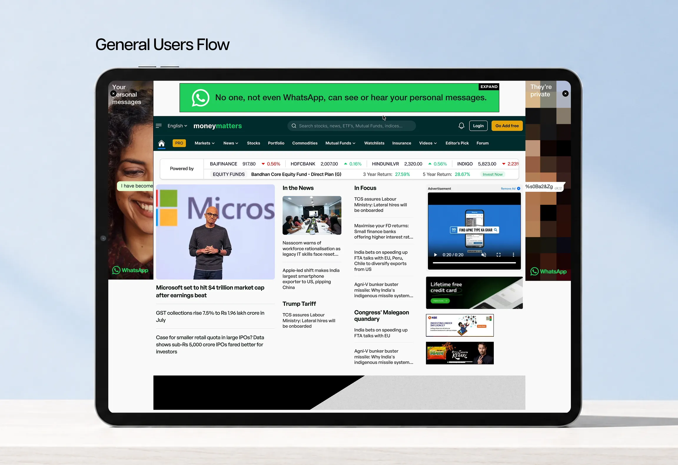
The core systemic challenge was centered primarily on navigational discoverability. Because high-volume programmatic ad inventory heavily occupied the header and lateral perimeters of the live platform, the primary navigation framework lost its structural prominence. Disrupting immediate orientation and intuitive wayfinding for incoming users the moment they landed.

Choreographed Commerce

In traditional design, the easiest way to fix clutter caused by ads is to simply remove them. Letting outside brands crowd your layout inherently dilutes your product, turning your own platform into a digital billboard for third-party companies. However, for a media giant whose revenue depends entirely on advertising, eliminating ads isn't a design solution: it is a business liability.


At the same time, letting ads overrun the page would destroy the user experience, while hiding them was impossible. The solution required a strict structural balance. We adopted a counter-intuitive, ads-first design philosophy: treating the ad slots as permanent landmarks and building the entire platform around them.

Design Language

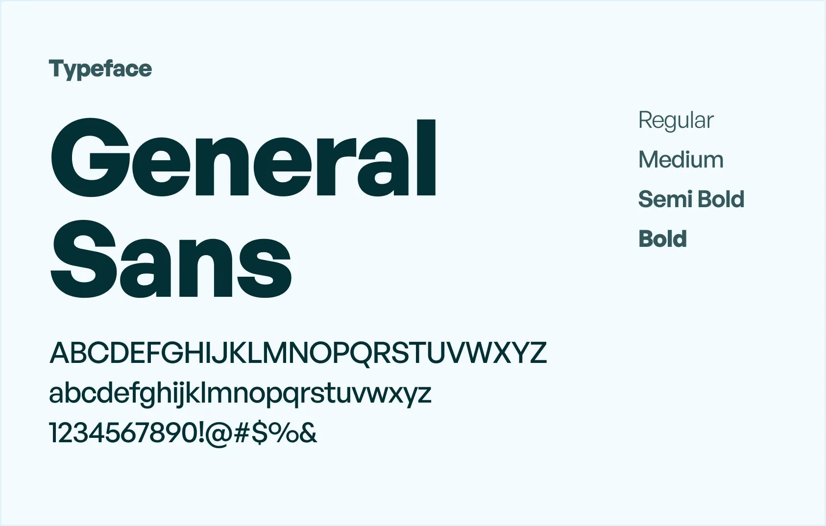
Typography

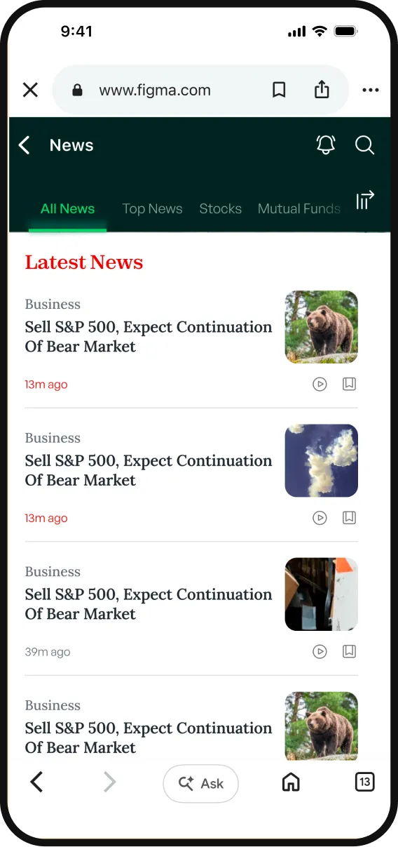
To guarantee maximum readability across high-frequency data streams, we suggested a crisp mix of serif and sans-serif typography. Refined serif fonts anchor editorial headlines, while clean sans-serif fonts keep real-time financial metrics and numbers effortless to read and scan.

Designing with Ads, Not Around Them

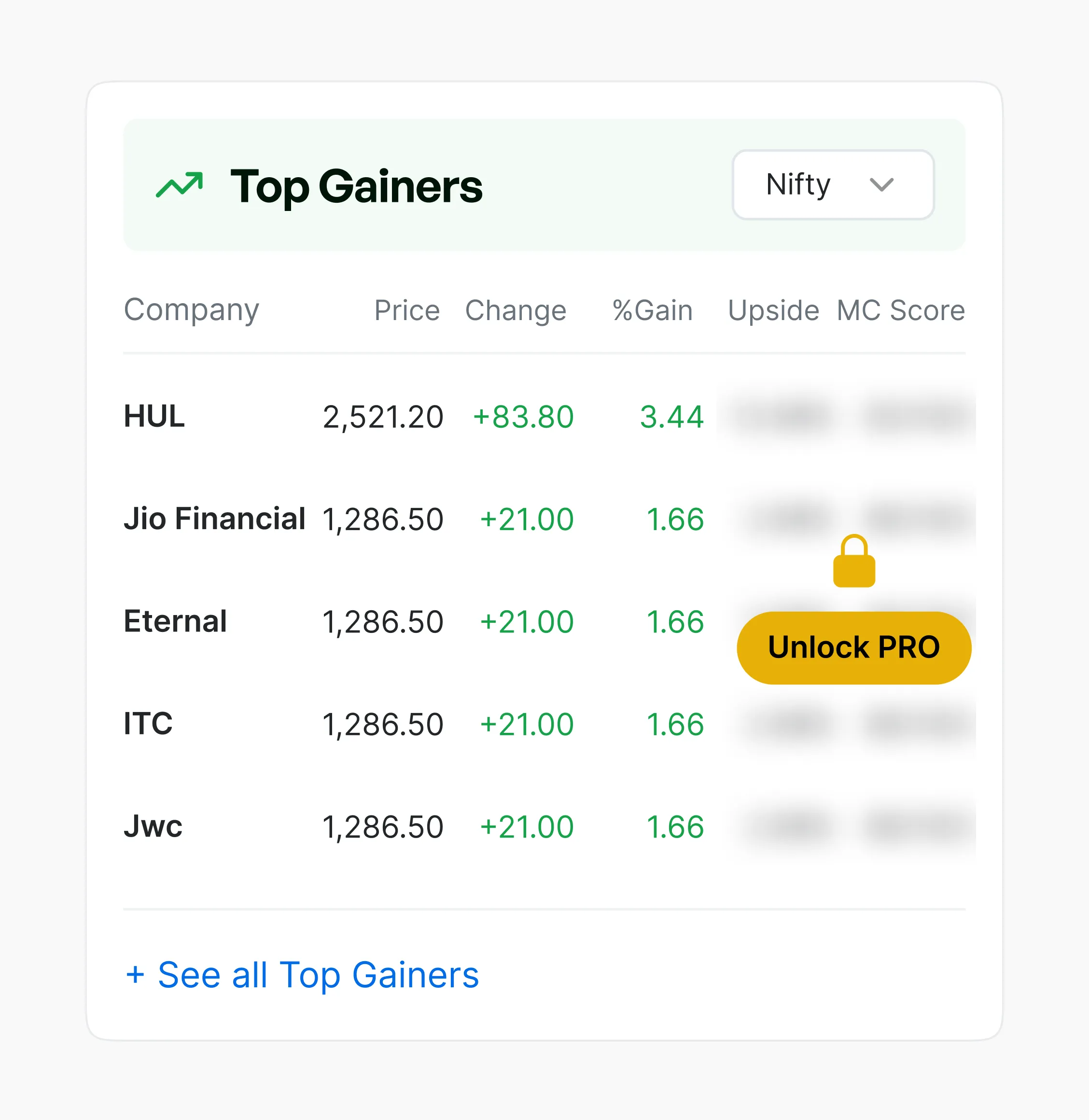
Instead of treating high-volume ad inventory as an afterthought, we introduced  a disciplined layout that integrates dedicated ad slots directly into the platform's structural grid. We utilized a strategic colour system to cleanly anchor content, allowing users to track dense data and real-time financial metrics without visual friction.

The platform eliminates empty gaps by deploying proprietary, custom-branded animations within those exact slots. We treated these fallback states not as dead space, but as valuable digital canvas for creative self-promotion.

Two-Tier User System

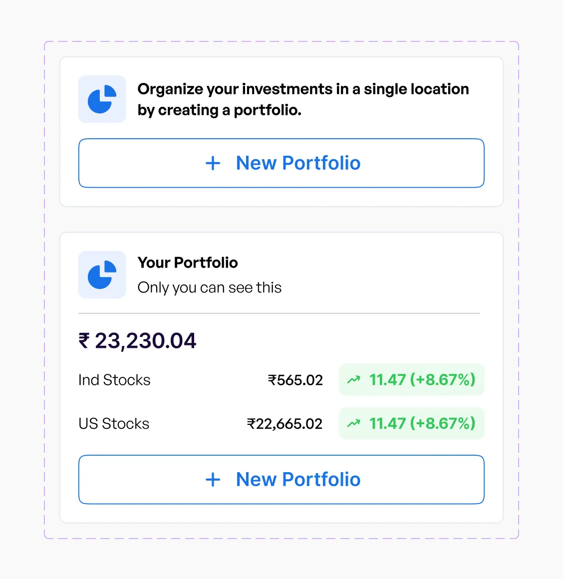
To resolve this spatial fragmentation, we proposed a strict Two-Tier User Architecture that cleanly bifurcated the platform’s digital real estate. On the Free Tier, chaotic ads were replaced with dedicated ad slots that preserved monetization while keeping navigation clean.


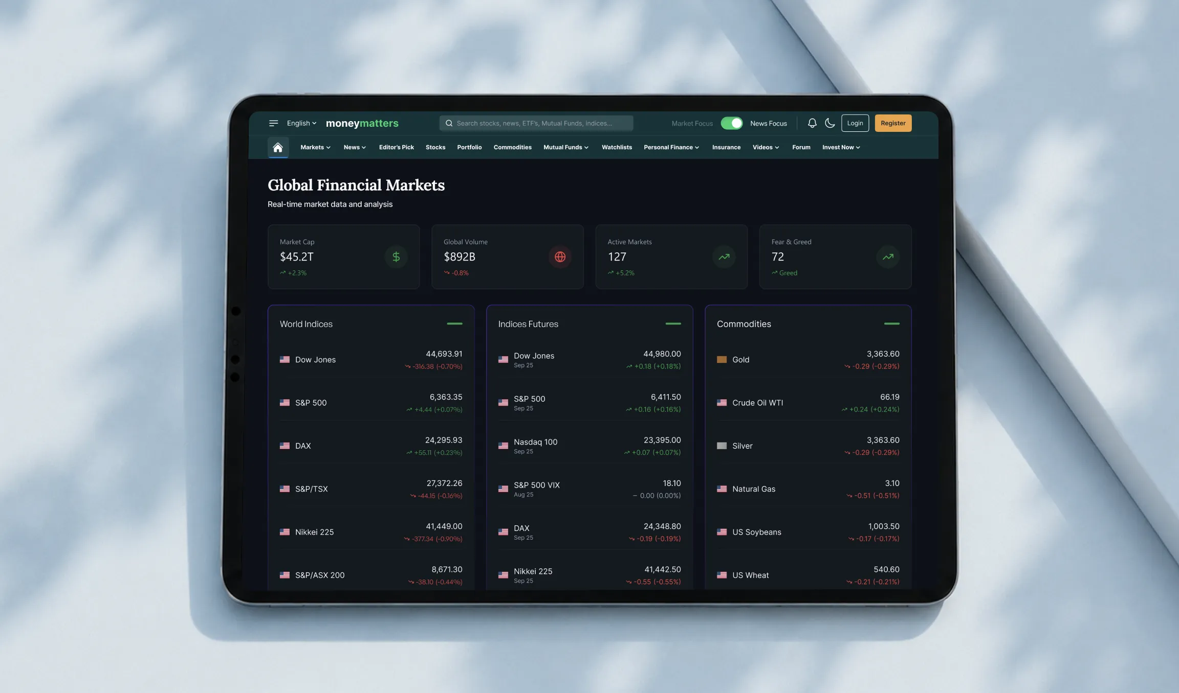
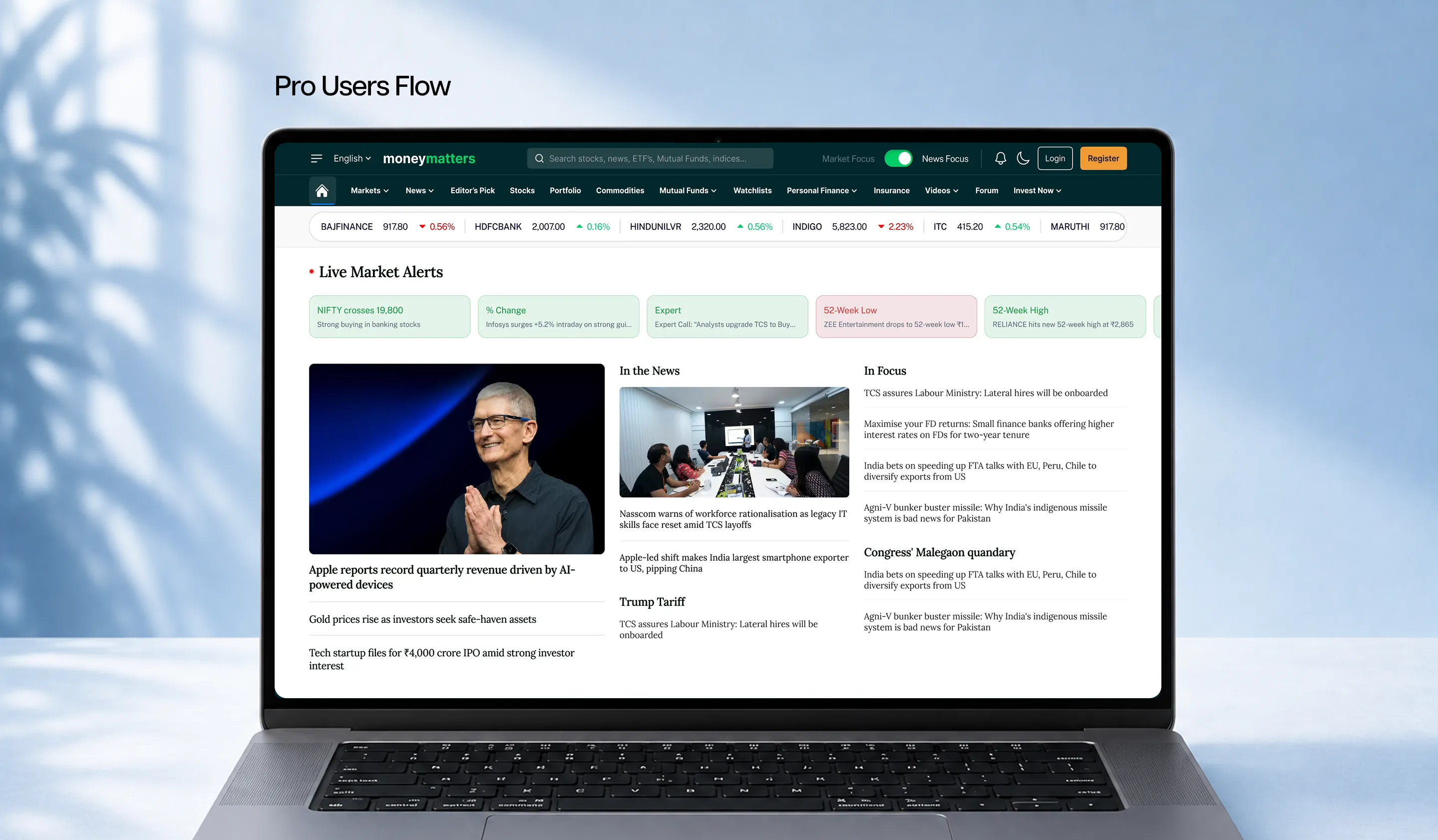
The Pro Tier seamlessly transitioned into an ultra-clean, distraction-free workspace fully optimized for advanced data analysis and executive execution.

Segmenting Market & News Focus

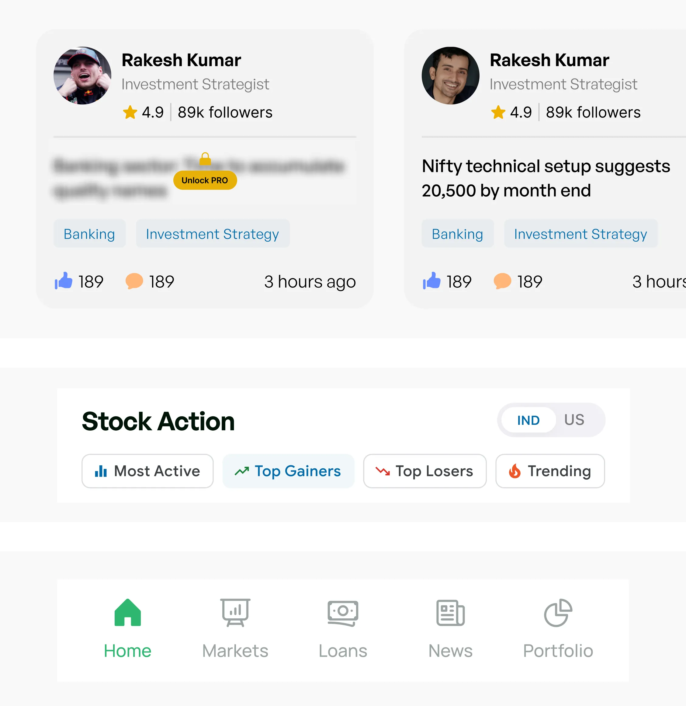
To improve user orientation, we proposed two distinct header architectures featuring a simple, intuitive toggle switch. This control gives users instant clarity on their active view, allowing them to shift fluidly between a news-heavy feed and a market-data stream. Decoupling the two lets each view maximize its own visual hierarchy and layout density without compromise. Users always know exactly what mode they are in, giving them complete control over how information is served to them without leaving the page or opening new tabs.

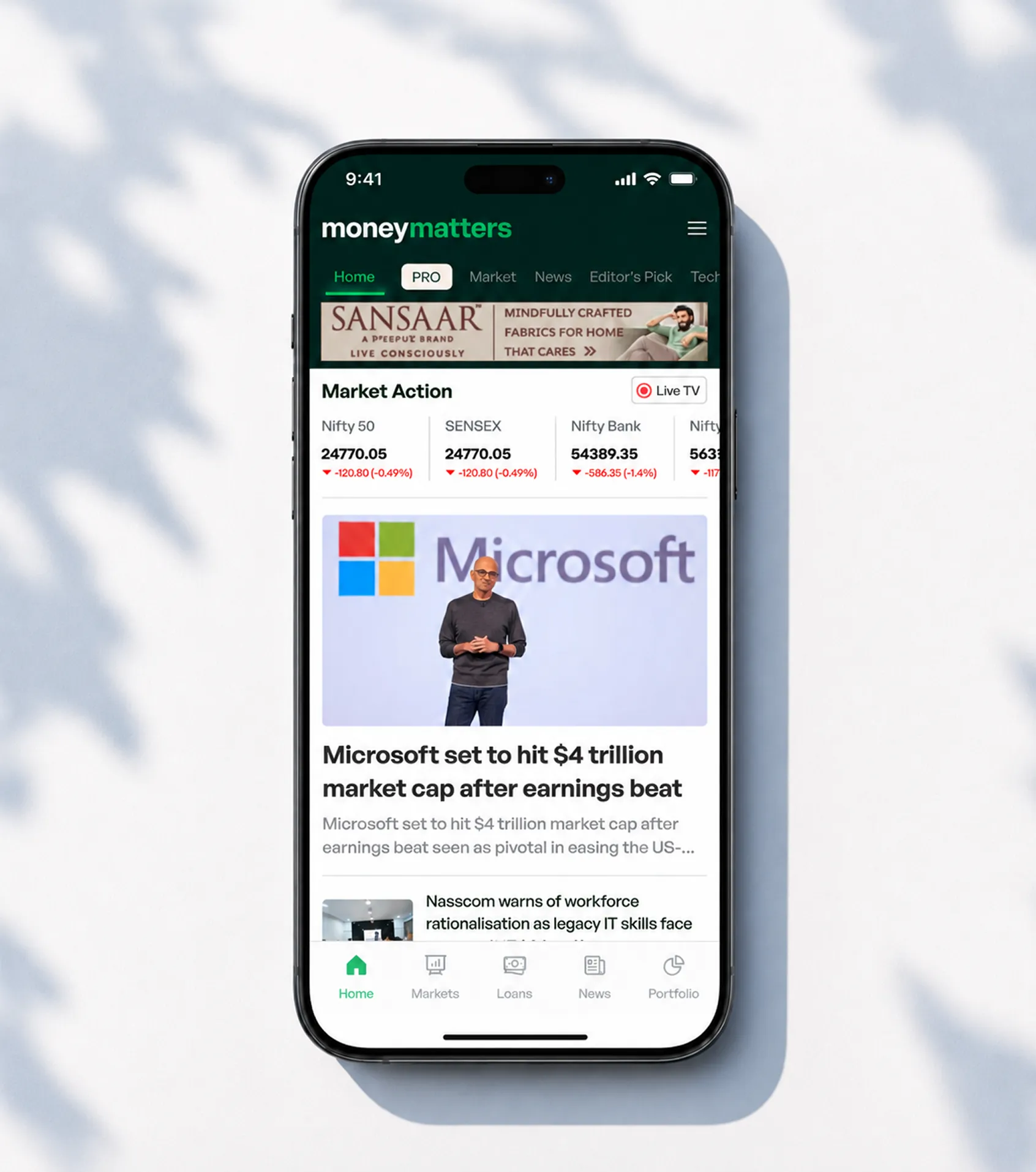
Mobile & App Experience

Scaling the platform's vast data density down to smaller screens required strict layout discipline. Mellow proposed a compressed, high-density mobile interface that prioritizes thumb-zone navigation and immediate data retrieval. Critical real-time tickers and quick-action market cards are brought directly to the foreground, ensuring essential financial indicators remain instantly accessible without layout shifts or cognitive fatigue.

Result

The final blueprint successfully balances high ad revenue with a clean, user-focused experience. By bringing clear structure to the layout, the overhaul transforms a crowded interface into a smooth, scalable, and high-performance financial platform.

Next Project

Next Project
Pause icon with two vertical white bars on a black square background.
Mellow Designs
Online
Hi there,
Ready to turn ideas into something awesome? How can we help you?
Start Whatsapp Chat
Chat on Whatsapp
Let’s shake things up.
Contact Us
Contact Us