


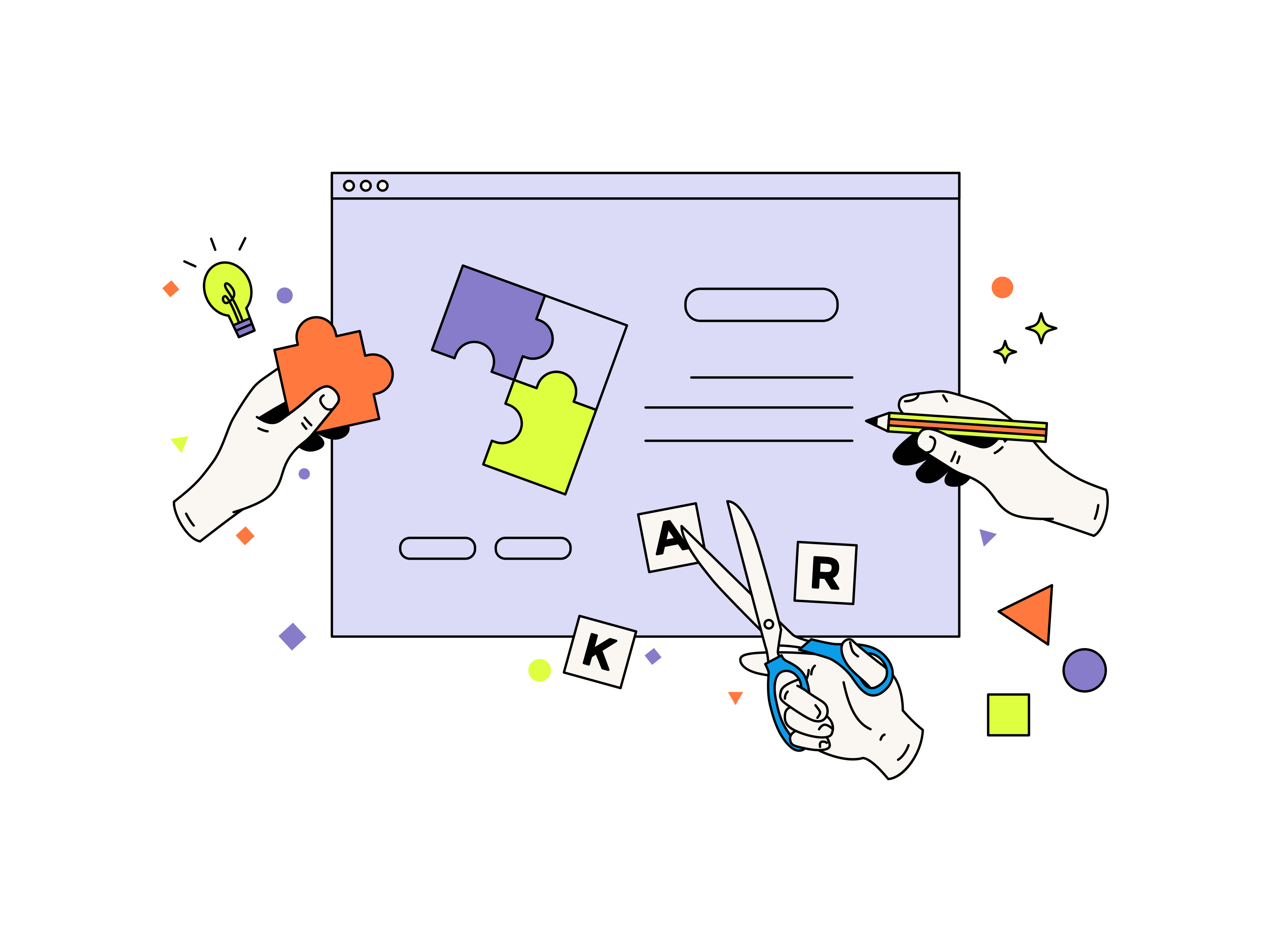
Logos are one of the most challenging aspects of graphic design to master. Making a logo requires no skill, and almost anyone can do it. However, creating a good business logo design requires a lot of planning, artistic talent, and perseverance.
Trends in graphic design come and go. Some of them last longer and become iconic design patterns, while others fade away. If you take the right approach, these trends can help you develop a strong brand identity and a loyal audience.
We see designers fall into the habit of running into a logo design architecture and coming up with such overused and old ideas.
What Are Some Logo Design Trends To Avoid This Year?
A business's performance may be significantly impacted by its logo design, which is a crucial component of branding. To guarantee that your logo doesn't appear antiquated, it's crucial to remain up-to-date with design trends. In light of that, the following logo design trends this year should be avoided:
Minimalist Design
Minimalist design logos are now out of trend and must be avoided in 2023. Instead, this year, you must go for dynamic designs. Designs that cue some movement appear interactive and animated have some momentum. Dynamic design trends are going to be one of the most popular and appealing trends this year.

https://media.giphy.com/media/26ufmepVftH5Y2V7q/giphy.gif
https://media.giphy.com/media/5NPhdqmyRxn8I/giphy.gif
Symmetry In Logo Design
Symmetry can be a powerful tool in logo design, but it is outdated and must be avoided this year. A more dynamic and distinctive logo that stands out in a competitive market might result from avoiding symmetry.
To convey a sense of motion or energy, logo design should also avoid symmetry. For businesses that are focused on innovation or disruption, an asymmetrical logo may effectively portray a sense of movement, change, and advancement.
Create a sense of originality or personality by avoiding symmetry in logo design. In addition to helping a company stand out in a competitive market, an asymmetrical logo may be more distinctive and memorable than a symmetrical one.

3D Gradient
Gradients and drop shadows are frequently used in 3D logos to imply depth, but with today's flat design trend, they might appear antiquated. Furthermore, 3D logos can be challenging to recreate in tiny sizes or on various media, such as digital or screen-based media.
Compared to their 2D counterparts, 3D logos might be more challenging to read and comprehend. A 3D logo's additional intricacy and dimensions might make it more challenging for visitors to immediately and readily recognise the business or brand it stands for.
Although 3D logos may have been fashionable in the past, they are losing significance in the world of design nowadays. If you want to alter your logo, think about going with a straightforward, flat design that may be utilised across different mediums.


What Makes A Good Business Logo Design?
A logo is a visual representation of a brand, not merely a straightforward image or symbol. A successful logo is one that persuades people of a company's or organisation's mission and ideals while also being instantly recognised and memorable. Here are some essential components of a successful logo:
Simplicity: A excellent logo is straightforward and simple to comprehend. A complicated logo could be hard to replicate and hard to recognise.
Versatility: An effective logo should be adaptable and able to be utilised in a range of contexts, including print, digital, and large-scale applications.
Relevance: An effective logo must be pertinent to and appropriate for the business or group it represents. It should convey the principles and message of the brand.
Uniqueness: A excellent logo must be distinctive from those of competitors in the same sector. It needs to be distinct and noticeable.
Timelessness: A good logo should be ageless and resistant to being quickly outmoded by fashion fads. It must be resilient enough to stand the test of time.
Memorable: People should be able to recall a good logo after only viewing it once, and it should be simple to remember.
In conclusion, an effective logo is a representation of a brand that is straightforward, adaptable, pertinent, distinctive, ageless, and unforgettable. It should be able to communicate the company's message and ideals while also standing out from the crowd and sticking in viewers' minds. Keep in mind the above points while creating a logo design this year, and avoid the common design trends. Focus on creating a unique, timeless logo that accurately represents your brand.
You can get in touch with Mellow Designs if you're searching for the best logo design company branding agency or want to enhance the user experience on your website.
.jpg)


