Chargnex entered the EV charging market with a product that worked, technically. Their platform connected drivers to AC Level 2 and DC fast chargers across commercial, residential, fleet, and hospitality use cases. The hardware was competitive. The CSMS backend was functional. But the user-facing experience told a different story.
The original interface had been built incrementally, without a unified design language or a clear mental model of how a driver actually moves through a charging session. Finding a station, initiating a charge, monitoring progress, and completing payment each felt like separate applications stapled together. For a product that positions itself on the promise of "Tap, Charge, Go", a three-step simplicity, the experience underneath that promise was anything but.
The problem wasn't cosmetic. Chargnex operates across Canada, the US, and India, in environments where EV adoption is still in the early-majority phase. Their users are not enthusiasts who will forgive friction, they are everyday drivers who will abandon a charging station if the interface confuses them in the first 30 seconds. A poor UX at the charger is a broken charger. Every session that fails to complete is a driver who doesn't come back and a site operator who questions their investment.
Chargnex came to Mellow with an existing product that needed to be rebuilt from a design standpoint, not abandoned but fundamentally rethought. The brief was clear: make this feel as intelligent as the hardware behind it.

The core mistake in the original design was treating the charging session as a transaction. It was designed like a payment terminal: get in, enter details, complete action, leave. But a charging session lasts anywhere from 20 minutes to over an hour. The interface needed to handle the before, during, and after: station discovery, session initiation, live monitoring, and payment, as one continuous, reassuring experience.
Mellow's insight was that trust is the real product. EV drivers at a public or semi-public charging point are operating with mild anxiety, will it work, how long will it take, am I being charged correctly? The design's job wasn't just to look clean. It was to actively reduce that anxiety at every micro-moment. Every label, every state, every progress indicator had to communicate: you are in control, this is working, you can relax. That shift became the design principle that governed every decision over 8 months.


Chargnex needed more than screens, they needed a foundation. Mellow built a full design system from scratch: a structured colour token architecture spanning Brand Blue, Secondary, Success, Warning, and Error scales, Inter typography from Display Large through Body, and a component library that covers every interactive state. Every future screen the product team ships now starts from the same source of truth, not a blank file.
.png)
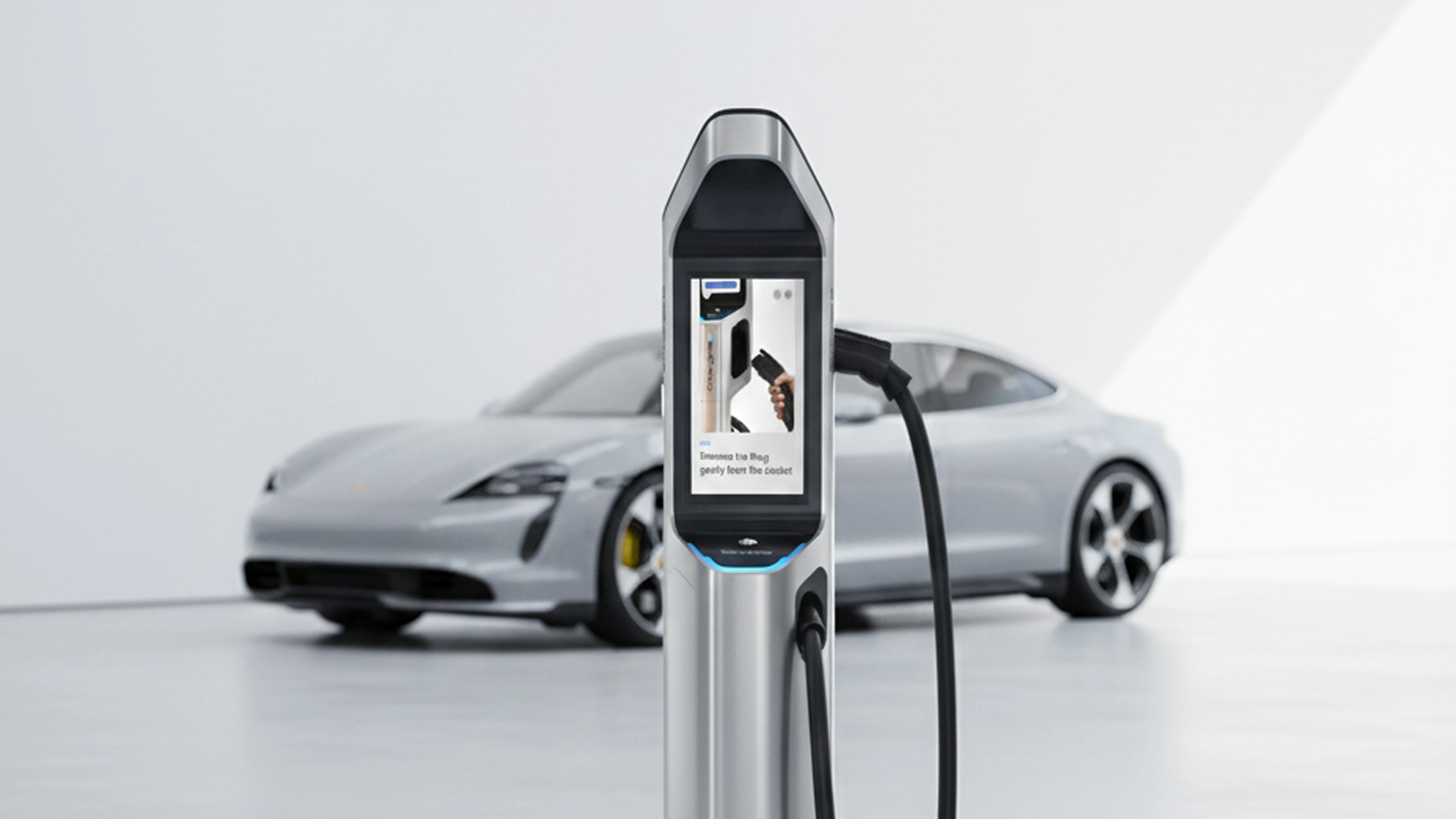
The original product buried the active charging session inside a generic interface, no dedicated state, no live feedback, no sense of control. Mellow gave it its own full-screen experience: real-time session data, clear progress indicators, and a visual language that communicates the charge is working before the driver thinks to check. A small structural decision with an outsized impact on user confidence.
.png)
Research showed the highest friction point wasn't payment, it was the 10 seconds before a driver knew whether the charger was available, compatible, and ready. Mellow redesigned every discovery and initiation state around a single principle: answer the question before the user has to ask it. Station status, compatibility signals, and session triggers were restructured so that by the time a driver reaches the charger, uncertainty is already gone.

.png)

The redesign gave Chargnex a unified design language across every surface their users and operators touch — the driver app, the site operator dashboard, and the backend CSMS. Where the original product had been built in layers with no common system, the new interface is governed by a design system that any product or engineering team member can extend consistently. The driver experience was restructured around confidence: clear station availability signals, unambiguous session initiation, a dedicated live-monitoring state, and a clean payment completion flow. For fleet and site operators, the dashboard redesign brought session visibility and management controls to a single, scannable interface.
A product that finally matches the promise on the tin — Chargnex's "Tap, Charge, Go" positioning now has an interface built to deliver exactly that experience, without friction, confusion, or abandoned sessions. The project established Chargnex's visual and interaction language at a moment when the company is expanding its network across Canada, the US, and India — meaning the design system now scales with the product rather than needing to be rebuilt at the next growth stage.
.png)
.png)
.png)
.png)
.png)
The Chargnex engagement ran for 8 months from discovery to final design handoff. For a platform of this complexity — spanning a driver-facing app, a site operator dashboard, and a backend CSMS — that timeline reflects the depth of research, architecture restructuring, design system build, and multi-round client review required to do it properly. Simpler, single-surface redesigns can be scoped shorter; platforms with multiple user types and environments typically require 6–10 months for a rigorous result.

At Mellow, a redesign engagement of this scope includes a full discovery and competitive audit, information architecture restructuring, user flow documentation across all primary and edge-case paths, a purpose-built design system (colour, typography, components), high-fidelity UI across all screens and states, interactive prototypes, and a developer-ready handoff package. The design system deliverable is particularly important — without it, future product work reverts to ad-hoc decisions and inconsistency.
The most important criteria are whether the agency has experience with transactional, multi-state interfaces — not just marketing sites or consumer apps. EV charging platforms involve real-time data, session states, payment flows, and operator tools simultaneously. A design partner needs to be comfortable with systems thinking, not just visual design. Proof of a design system methodology and structured handoff process are strong indicators of a partner who can actually hand something over to engineering.
The most direct impact is on session completion rates — fewer drop-offs between station discovery and successful charge completion. Operator adoption of dashboards improves when tools are genuinely usable rather than technically functional. Longer term, a strong design system reduces the cost of every subsequent feature build because design decisions don't start from zero. The indirect effect — on brand perception among site operators, fleet managers, and enterprise clients evaluating the platform — is harder to quantify but consistently reported by clients as significant.
Mellow's engagements of this scope — multi-surface, design system included, 6–10 month duration — are priced at a level appropriate for funded startups, scale-ups, and enterprise technology companies. Contact us for a scoped proposal tailored to your platform and timeline.