Challenge
HealthFeed.ai is a multichannel member‑engagement platform for healthcare organisations, powered by AI to deliver personalised care journeys, automate risk assessments, and drive better outcomes. Their original website, however, was overly generic. Seeking to showcase their true capabilities and boost demo requests, HealthFeed approached us to rebuild their site from the ground up.
Approach
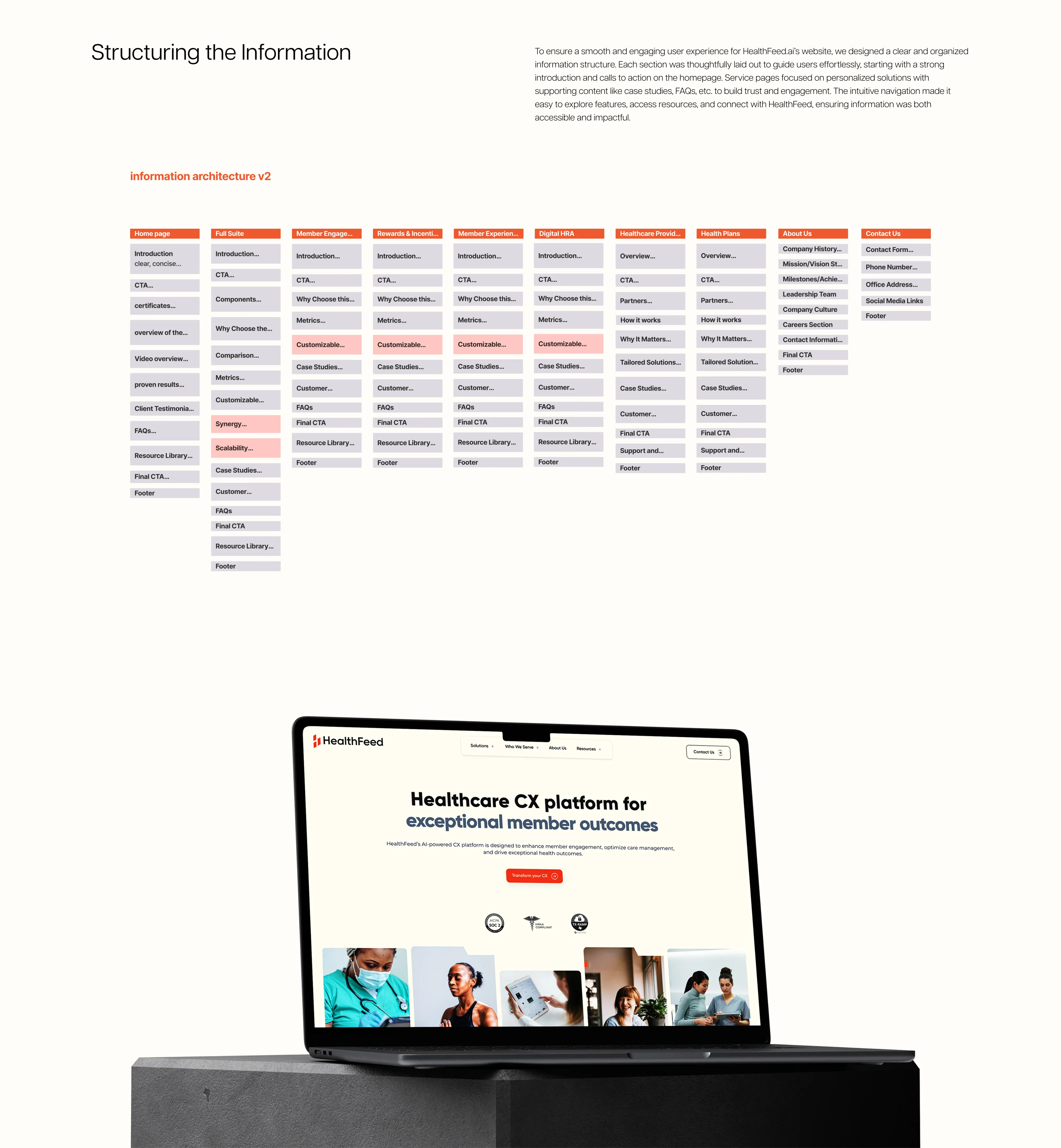
We began with an information‑architecture audit and stakeholder workshops to map out primary user journeys across providers, payers, and clinics. From there, we designed a clean, modern UI that highlights “AI‑powered healthcare CX” front and centre, followed by modular solution cards, interactive demos, and clear calls to action. Throughout, we ensured the new site was purpose‑driven: every layout, graphic, and interaction guides visitors toward “Book a Demo”.
Thought Process
Our mantra was “clarity through design”. We retained HealthFeed’s signature blue and introduced warm accent tones to highlight steps and CTAs. Custom iconography and micro‑animations bring each of the five core solutions to life, making complex features approachable. By reorganising content hierarchy and simplifying page flows, we created a seamless journey that builds confidence and drives engagement.
Result
The revamped website immediately reflected HealthFeed.ai’s market leadership. Visitors immediately understand the platform’s value, leading to deeper engagement and stronger interest. The streamlined user journey and compelling visuals have transformed the site into an effective lead‑generation engine, elevating HealthFeed.ai’s digital presence and reinforcing its position as a leader in healthcare member engagement.