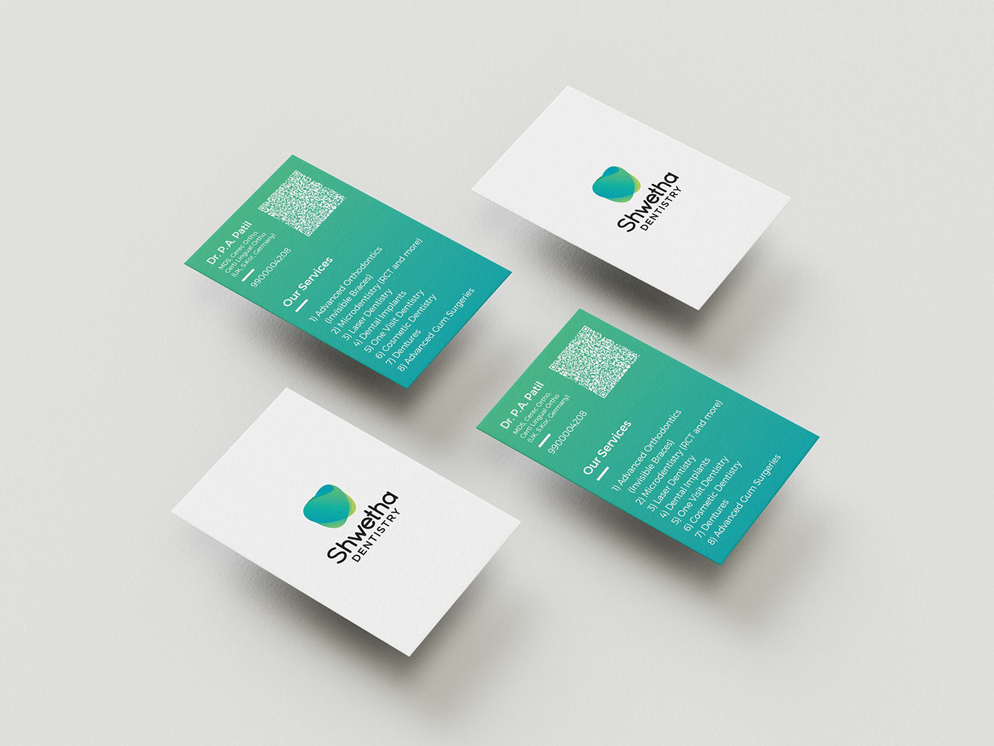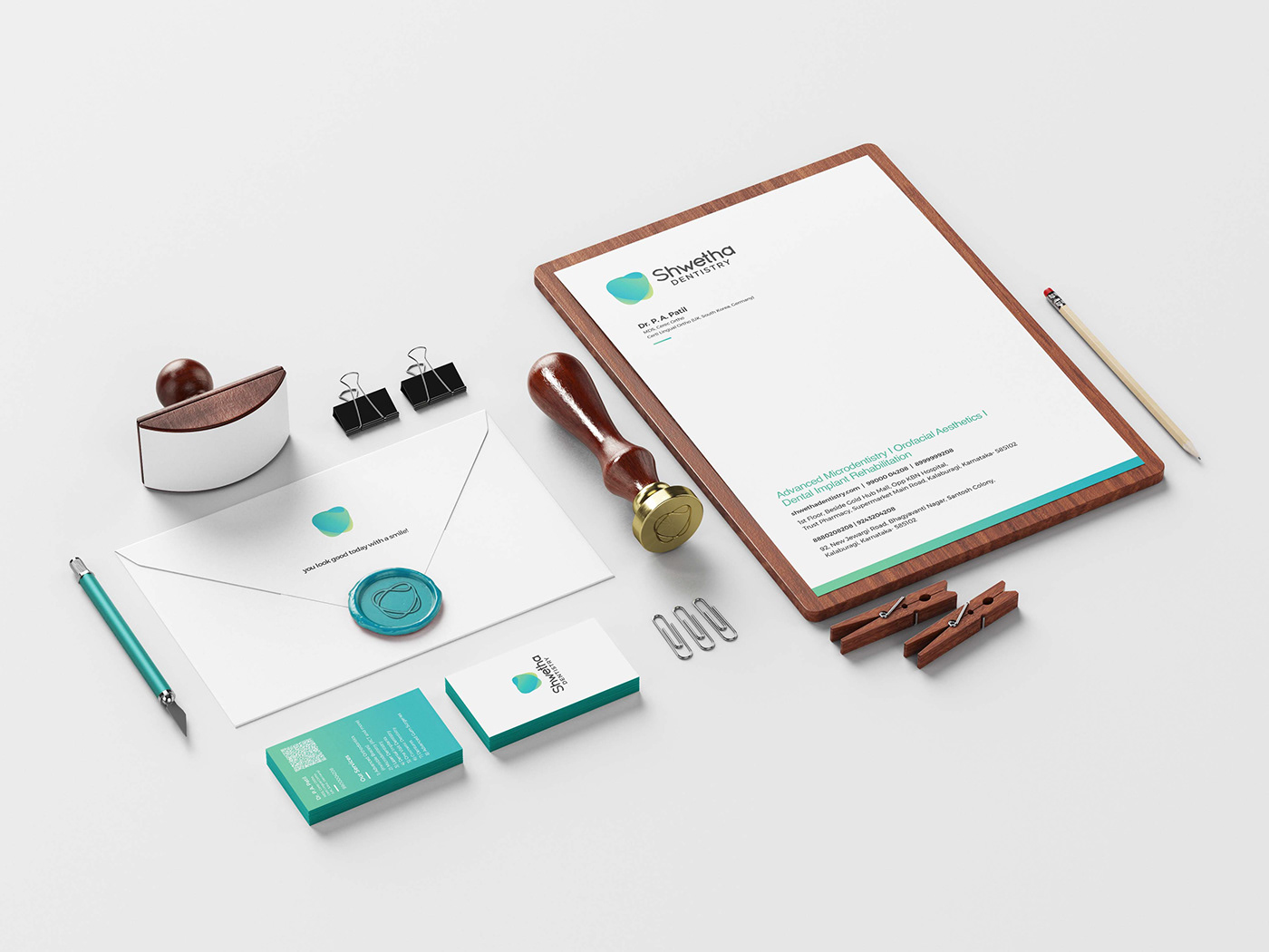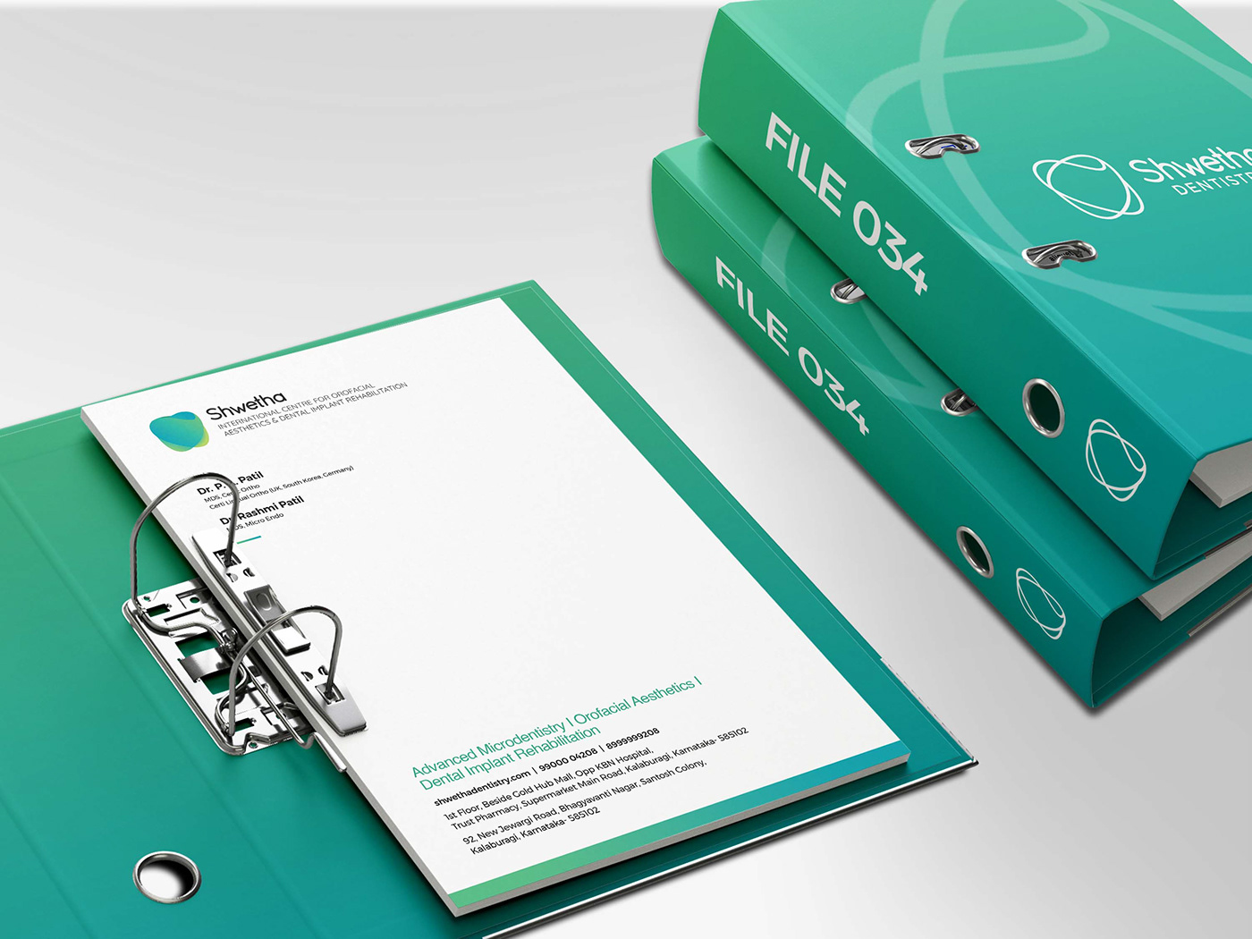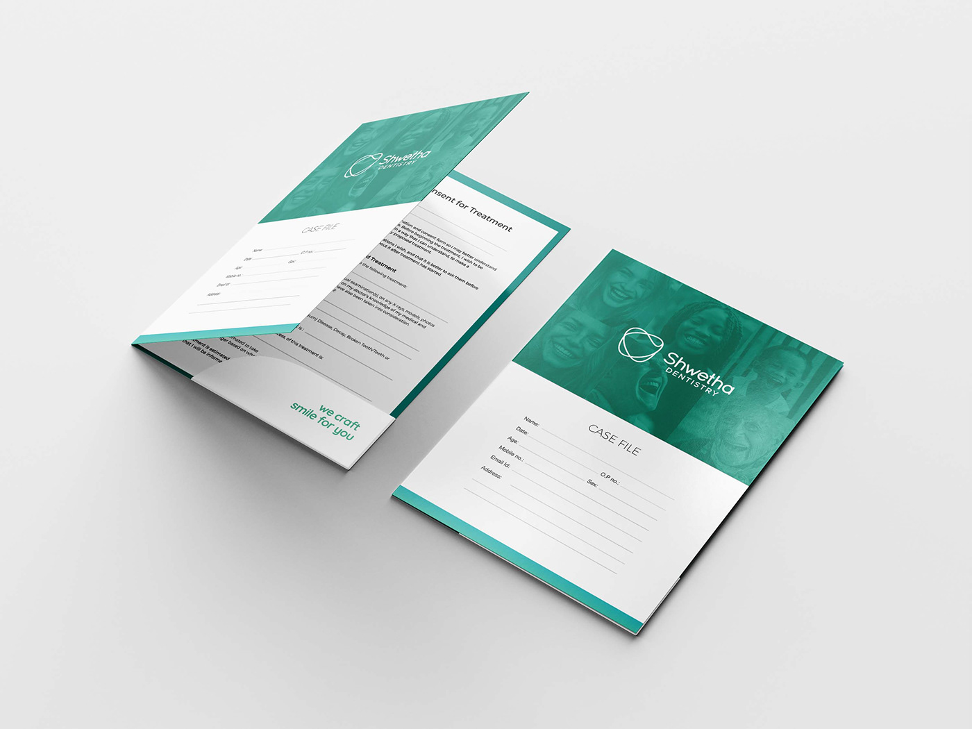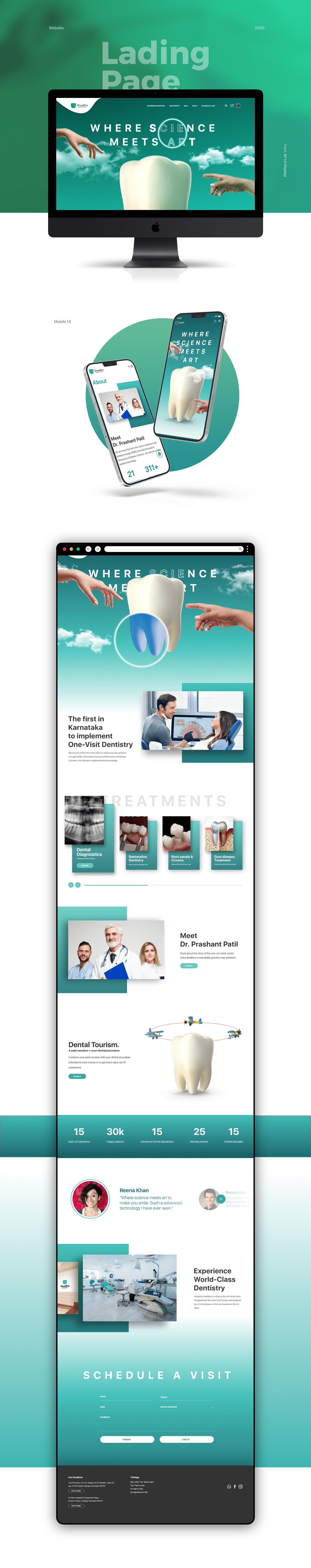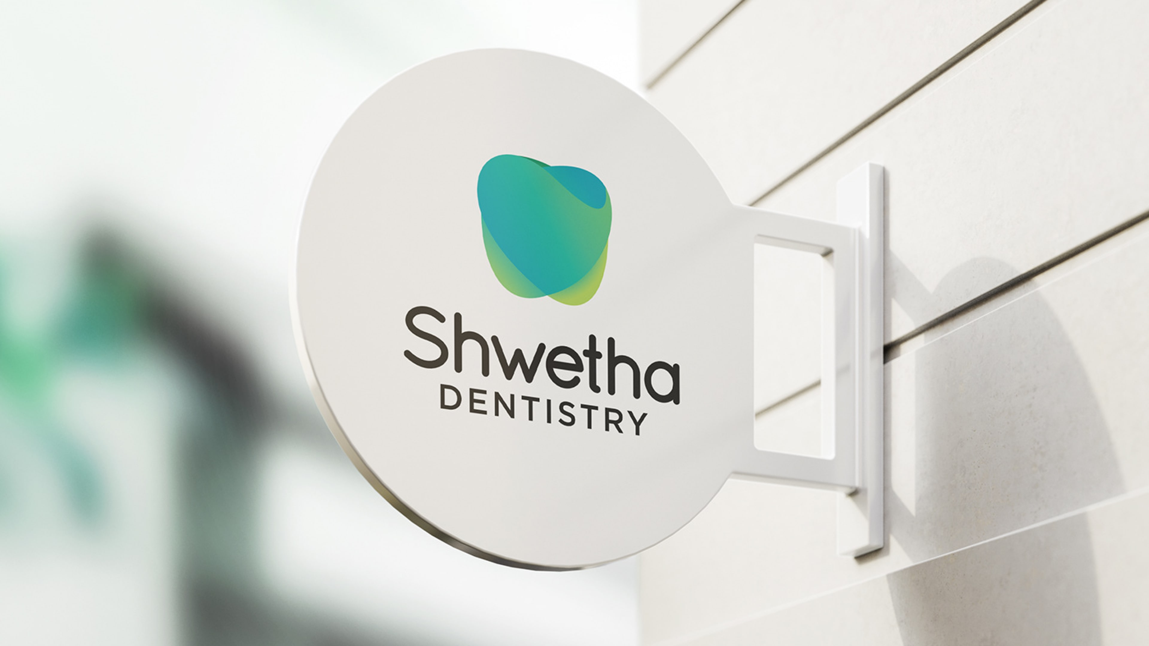
Shwetha Dentistry aimed to establish a brand identity that was professional, trustworthy, and approachable while reflecting its commitment to gentle, high-quality dental care.
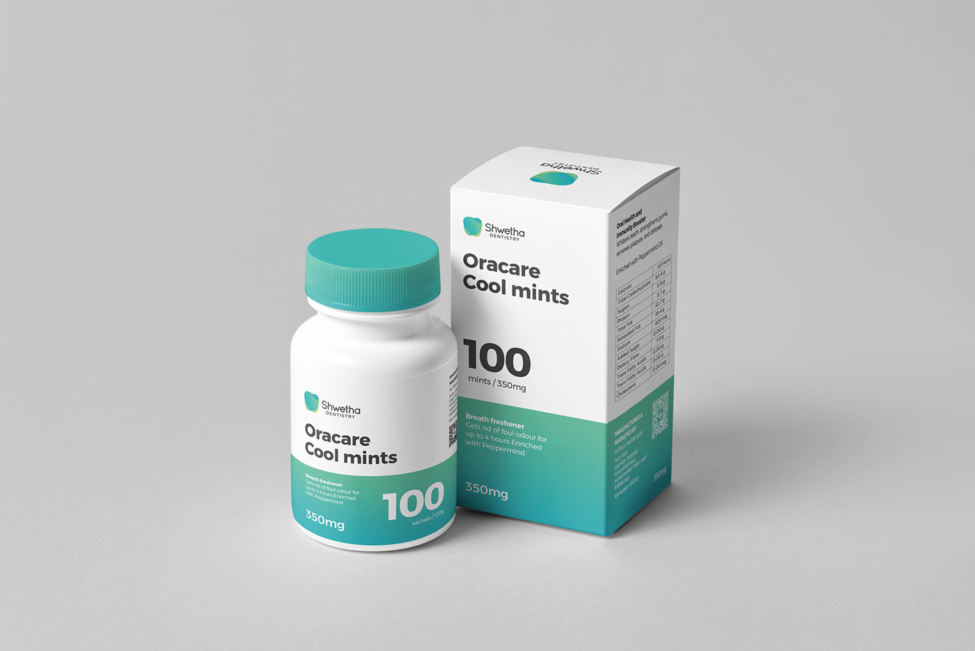
Mellow Designs focused on creating a simple, elegant, and approachable brand identity. Every element—from the logo to the colour palette—was designed to convey warmth and comfort while maintaining a sense of professionalism.
We balanced sophistication with a friendly tone to ensure the brand resonated with patients seeking a positive and reassuring dental experience.
The new branding elevated Shwetha Dentistry’s visual presence, successfully creating an inviting atmosphere that appealed to its target audience.