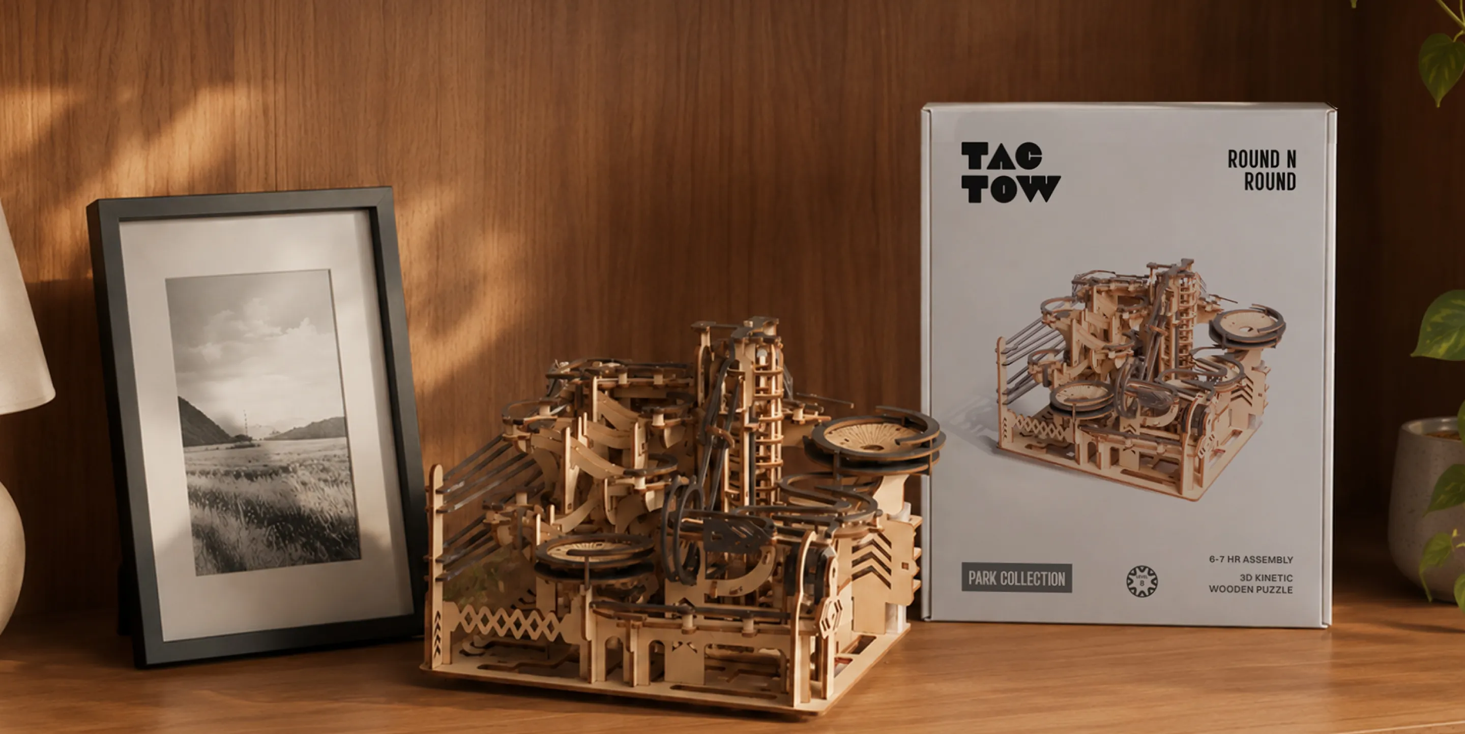
As the digital world grows louder every day, attention spans are shrinking. And somewhere in the middle of it all, the hunger for something real keeps growing. Tactow is the answer to that. Wooden, self-assembly mechanical kinetic puzzles that give you something to feel, something to focus on, and something to be proud of when it's done.
While Kenzai was handing the people back their focus and their satisfaction, the brand hadn't caught up to what it was quietly doing. The product was tactile down to its last gear, and it deserved an identity that felt the same way.
We came in to change that. A full rebrand from the ground up, from a new name to packaging, everything built to put Tactow at the front of a category it was always meant to own.

Kenzai had solved the equation for the adult who needed a digital escape through its tactile 3D puzzles, but its brand language lived in a completely different world from the product. Instead of inviting a tired, screen-fatigued adult to slow down and feel, the messaging read like a tedious chore. Kenzai behaved like a cheap hobby-shop toy, completely failing to articulate the luxury of focus it was actually offering.
.webp)
Before building the brand, we had to understand to who we were catering it for. What they were feeling, what the market was already proving, and what it would take to turn both into a brand worth believing in.


We keep going back to our screens because we can't seem to stop even when we dont want to. The addiction is quite convenient and completely by design. What we've lost in the process is the ability to just be somewhere, fully, without any distractions.
.webp)
At its core, this is a product you experience through your hands. The grain of the wood, the precision of every joint, and the moment a mechanism comes alive after assembly. Tactility felt like the most honest way to describe all of it.
To capture this honestly, we stripped tactility down to its active root: Tact. We then paired it with the soft, rounded suffix ow, turning a rigid concept into an effortless, friendly nickname. This creates Tactow, a name that perfectly balances physical precision with a warm, human finish that is deeply satisfying to say.
.webp)
Every design decision should be felt; if it couldn't be felt, it didn't belong. Raw wood grain, interlocking geometry, the precision of a laser-cut edge. Everything that made Tactow was fed directly into the design decision.
.webp)
.webp)
.webp)
.webp)
.webp)
.webp)
.webp)
.webp)
.webp)
.webp)
.webp)
With over 3,000 units sold, the true impact of this design revamp is impossible to ignore. Where the old packaging felt like a standard hobby box hidden away in a cupboard, the new identity is an immediate invitation to unplug. By matching the outer aesthetic to the high-quality tactile experience inside, Tactow has moved into the center of adult living spaces as a proud statement of the offline lifestyle.