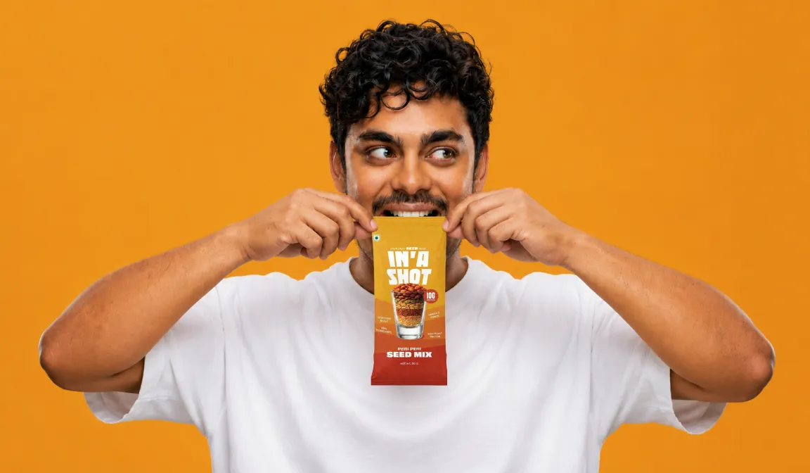
IN'A Shot is a seed-based nutrition brand that fits your entire day's intake into one small, grab-and-go shot.
Somewhere along the way, the functional snack category stopped being for everyone. It gets louder, harder, and more performance-obsessed, leaving the everyday health seeker with nowhere to go.
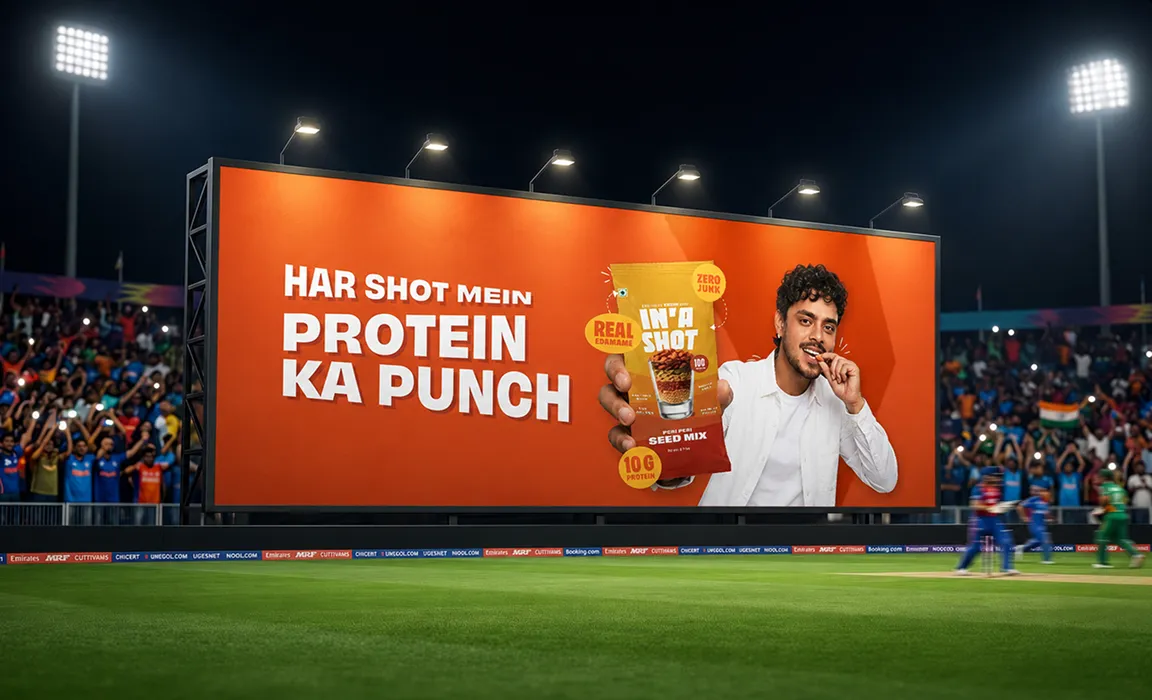
Founded by Ishan Kishan, the brand has the instinct to be a category disruptor by making healthy snacking easy and portioned. We are building every layer of it, from brand identity to packaging to website, giving seed-based nutrition the warmth and personality the modern Indian snacker has always deserved but never really been offered.
Healthy snacking is a growing market in India since the health revolution. The category is making it harder than it needs to be: big packets, generic blends, no real sense of how much you actually need. The intent is there. The awareness is there. But the habit never quite forms.
The category has solved healthy. Nobody has solved daily.
Indians have adopted healthy snacking as an idea. But nobody has made it easy enough to become a habit.
The problem is never the food. It is the friction around it. Too much choice, too little guidance, and too many decisions before you even open the packet. In'a Shot removes all of it. Your day's seed intake, In'a Shot. Small enough to fit into your day without thinking about it. Simple enough to actually stick.
.webp)
Ishan is warm, playful, and confident without being loud. That energy lives in the brand without the brand leaning on him entirely. So before anything is designed, we are mapping what the brand should feel like and, just as importantly, what it should never feel like. Not gym-coded, not cold, not trying too hard.
The wordmark comes from that same place. Chunky, playful, impossible to miss. The shot glass silhouette lives right inside the letterforms, so you understand what you are holding before you even read the name.
.webp)
.webp)
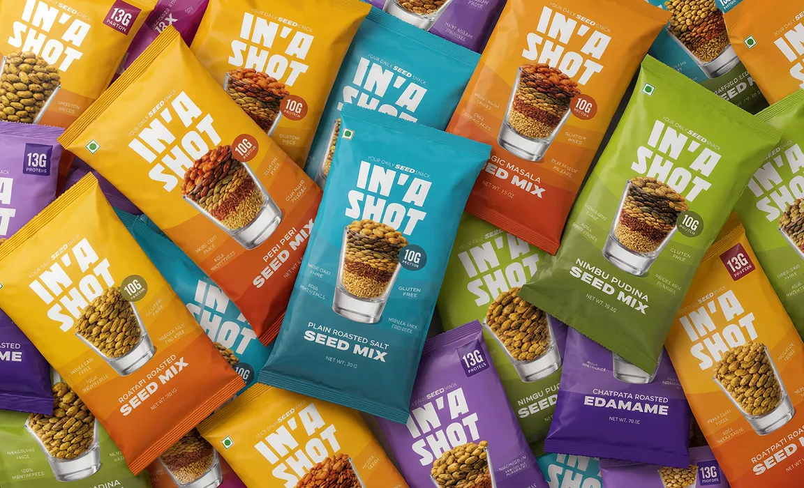
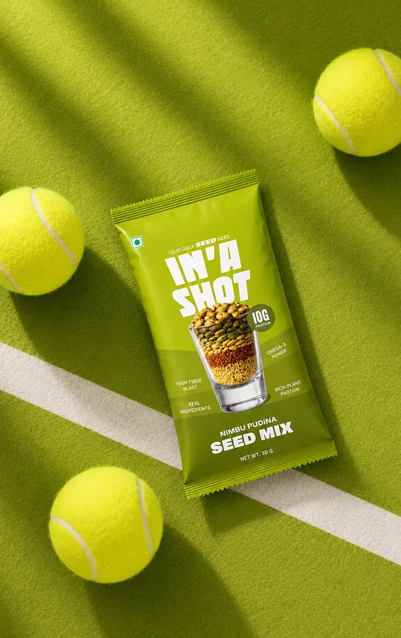
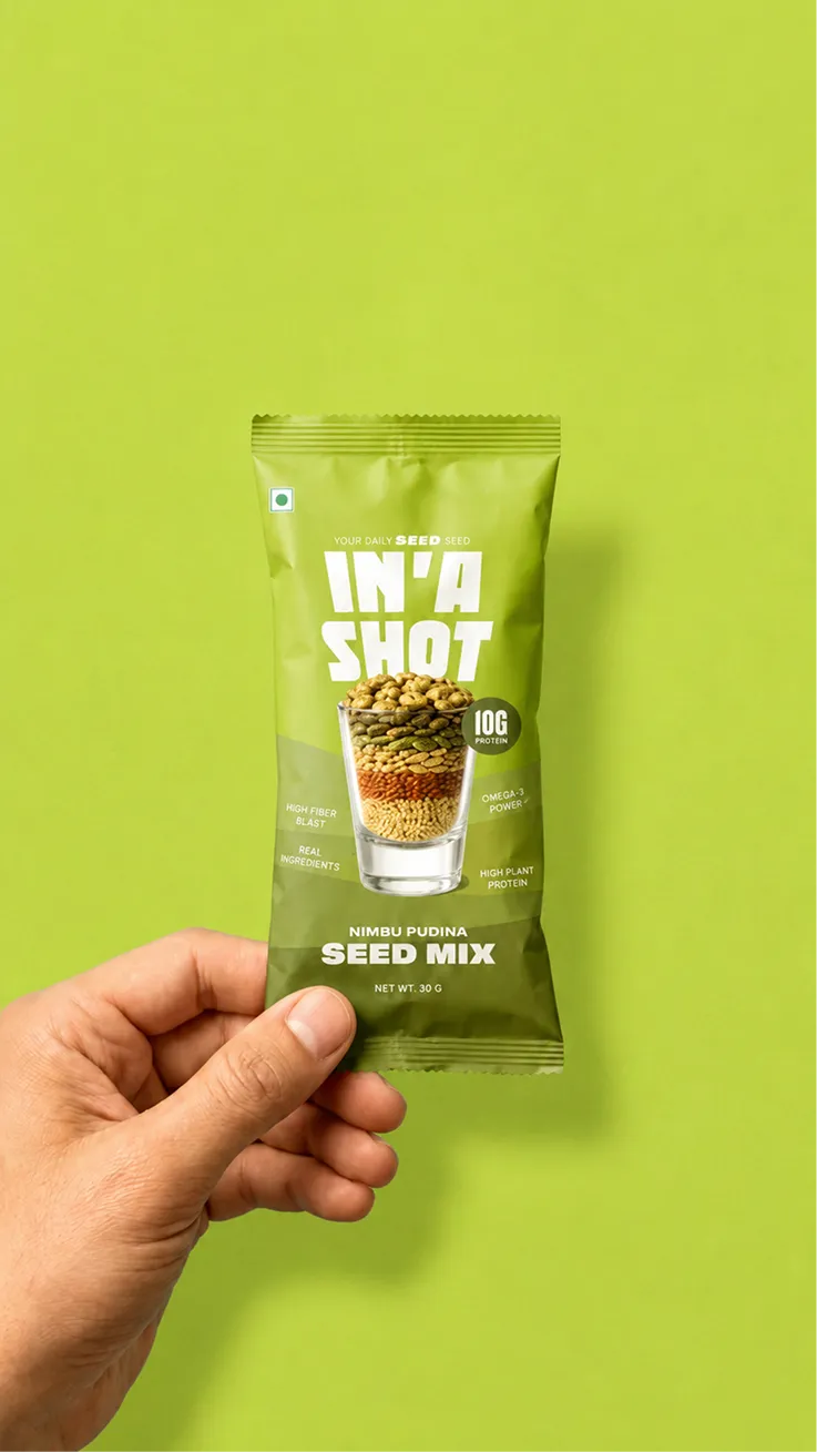
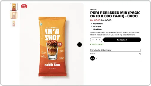
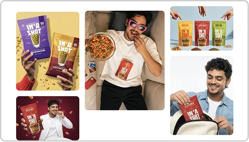
Each pack leads with the actual ingredients, honest and upfront. No lifestyle photography, no abstract illustration. Just the product, doing the talking.
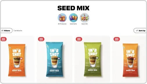
The layered waves across each pack carry the visual logic of the brand. Colours sit within the same family, each shade flowing naturally into the next. Bold enough to stand out on shelf, restrained enough to never tip into noise. A range that reads as one brand from a distance and as its own thing up close.


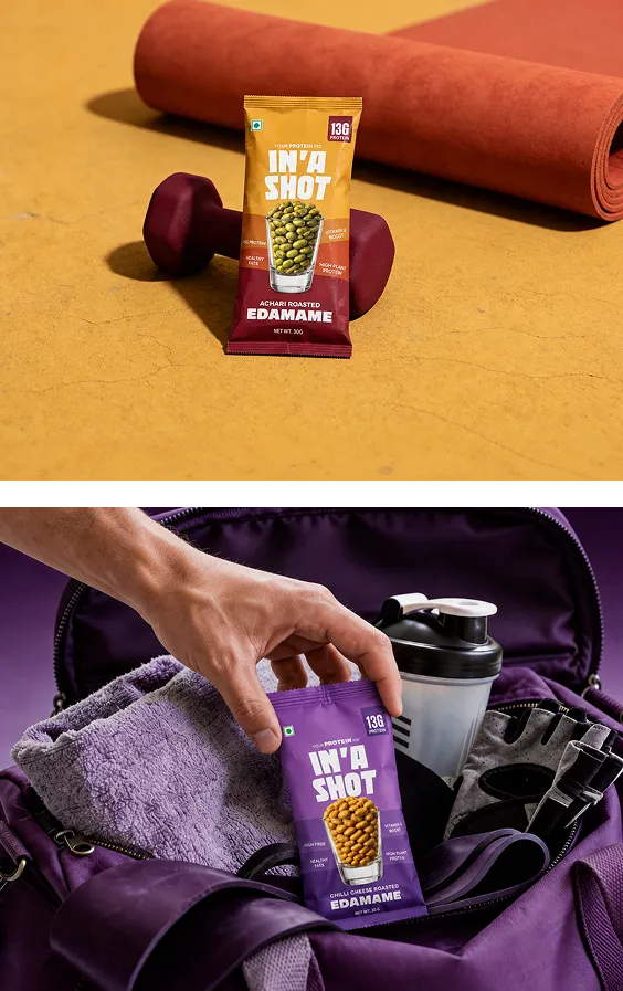
A brand that looks as good in your hand as it does on the shelf. The chunky type, the warm layered design , the ingredient-first layouts. all designed to live in the real world.
Nothing about In'a Shot asks you to try hard. Not the snack, not the design, and definitely not the way you think about eating healthy. It solves the measuring, the guessing, and the overthinking.
Cool without trying. Healthy without the effort.
.webp)


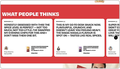
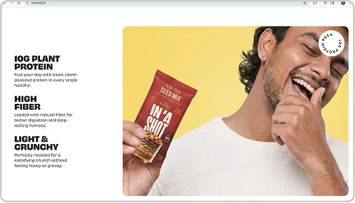
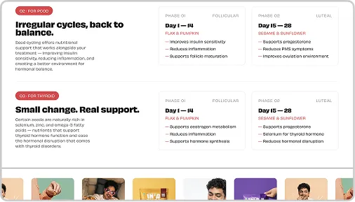
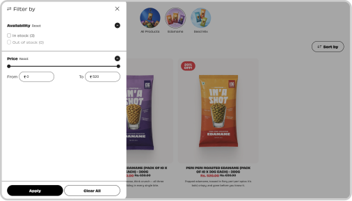
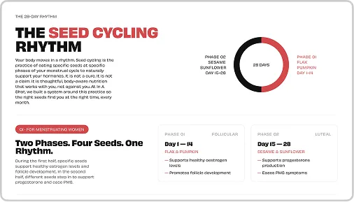
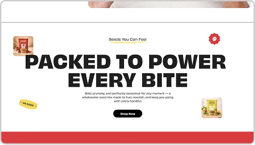
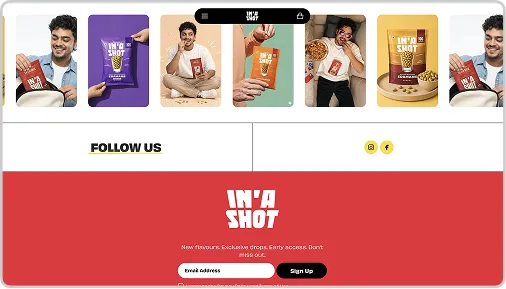
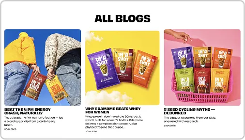
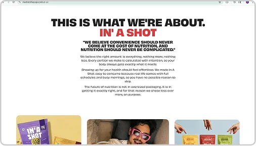
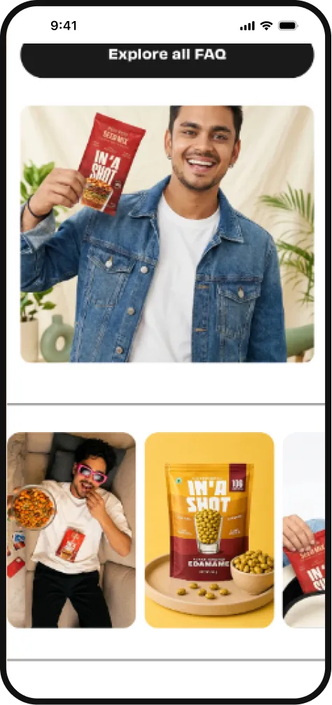
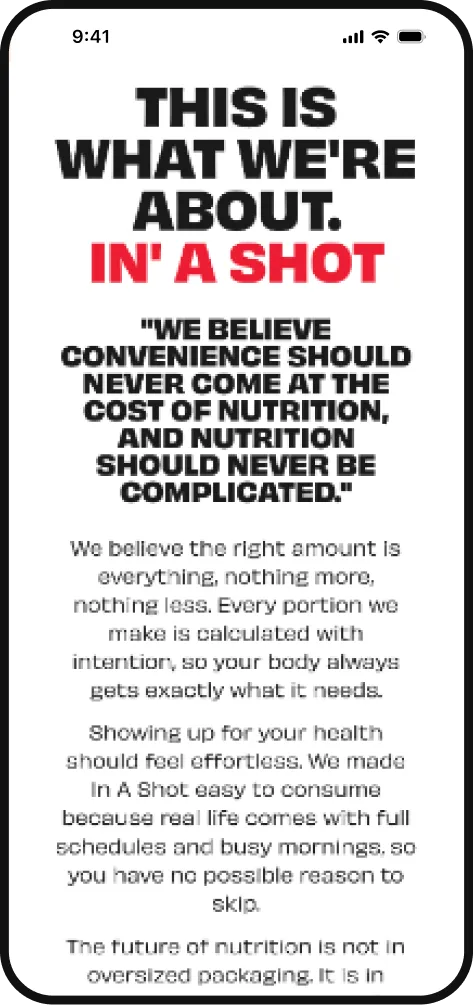
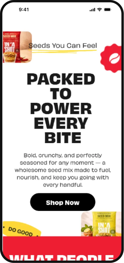
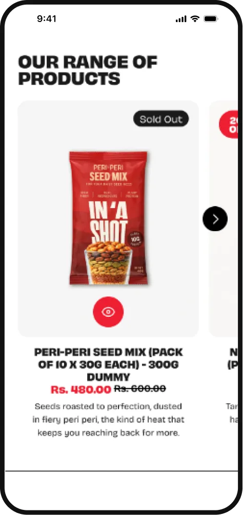
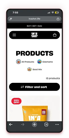
The site leads with Ishan, his energy, his story, and his product. Everything the packaging builds, the website carries forward. Same gradients, same chunky type, same colour logic. What you see on shelf, you feel on screen.


.webp)