.webp)

The technology services industry has trained enterprise buyers to be suspicious of ambition. Every mid-sized firm claims to be "AI-first" and "transformation-ready". The language has collapsed into noise.
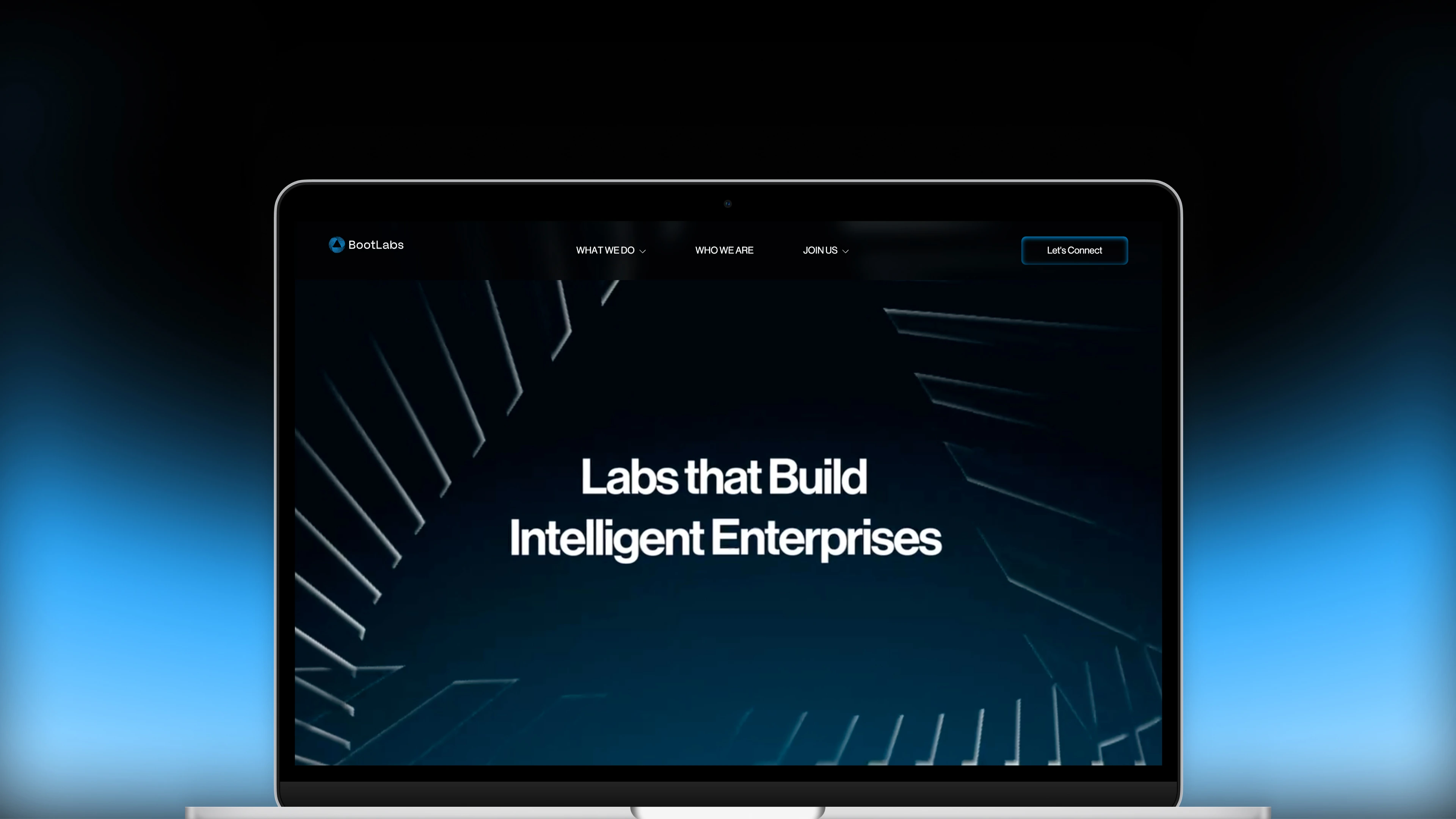
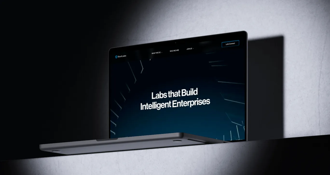
What Mellow identified was that BootLabs' real differentiator was not a capability; it was a posture. BootLabs did not just consult and recommend. They built, operated, and transferred. Their model was a lab: contained, precise, relentlessly outcome-orientated. That distinction, the difference between an advisor and an engineer, was the brand. The entire system needed to be built around making that posture felt, not just stated. Intelligence Engineered for Business was not a tagline we wrote for BootLabs. It was the strategic truth we uncovered and then made visible across every touchpoint, from the kinetic energy of the logomark to the motion-designed website intro that opened with the world of intelligent enterprise before it ever named a service.


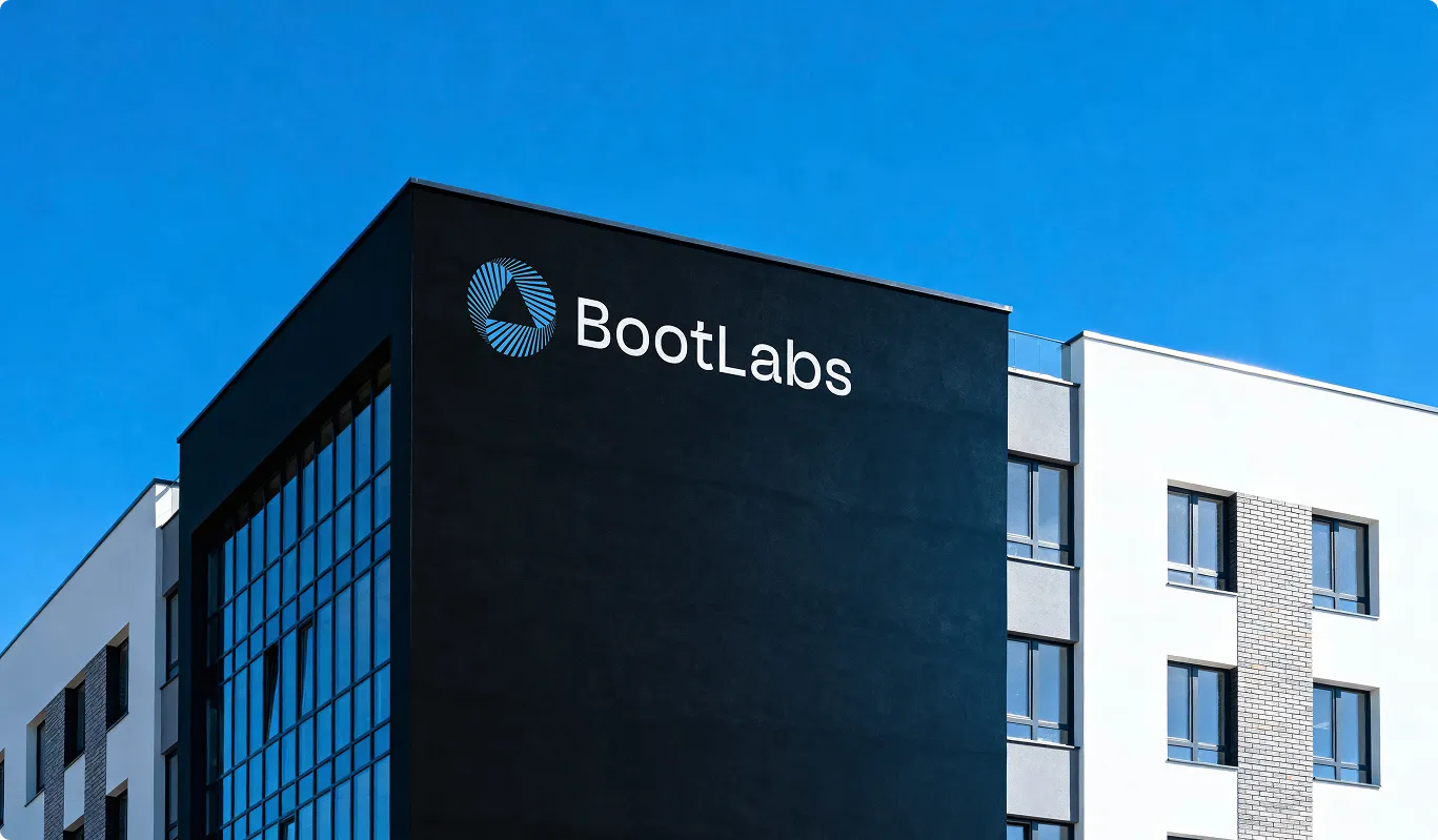
A kinetic logomark built around a radiating triangular form, designed to communicate acceleration, AI, and continuous transformation. Clean grotesk type reinforces engineering precision. Every application, from digital to print, carries the same forward momentum.
.webp)
BootLabs operates at the edge of enterprise AI, but their voice needed to be understood by the CTO and the procurement lead equally. Mellow defined a tone that is technical without being alienating: precise, outcome-first, and built to convert enterprise decision-makers who have heard every claim before.
.webp)
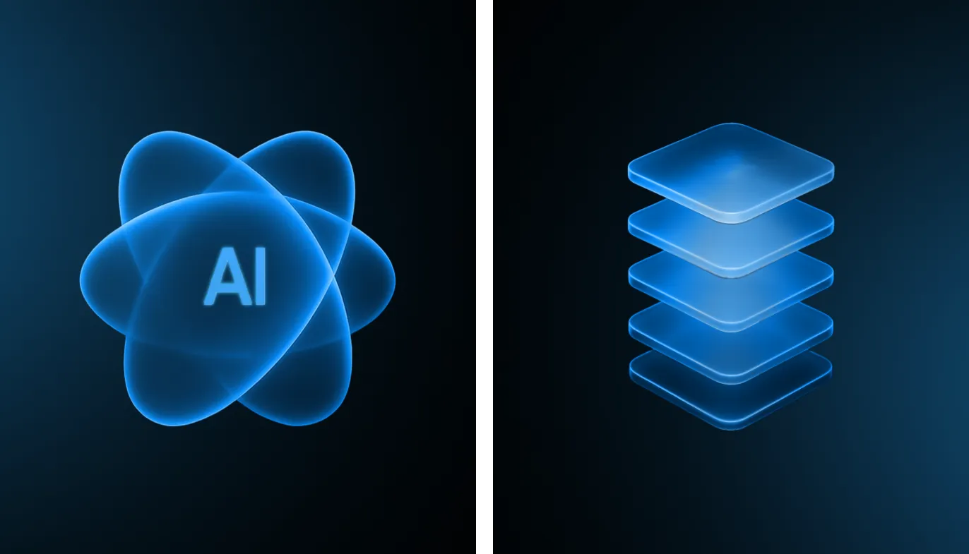
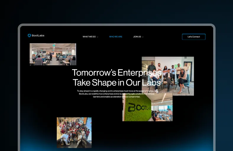
A dual-mode colour system anchored in Electric Blue and Black, built for enterprise digital environments where credibility is visual before it is verbal. Neon glassmorphism iconography, Neue Haas Grotesk typography, and a motion-designed web experience that signals AI-first intelligence the moment the page loads.
.webp)
.webp)
Before Mellow's engagement, BootLabs' technical capability significantly outpaced their brand presence. Enterprise buyers encountering them for the first time had no visual or narrative framework that communicated the scale of what BootLabs could actually deliver. The full brand system — strategy through identity through digital — was delivered end-to-end in 6 months, giving BootLabs a cohesive, production-ready presence across digital, print, and presentation contexts simultaneously.
The rebrand changed the equation. Because the identity now communicated engineering precision and AI-first confidence at every touchpoint — from the first sight of the logomark to the motion-designed website entry — BootLabs was able to enter conversations with global enterprise decision-makers on equal footing with competitors who had been in the market for decades. Positioned as a global enterprise AI partner with a named clientele that now includes HDFC, Mahindra, and AstraZeneca.
.webp)

.webp)
.webp)
.webp)
Built in from the start. We included SEO and GEO in BootLabs' go-to-market strategy from the outset rather than treating discoverability as a post-launch task, which positioned the brand to be found by search engines and AI answer engines alike.
Generative engine optimisation is being discoverable inside AI answer engines rather than only in search results. We built it into BootLabs' launch strategy so the brand could be surfaced by AI-driven tools alongside conventional search.
Design for the destination, not the starting point. We developed BootLabs' brand strategy, visual identity and product design together from the start, so the brand could scale into international markets without a rebuild later.
Yes. We developed BootLabs' identity specifically for an enterprise and AI audience, prioritising credibility and clarity over the more expressive style that suits D2C tech brands.
BootLabs' GTM combined brand strategy, SEO and GEO, and product design as one system, built to support international expansion from launch rather than being assembled market by market afterwards.