Real estate search in India has a trust problem. Platforms built over the last decade accumulated listings, agent networks, and ad inventory but never stopped to ask whether the person searching actually understood what they were looking at. By 2024, the dominant portals had become destinations for lead generation disguised as discovery tools: contact details gated behind paywalls, listings inflated with agent-first information, and interfaces designed to generate calls rather than confidence.
Lands & Homes was founded to dismantle this model entirely. The proposition of India's first no-subscription property platform, with direct owner contact, RERA indexing, and side-by-side comparison was genuinely differentiated. The problem was that none of that differentiation was legible. Without a brand and a product experience that could carry this positioning, the platform would arrive in the market looking like every other portal it was trying to replace.
The deeper challenge was structural: real estate platforms serve multiple distinct user types with buyers searching across cities, sellers listing properties, agents managing pipelines, and builders showcasing projects. Each role brings different needs, different mental models, and different expectations of what "useful" looks like on screen. Most platforms resolve this tension by building separate, inconsistent interfaces for each group. The result is a product that feels cobbled together rather than considered, and a brand that means different things to different people.
Lands & Homes needed a brand that could hold a single, clear idea across all of these contexts and a product design system capable of expressing that idea consistently, no matter who was on the other side of the screen.

Most property platforms are built around supply. The number of listings, the size of the agent network, and the volume of daily searches, these are the metrics that dominate the industry's self-image. But the person actually trying to buy, rent, or invest in a property doesn't experience supply. They experience friction. They experience the moment the contact form doesn't work, the moment the price turns out to be wrong, and the moment the agent calls before they're ready.
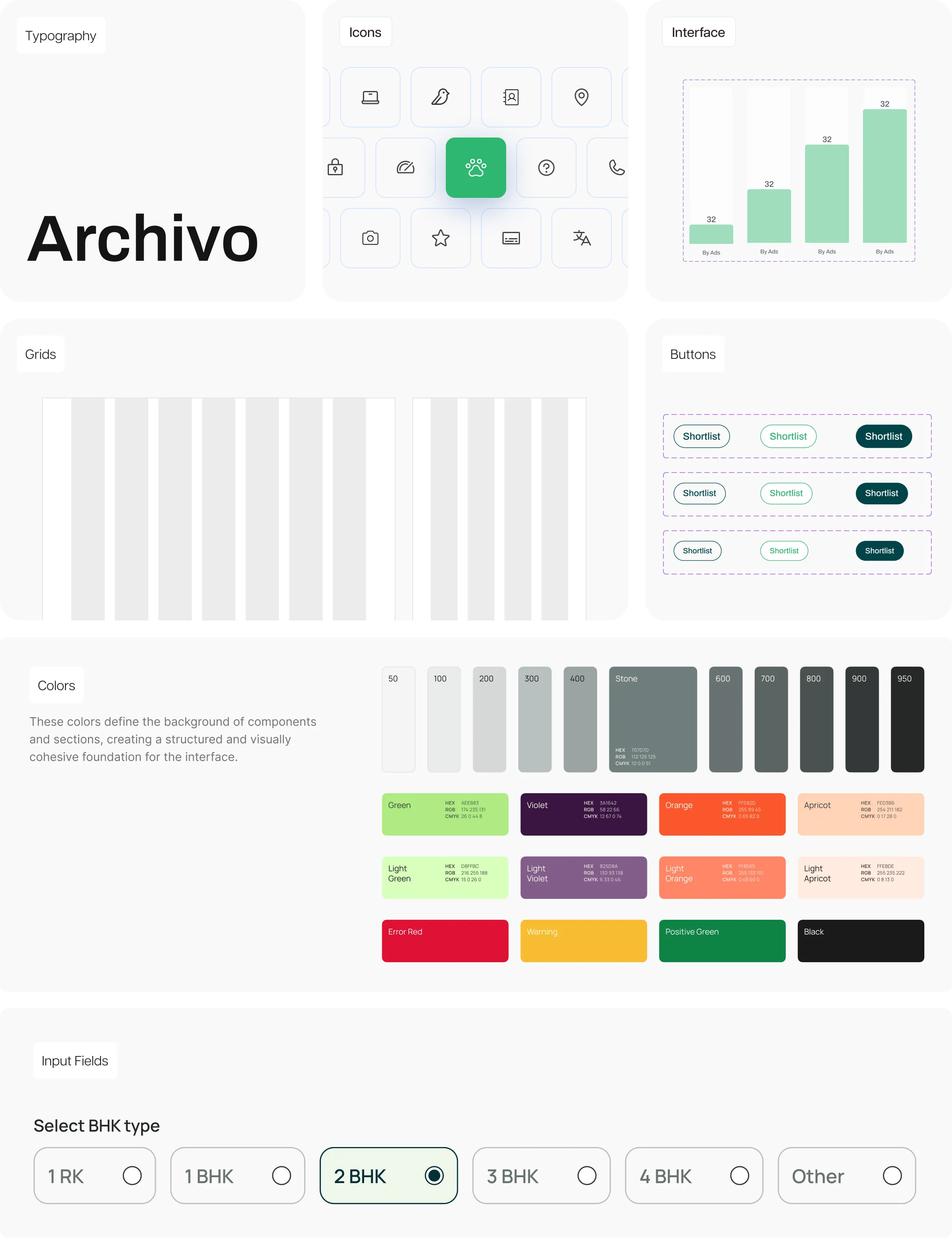
Mellow's insight was that Lands & Homes' competitive advantage wasn't the absence of a subscription fee. That's a pricing decision. The real advantage was structural honesty — a platform designed to reduce the distance between information and decision. The brand and product had to be built around that idea: not around what was available, but around what was legible. Every design decision, from the Midnight Green and Jade palette signalling trust and growth to the multi-role interface architecture, had to ask the same question: does this make the user more confident, or does it make them more dependent?


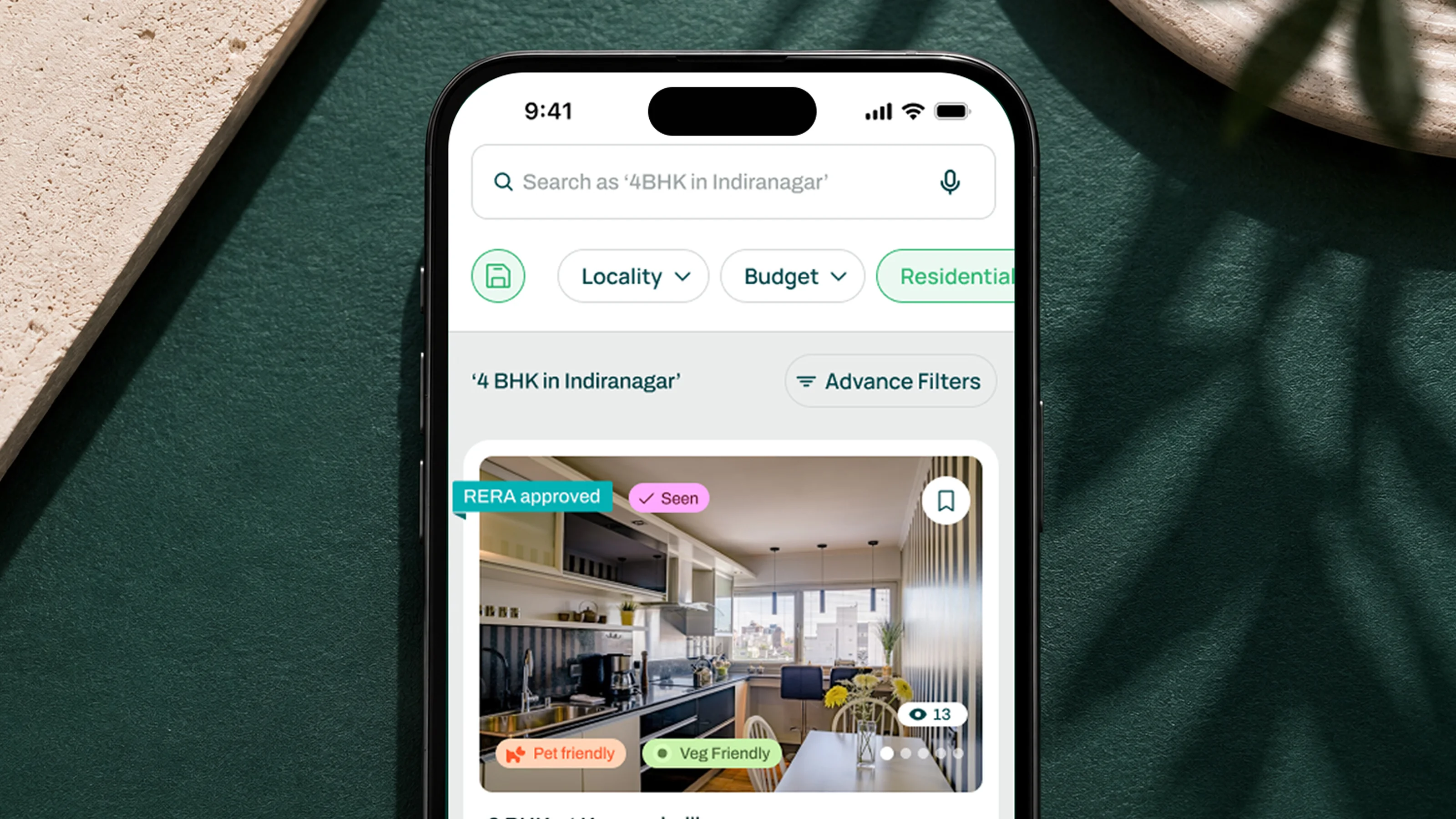
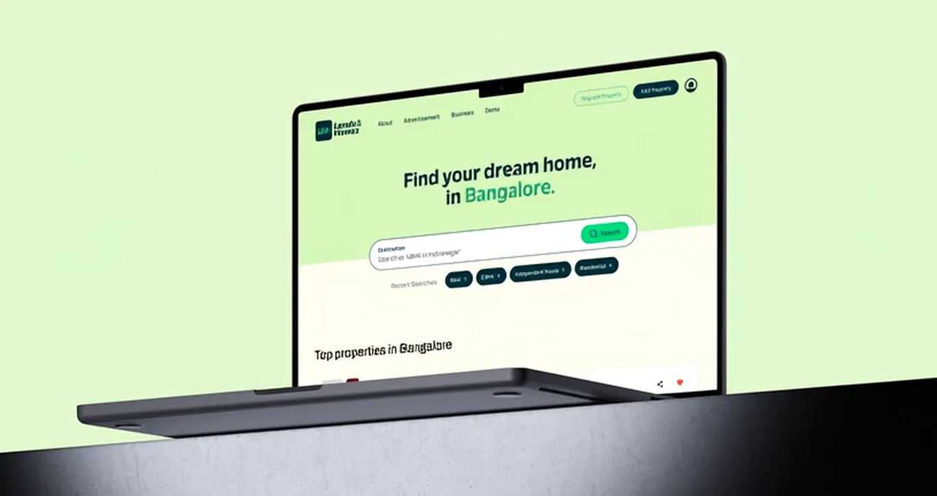
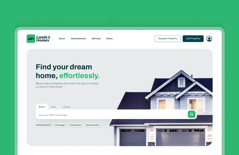
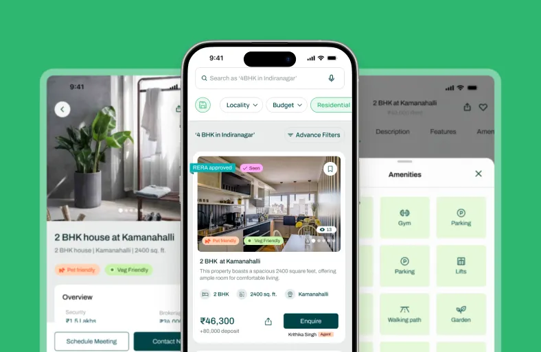
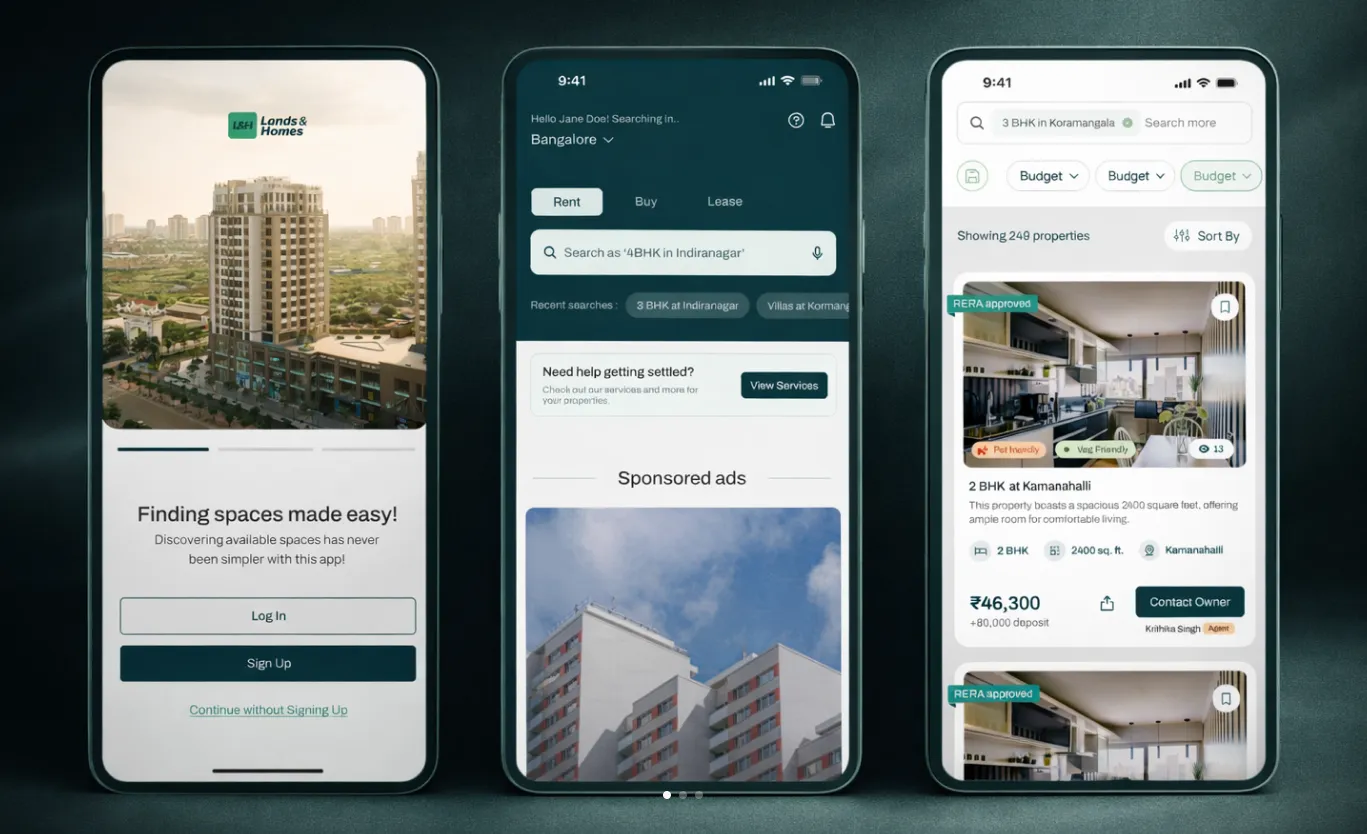
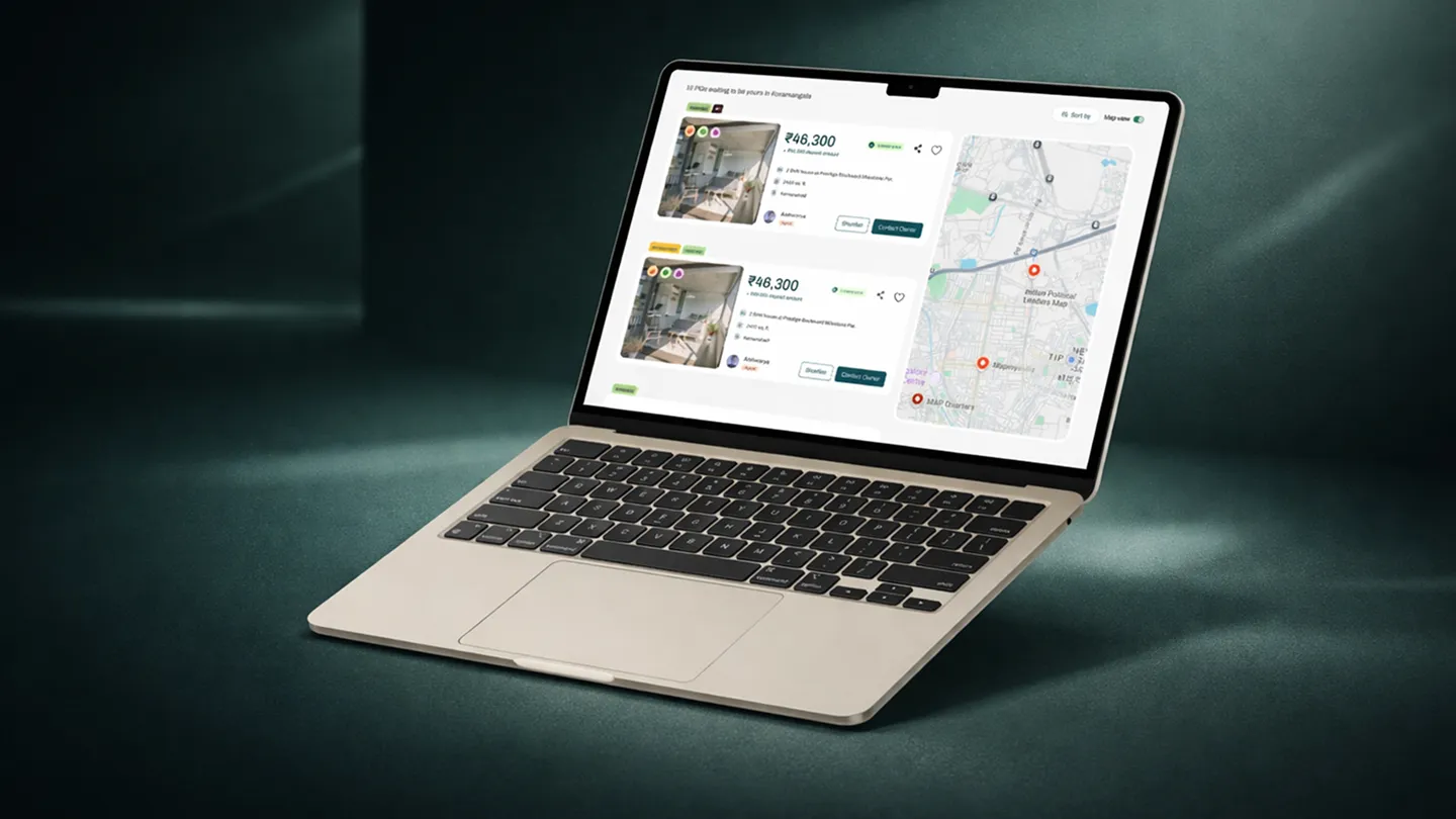
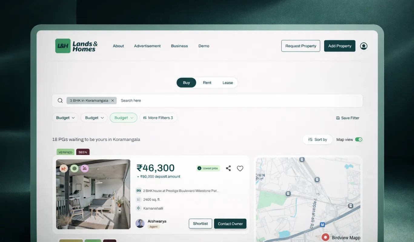
Buying or renting a home is one of the highest-stakes decisions you'll make, and most real estate websites make it harder than it needs to be. We've replaced cluttered filter walls with a clean, focused search bar and instant location tags, so you can find homes by city, neighbourhood, or landmark in seconds. No choice paralysis, no endless scrolling — just relevant property listings the moment you start typing.

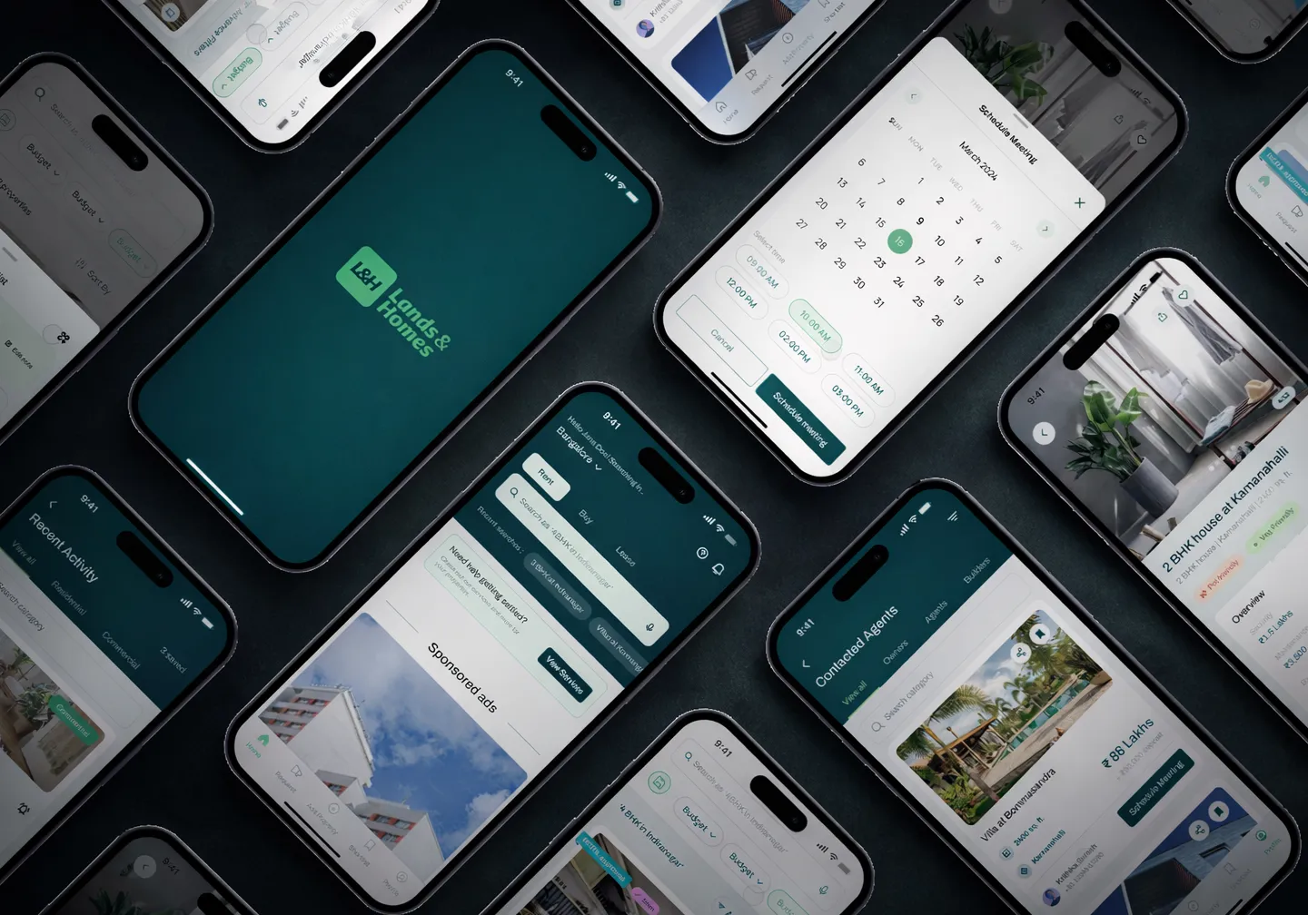
Over 70% of home seekers browse listings on their phone, often during a commute or coffee break. We built every property page to be thumb-friendly: pricing, floor plans, carpet area, amenities, and locality details are all accessible within a single swipe. Switch between two or three shortlisted homes without losing your place, and shortlist favourites with a tap to revisit later.
.webp)
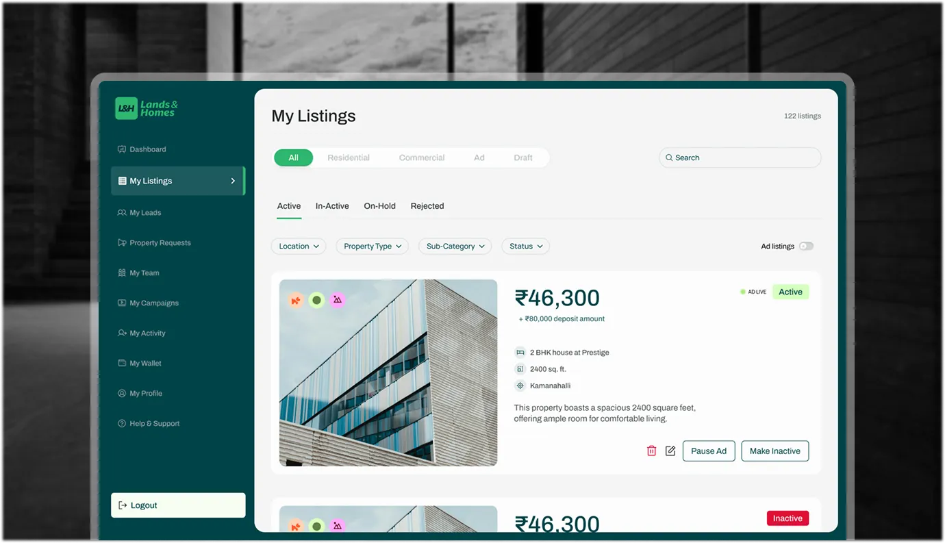
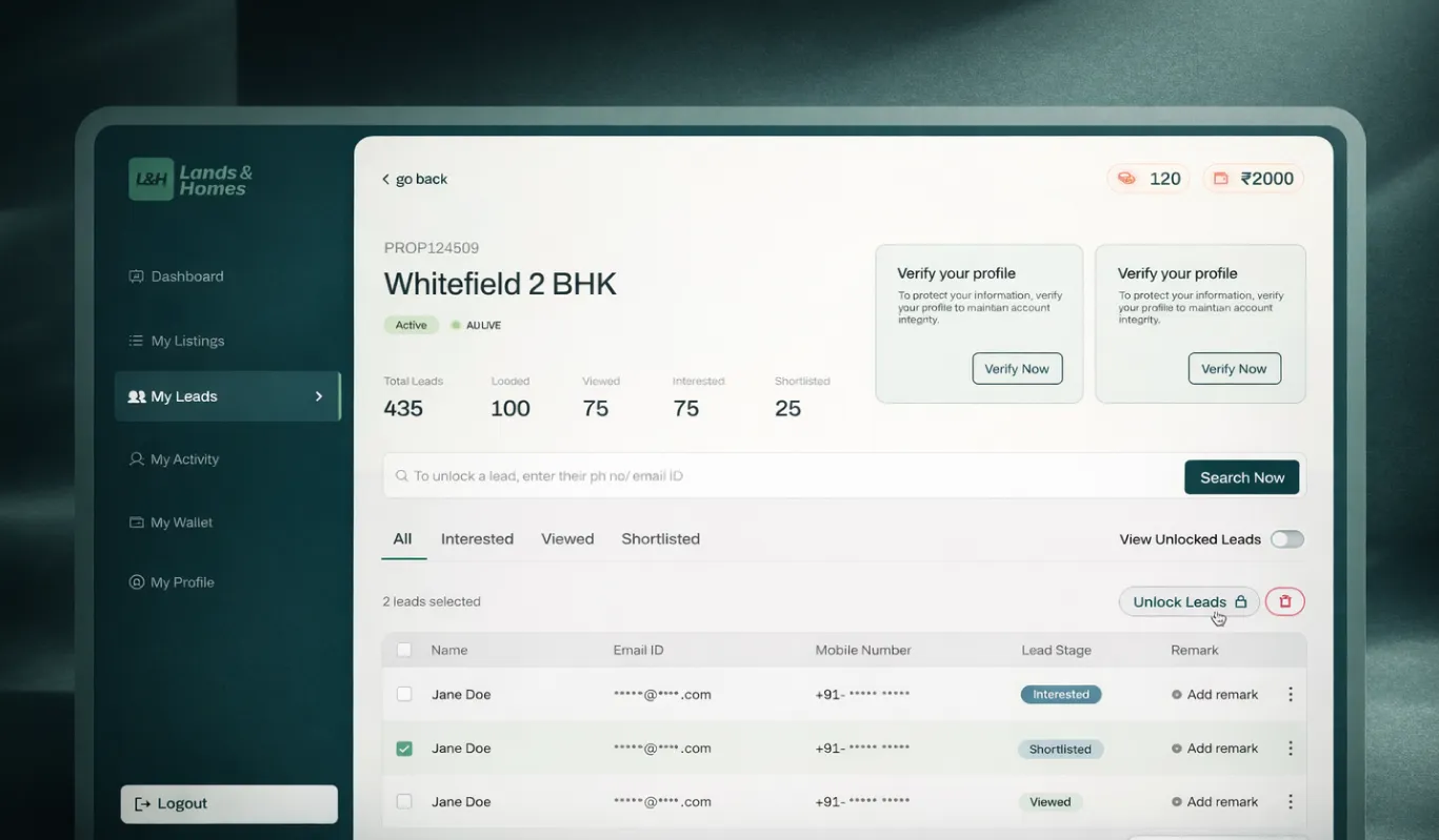
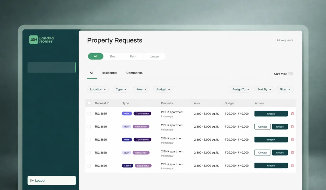
Agents and owners juggle dozens of enquiries across calls, WhatsApp, and email — and most lose deals to a disconnected experience. We've solved this with a unified dashboard: every enquiry lands in one table view with clear status tags (Active, Inactive, Converted, Follow-up), assigned ownership, and timestamped activity. Track every lead from first enquiry to closed deal without switching tools or losing context.


We cut the clutter. By fixing the search filters and cleaning up the property cards, users stopped getting lost in the noise and started booking actual site visits faster.
Fake leads waste everyone’s time. Our "Verified" tags and transparent pricing meant agents got calls from people actually ready to move, not just window shoppers.


Both, developed together. We built Lands & Homes' brand identity and UI/UX in parallel, so the platform launched with a consistent experience across its identity and its actual product rather than reconciling a mismatch later.
Remove rather than add. We built Lands & Homes around simplifying property discovery itself, positioning it as a way to cut through listing-site clutter instead of layering on more filters.
Neutrality. As a platform rather than a broker or builder, Lands & Homes needed an identity that reads as a trustworthy discovery tool, distinct from the promotional tone of an individual property brand.
Yes, when it is designed around a proposition rather than a pattern. We built Lands & Homes' UI/UX specifically to reduce search noise, instead of replicating the listing interface every competitor already uses.