Mavi’s, a Shark Tank-backed artisanal kombucha brand, needed a fresh identity that resonated with health-conscious consumers while reflecting their commitment to natural ingredients and sustainability.
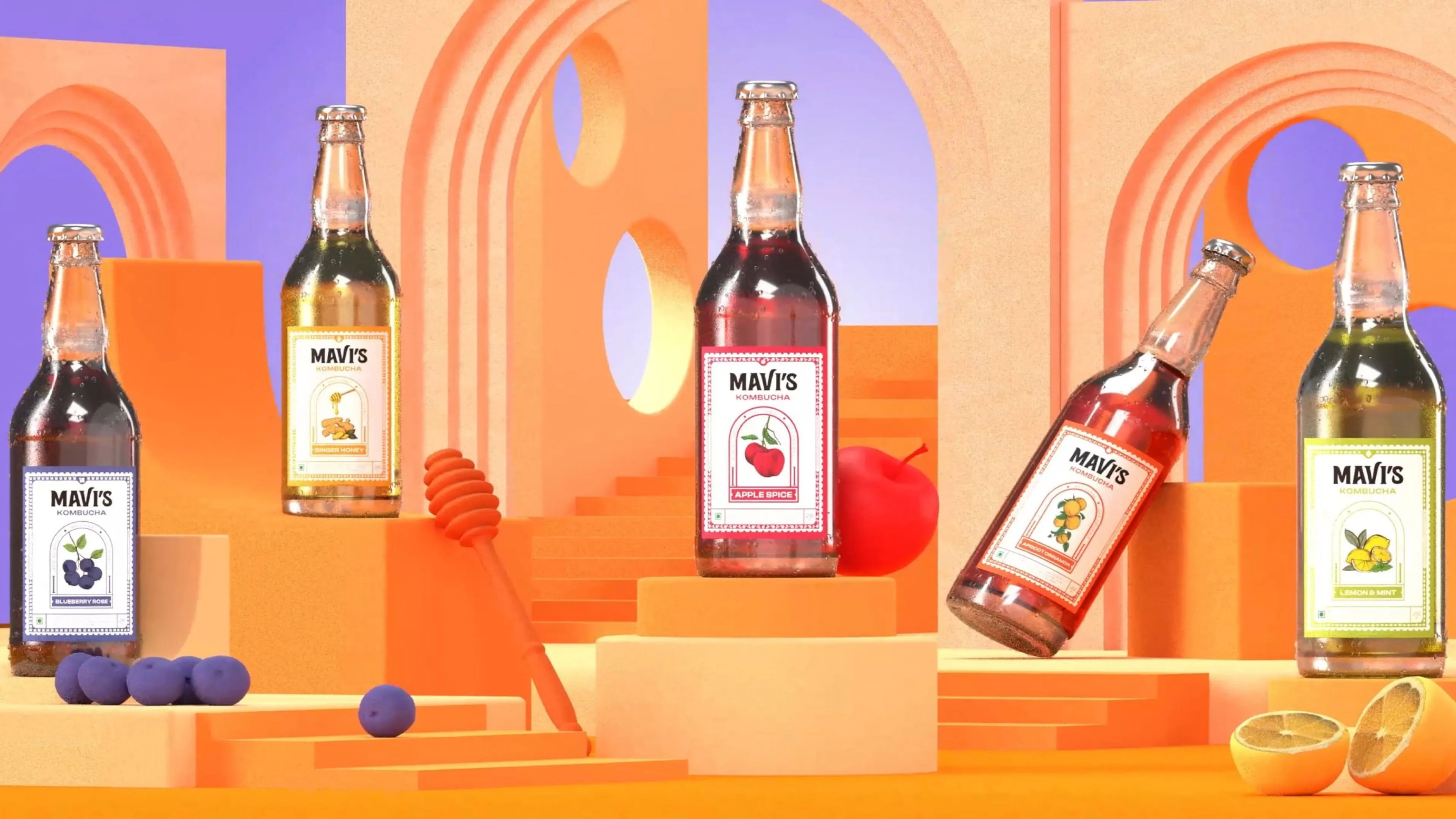
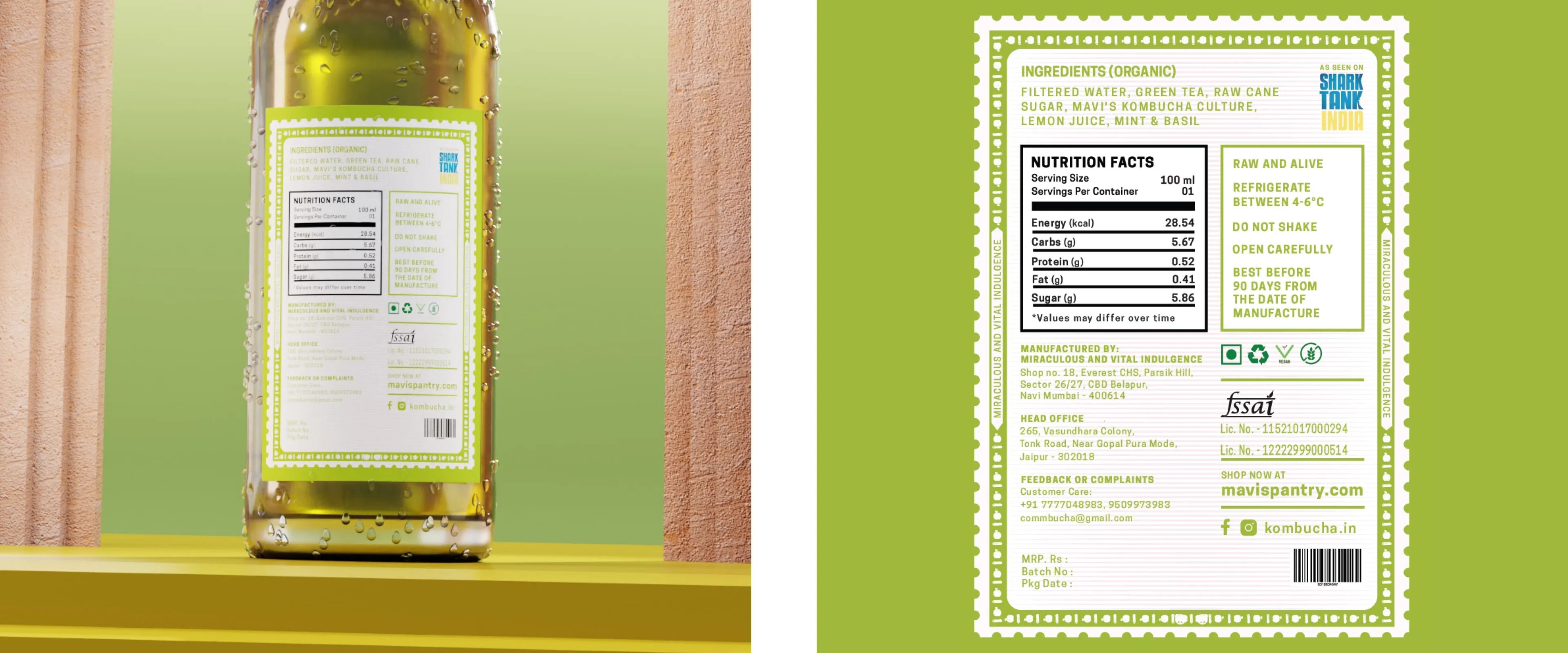
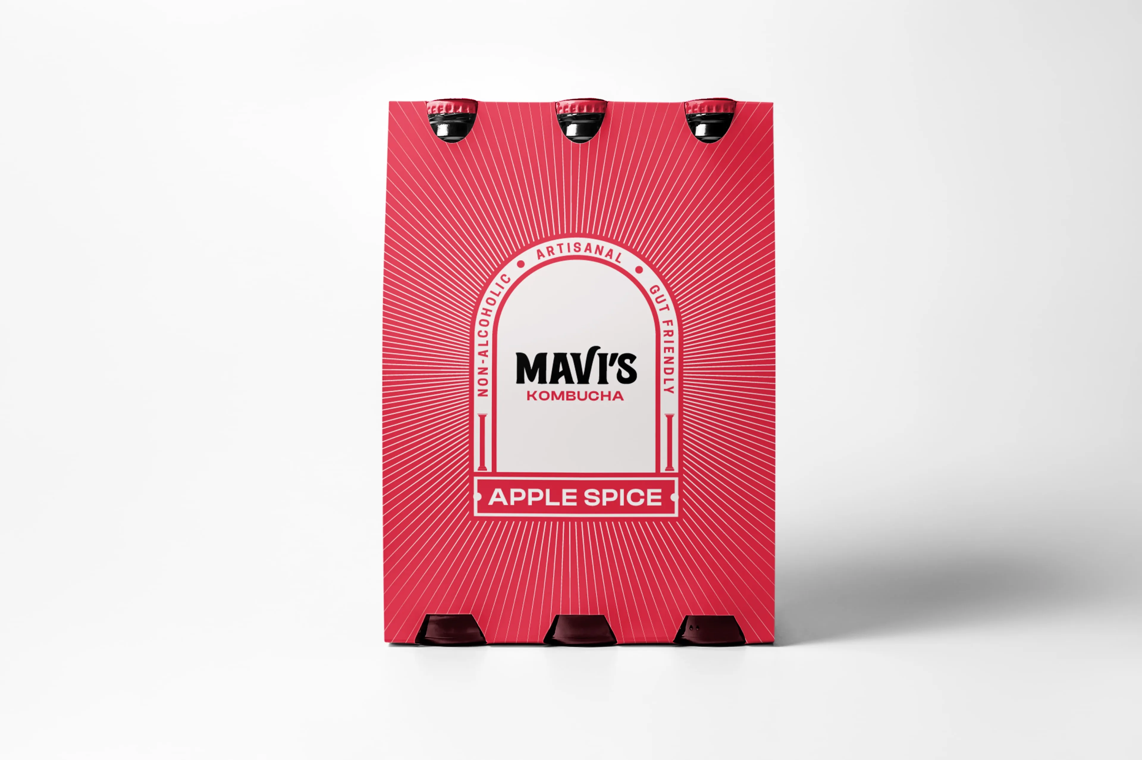
We crafted a compelling brand narrative that emphasised Mavi’s passion for quality and unique flavours. The new visual identity featured a modern logo and vibrant, hand-drawn illustrations for each flavour, ensuring distinctiveness and clarity in product information.
The rebranding led to increased brand awareness, positive customer feedback on the packaging, and a notable boost in sales and brand loyalty.


Make each variant distinct without breaking the family. We gave every Mavi's flavour its own hand-drawn illustration, held inside one modern visual identity, so the range reads as a single brand on shelf rather than unrelated packs.
It has to make the investment visible. We built Mavi's identity around a narrative of quality and distinctive flavours, giving the brand a clear story to lead with as it entered a competitive market with fresh backing.
Yes. Each Mavi's flavour is represented by a hand-drawn illustration instead of a photograph, which gave the packaging an ownable illustrated identity that photography would not have produced.
It extends the brand past the pack. Mavi's engagement included experience design alongside packaging and brand films, covering how the brand is encountered beyond the moment of purchase.
By carrying the same story into motion. We built Mavi's films from the visual identity and narrative already established in the packaging, reinforcing the brand in a format made for social and digital distribution.