Challenge
Old School Station (OSS) is a gaming console loaded with 10,000 retro games from the 80s and 90s, offering a genuine 90s gaming vibe. The task was to encapsulate the spirit of retro gaming and connect with an audience that grew up enjoying these classics. They needed an engaging Amazon storefront with A+ content, along with branding, packaging, and social media marketing that would instantly transport users back to their childhood.
Approach
We set out to build a strong emotional bond between the product and its audience by tapping into nostalgia. The creatives need to feel like a time machine to the 90s, immersing visitors in the thrill of retro gaming right from the start. Every visual and interactive feature should recreate the excitement of firing up an old console, making OSS a relatable and immersive experience for gamers rather than just a product.
Thought Process
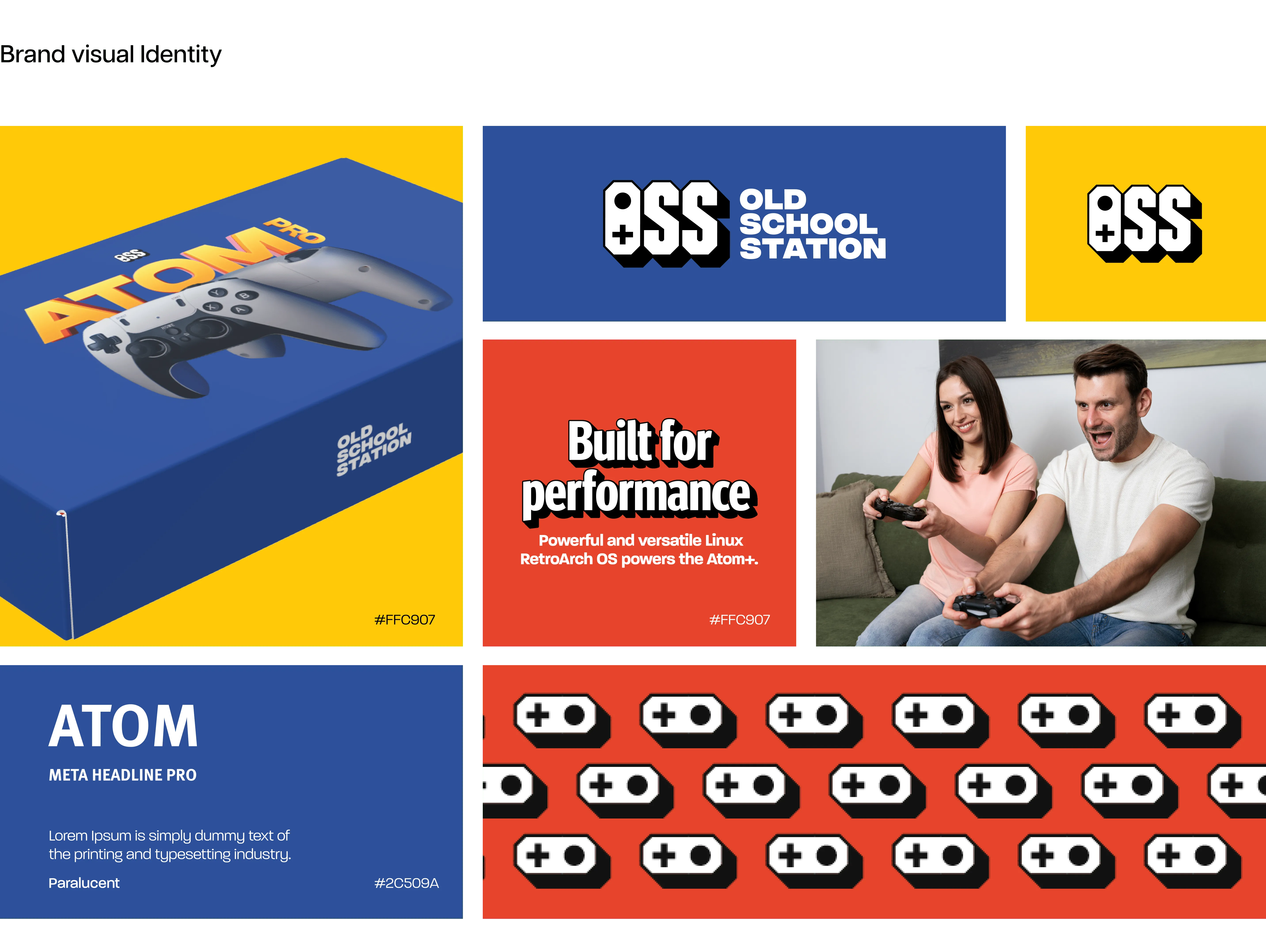
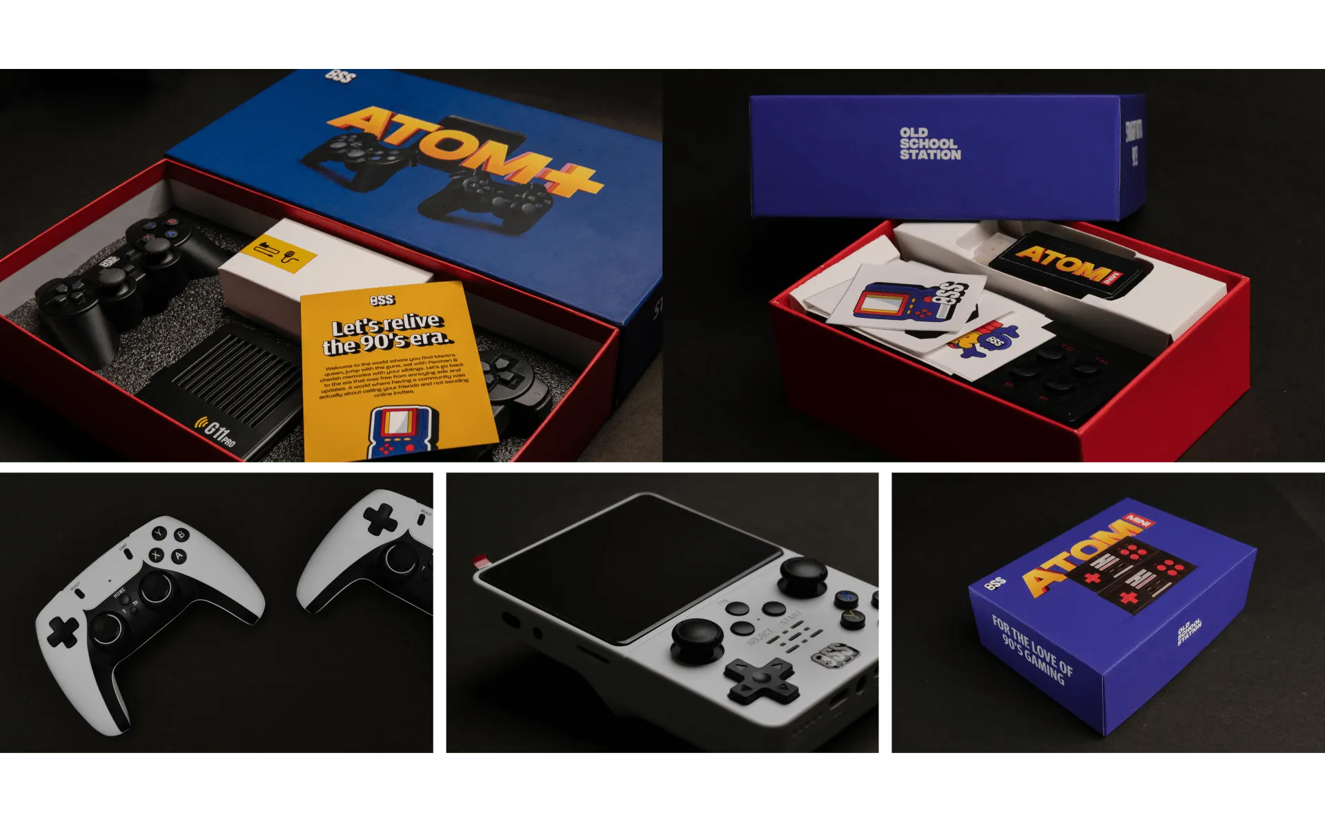
Our goal was to build an engaging and visually appealing brand that struck a chord with gamers who grew up in the arcade and console era. To do this, we incorporated bold, vibrant colours like red, blue, and yellow, reminiscent of classic arcade machines, in all our creatives. Simple illustrations and font styles reinforced the retro theme, ensuring the product stood out while honouring its nostalgic roots. This design approach extended to stickers, packaging, and social media content, along with a dedicated product photoshoot, making sure every interaction captured the essence of classic gaming culture.
Result
The redesigned packaging, social media presence and the Amazon storefront A+ content effectively embodied the spirit of retro gaming, resonating with an audience eager for nostalgic experiences. The striking visuals and branding helped OSS position itself as the go-to console for anyone wanting to relive their favourite gaming moments from the past.


.svg)








.svg)


