The ice cream market in India is split between two extremes: mass-market brands competing entirely on price and flavour count, and aspirational premium players chasing the Instagrammable café crowd. Neither extreme had claimed the middle ground, the young, internet-native consumer who wants something with genuine personality, not just a logo on a cup.
The Chill Cat came to Mellow as an idea, not yet a brand. The founders had the product, artisanal ice cream crafted in small batches with honest ingredients; the ambition to open a store in Hassan, Karnataka; and a clear instinct about the audience they wanted to speak to: a generation that grew up on memes, treats a corner ice cream shop as a social ritual, and can immediately tell when a brand is trying too hard to seem cool versus actually being it.
The risk was not a lack of product. Artisanal ice cream sells itself when it is good. The risk was invisibility. Without a distinct identity, The Chill Cat would open as just another scoop shop in a market where novelty fades fast and loyalty is earned through character, not just flavour. They needed a name that stuck, a mascot that could live beyond the store walls, a colour and typographic system that felt alive, packaging that turned the moment of buying into an event, and a retail environment that gave people a reason to stay, share, and return.
Everything had to be built from scratch, and it had to be coherent from the first sketch to the first scoop served.


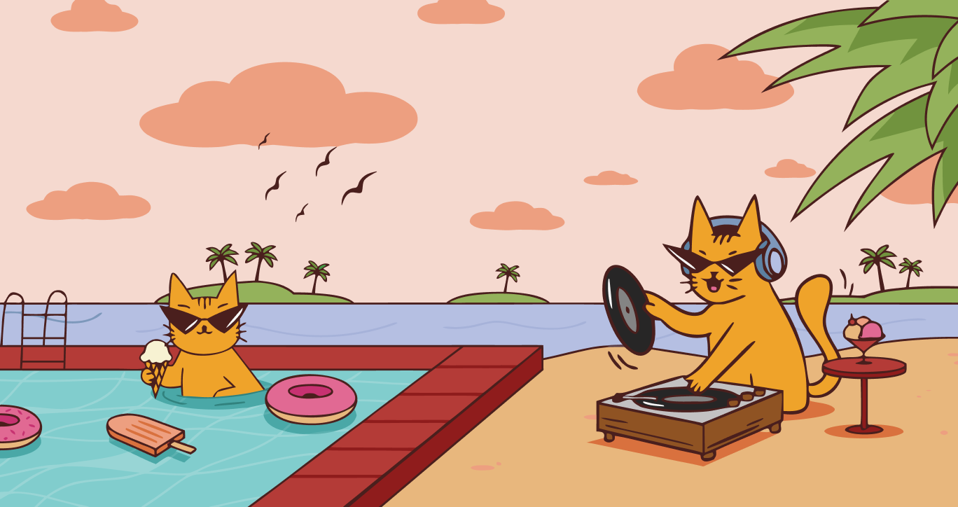
Most food brands treat their mascot as decoration, a friendly face on packaging that communicates "fun" without saying anything specific. The Chill Cat's opportunity was the opposite: make the mascot the entire personality, then build the brand as its world.
Internet culture had already established that cats are the universal language of effortless cool. A cat does not try. A cat simply is. That quality, unbothered confidence, laid-back charm, and zero need for approval mapped precisely onto what The Chill Cat's audience responds to. The insight was not "use a cat". It was the mascot should be so expressive and so consistent that it becomes a local character, the kind of personality a neighbourhood feels it already knows before it has even walked through the door. If the mascot could earn that relationship, The Chill Cat would never merely be a place that sells ice cream. It would be someone the town actually likes.


.webp)
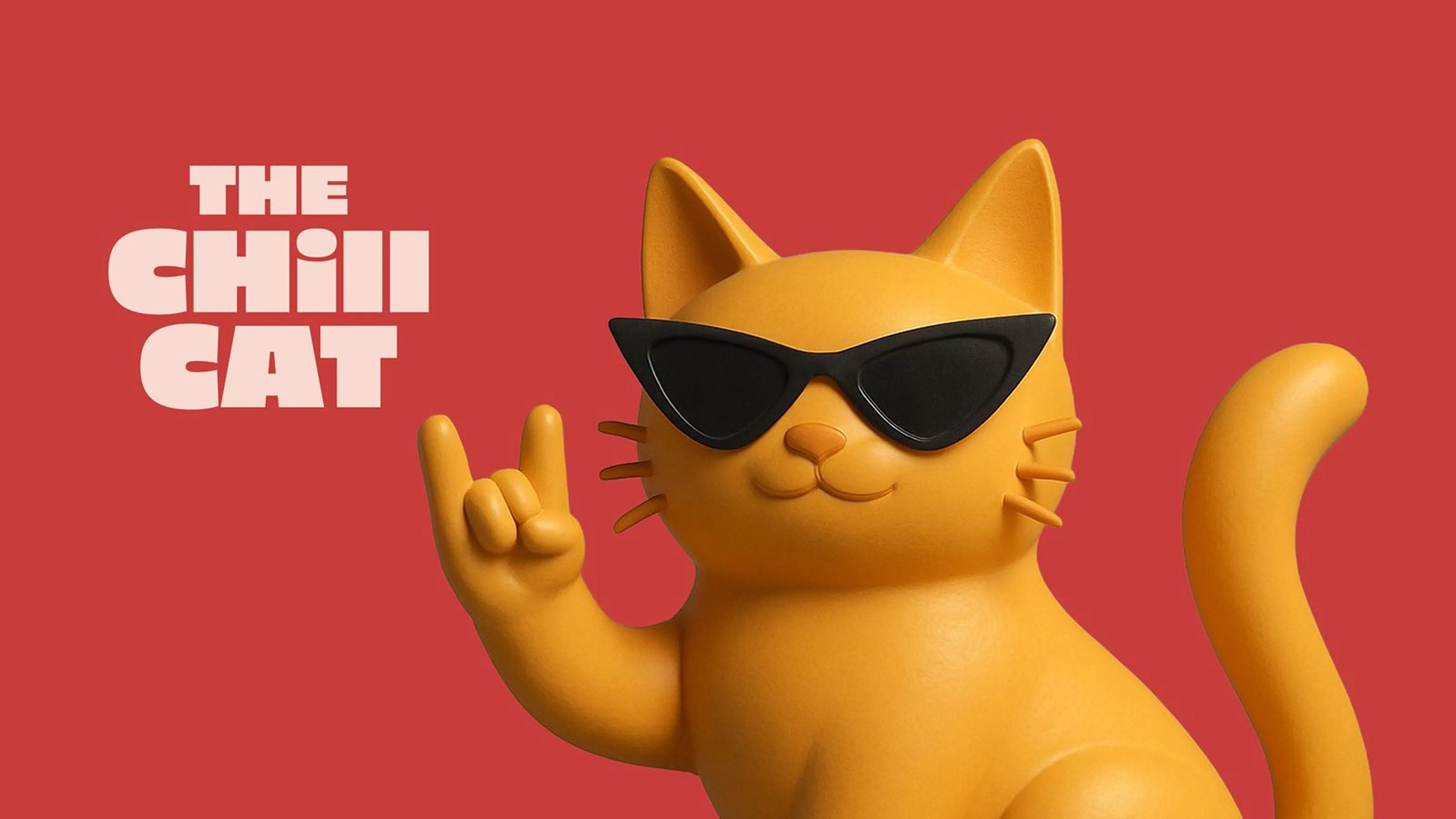
Chill Cat's mascot became the soul of the entire brand. Expressive, laid-back, and endlessly meme-able, the character gave the brand a personality that lives as comfortably on packaging as it does on social media and as naturally in a store corner as it does on a phone screen.
.webp)
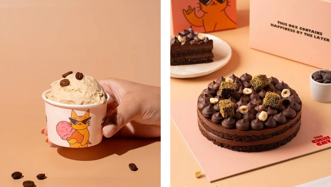
Sampling ice cream should feel like an event, not a transaction. We built a palette-inspired packaging experience where every scoop arrives as a tester, each one illustrated with the Chill Cat character, turning the first bite into the first brand moment.
.webp)
The retail space was designed as a full brand immersion. Graffiti-style walls, the cat's language woven into every corner, and copy that sounds like it was written by the coolest person in the room, because it was.
.png)

A fully operational artisanal ice cream brand, built from name to store in 6 months.
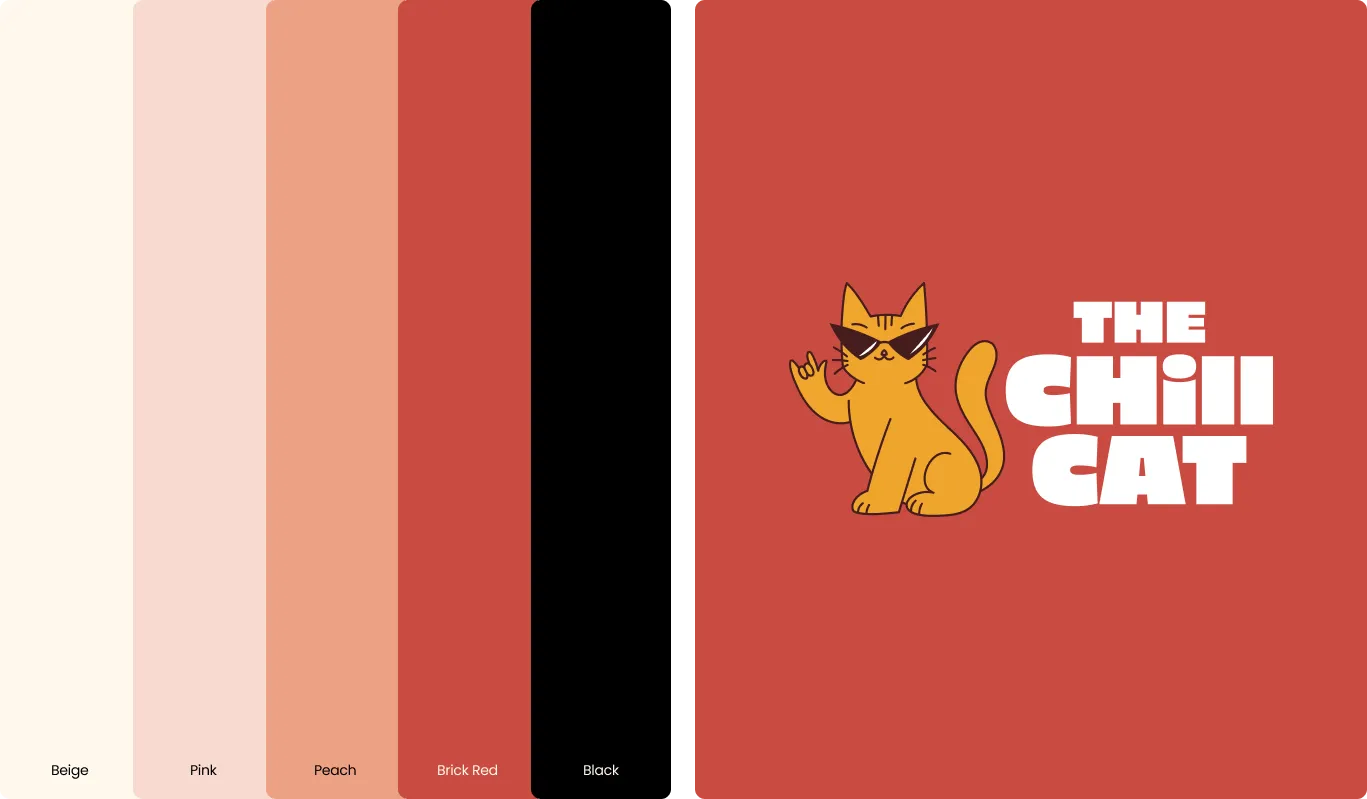
When The Chill Cat opened in Hassan, Karnataka, it did not arrive as a new business hoping to find its audience. It arrived as a complete brand: a mascot with genuine personality, a colour system that holds across every surface, packaging that turns a scoop into a shareable moment, and a store that feels like the character's home rather than a generic dessert outlet.
The brand's positioning as Hassan's first artisanal ice cream destination — small-batch, honest ingredients, and bold flavours — was made credible not just by what was in the cup, but by everything surrounding it. Because the identity system was built with rigour from the beginning, the founders could open with confidence: consistent packaging, a retail environment that matched the brand's tone exactly, and a visual language coherent enough to carry The Chill Cat wherever it grows next.
The Chill Cat is now a neighbourhood personality, not just a shop. In a category where most new entrants compete on product alone, it competes on character — and that is a far more durable advantage.
.png)


.png)
We took The Chill Cat from an unbranded idea to a fully operational store in Hassan, covering naming, mascot development, packaging and retail design as one system rather than a queue of separate deliverables.
Give it a voice, not just a face. We developed The Chill Cat's mascot as the brand's primary voice, expressive and consistent enough across packaging and store design to read as a character customers actually recognise.
Serve the customer neither one targets. We positioned The Chill Cat for a younger, internet-native audience that wants personality rather than the lowest price or the most polished aesthetic.
It outlasts the product novelty. In food and beverage a new flavour holds attention briefly, which is why we built The Chill Cat to compete on character. That compounds where a flavour expires.
Design them. We redesigned The Chill Cat's tester scoops as a palette-style experience with the mascot illustrated on each one, turning a throwaway interaction into a customer's first real impression of the brand.