V-Align Technologies is a distinguished Zoho Premium Partner with 14 years of extensive industry experience. With a strong presence in 13 different countries, we exist to align technology, processes, and cross-functional teams, enabling them to bring about breakthrough digital transformation for our customers.
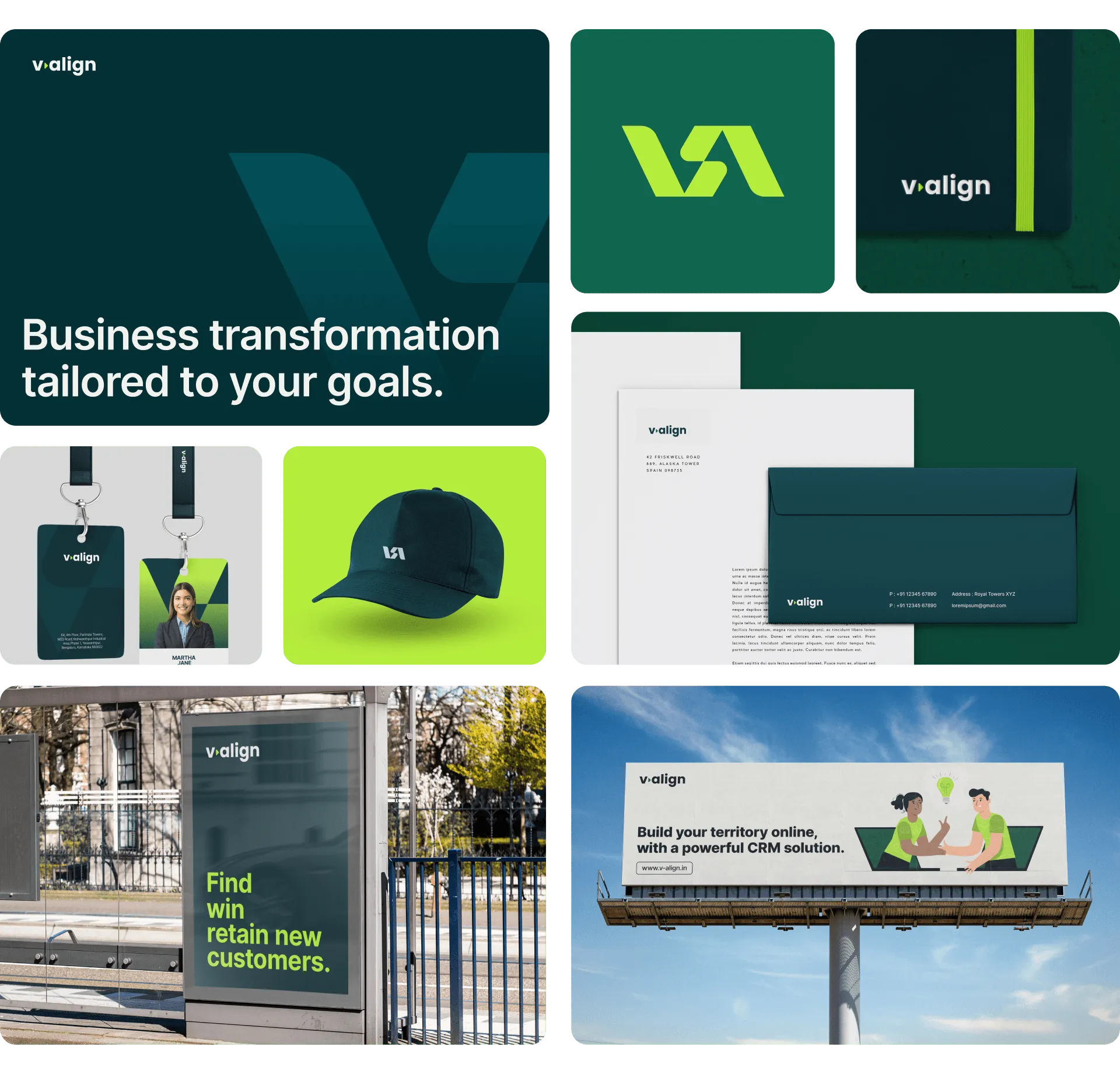
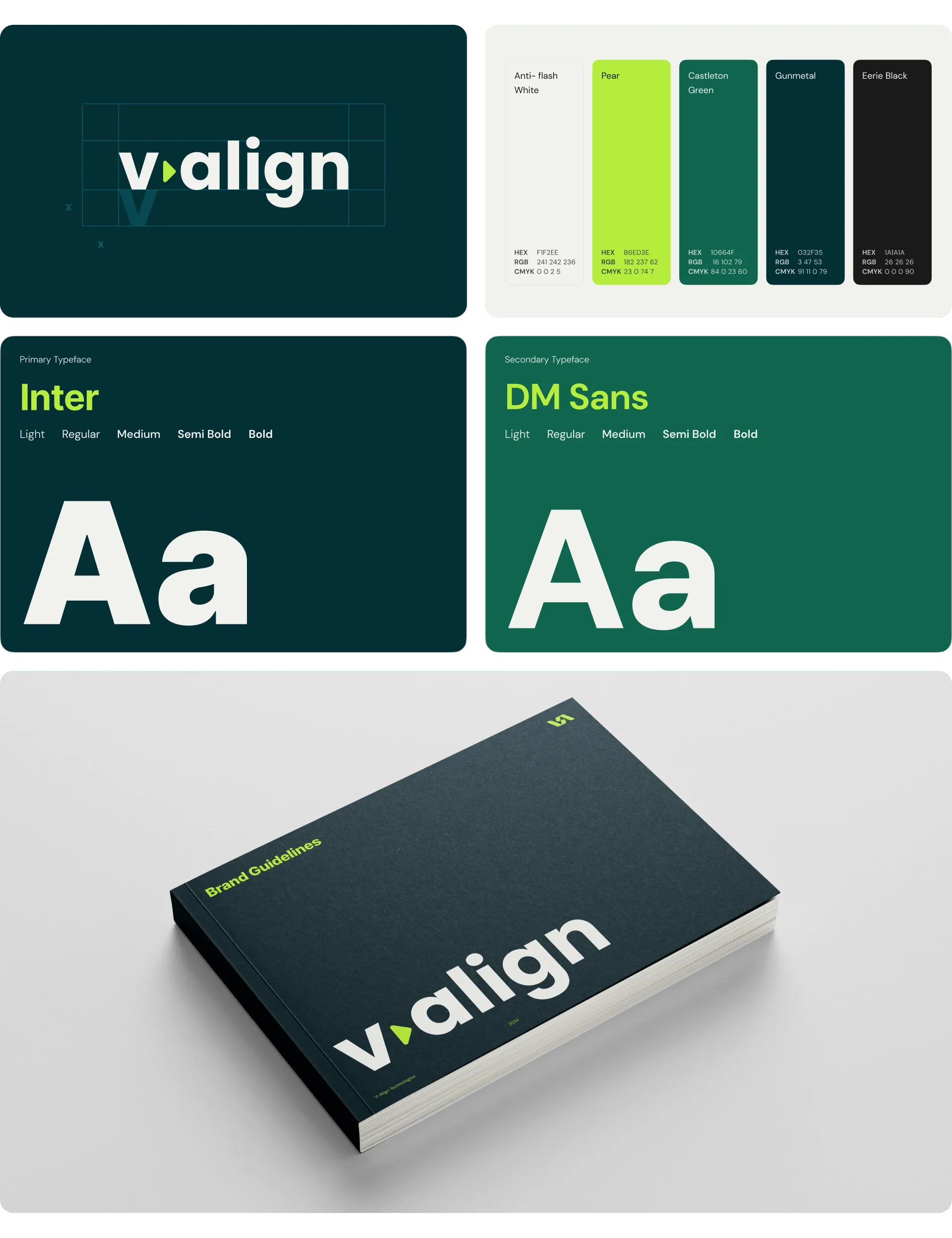
At Mellow Designs, we took a strategic design approach to solve these problems. We did a deep dive into the subject and started designing an identity system that would resonate. The product itself served as inspiration for the logo design, with a V-Align icon forming the logo mark. The font choice was kept confident and approachable to establish expertise and inspire trust. We also did UX exercises to help sort out the vast information and condense it into an easily digestible information flow.


Build one adaptable system rather than local variations. We created V-Align's identity to work across 13 countries, distilling technology alignment and transformation consulting into a single visual system that holds in every market.
Yes, and it usually produces a more honest mark. We built V-Align's logo directly from a V-Align icon drawn from the product itself, using the company's own offering as its identity source rather than an abstract symbol.
A full system, if the positioning has outgrown the mark. Despite 14 years in the industry, V-Align needed an identity built around its current positioning rather than a surface-level update, to represent its scale across 13 countries.
Start from what the company actually does. We developed V-Align's system after a deep dive into its real service offering, so the visual language reflected technology and process alignment instead of a generic corporate look.
It sells implementation, not software. As a Zoho Premium Partner, V-Align needed an identity reflecting its role as an alignment and implementation partner, which produced a more consultative direction than a product brand would take.